There is a profound intimacy in choosing to wear a poem, a literary passage, or a personal manifesto on one’s skin. Unlike a single-word tattoo, which acts as a bold exclamation point, long-form text tattoos are more like a slow-burning fire—they invite the eye to linger and the mind to reflect. However, the technical execution of a long quote is one of the most significant challenges in the tattoo industry. Without careful planning, a beautiful sonnet can easily transform into a dense, illegible “wall of text” that looks more like a newspaper clipping than a piece of art. To avoid this, a professional tattoo font generator has become an essential tool for poets and literature lovers to ensure their ink possesses the necessary “visual breathing room.”
The Literacy of Skin: Why Long-Form Tattoos Fail
The human eye requires specific conditions to read text comfortably. We need contrast, rhythm, and, most importantly, space. On a flat page, these are controlled by margins and typesetting. On skin, which is a living, breathing, and stretching canvas, these factors are even more critical.
The biggest pain point for those seeking a literary tattoo is “crowding.” Over time, as ink settles into the dermis, it naturally spreads—a process known as “fanning.” If the lines of a poem are too close together, or if the individual letters are too cramped, the text will eventually merge into a dark, unreadable mass. This is why a specialized tattoo font generator is vital; it allows the user to simulate the “breathing room” required to keep the text legible for decades.
Designing with “Visual Breath”: The Role of Spacing and Rhythm
In poetry, the “white space” on the page is just as important as the words themselves. It dictates the pace at which the reader consumes the content. The same logic applies to body art. When planning a long-form piece, you must consider three types of space:
- Kerning (Letter Spacing): The gap between individual characters.
- Leading (Line Spacing): The vertical distance between lines of text.
- Tracking (Word Spacing): The overall density of the passage.
By using a tattoo font generator, you can manually adjust these parameters in real-time. This allows you to see how a “Typewriter” font looks when it is given extra room to breathe versus a “Script” font that might require tighter ligatures but wider line breaks. The goal is to create a rhythm that matches the tone of the literature you are immortalizing.
5 Popular Content Themes for Literary Tattoo Design
- The Typography of Truth: Why “Old English” is losing ground to “Minimalist Serif” for long quotes.
- Anatomical Alignment: Placing long-form text where it won’t distort during muscle movement.
- The 10-Year Test: How to choose font weights that withstand the natural aging of the skin.
- Cursive vs. Print: Which style offers better long-term legibility for paragraphs?
- Digital Pre-Visualization: The importance of seeing your text on a 3D model before the needle touches the skin.
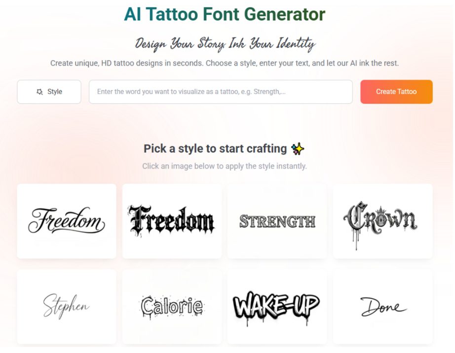
Customization: The Heart of the Tattoo Font Generator
The modern literary enthusiast is no longer satisfied with “off-the-shelf” fonts. They want their ink to be as unique as the poem it contains. A high-quality tattoo font generator offers an AI-driven interface where the user can customize every aspect of the typography.
For instance, if you are tattooing a passage from Leaves of Grass by Walt Whitman, you might want a font that feels organic and flowing. However, to ensure it doesn’t blur, you can use the generator to increase the leading, giving each line of the poem its own distinct territory on your ribs or forearm. This “customization of breath” is what separates a professional design from a haphazard one. It ensures that the rhythm of the poem is preserved not just in the words, but in the visual architecture of the ink.
E-E-A-T Principles in Literary Ink Selection
In the digital marketing world, Google prioritizes Experience, Expertise, Authoritativeness, and Trustworthiness (E-E-A-T). Interestingly, these principles are equally applicable when choosing a font for a permanent literary tattoo.
- Experience: The font should reflect the “lived experience” of the quote. A gritty Bukowski quote requires a different aesthetic than a delicate Sylvia Plath verse.
- Expertise: Rely on tools designed by typography experts who understand the limitations of skin as a medium.
- Authoritativeness: Use a tattoo font generator that provides high-resolution, vector-based outputs that professional tattoo artists can trust for their stencils.
- Trustworthiness: Seeing a realistic preview helps build trust in the final result, reducing the anxiety often associated with getting a large-scale text tattoo.
Technical Standards for Long-Form Legibility
When you are dealing with 50 to 100 words in a single tattoo, you must adhere to strict technical standards to avoid “visual fatigue.”
1. The “Counter” Rule
Letters with enclosed circles (a, o, p, d, b) are the first to blur. Choose a font style that keeps these “counters” open. If the font you love is too tight, use the generator to slightly scale the font size up until the counters have enough white space to survive the healing process.
2. Consistency of Weight
For long poems, avoid “Thick-and-Thin” scripts (high-contrast calligraphy). Under the skin, the thin lines may disappear while the thick ones remain, making the poem look like a broken Morse code. A consistent “monoline” weight is the safest bet for long-term readability.
3. Margin Management
Don’t let your text run right to the edges of your limb. A tattoo font generator helps you visualize the “frame.” Just as a poem needs margins on a page, a text tattoo needs a border of clean skin to act as a visual frame, highlighting the elegance of the script.
The Future of Literary Tattoos: AI Meets Art
As we move into 2026, the intersection of AI and body art is becoming more sophisticated. We are seeing tools that don’t just “show” a font, but “suggest” layouts based on the length of the text and the specific body part. For a long-form poem, the software can automatically suggest the optimal line breaks to fit the taper of a thigh or the curve of a back.
This technological leap is empowering a new generation of “literary collectors”—people who view their bodies as living anthologies. By utilizing a tattoo font generator, these collectors can ensure that their favorite verses are rendered with the precision of a master typesetter and the soul of a poet.
Conclusion: Let Your Text Breathe
A tattoo of a poem is a lifelong commitment to a specific set of ideas and aesthetics. It is a visual representation of your internal library. To do justice to the words of the greats—or your own original prose—you must prioritize the “breathing room” that makes reading possible.
Using a tattoo font generator allows you to move beyond the limitations of standard word processors. It gives you the power to manipulate space, weight, and rhythm to create a piece of art that is as legible as it is beautiful. Don’t let your favorite verses become a blur; give them the space they need to resonate. Whether it’s a single stanza or an entire epic, your ink deserves the clarity that only professional-grade typographic tools can provide. In the end, the most beautiful tattoos are the ones that can still be read—and felt—decades after the first drop of ink is placed.