Part One: What a Price Actually Is
The single number displayed next to an asset is more constructed than it appears, and understanding how it is constructed explains why it sometimes behaves strangely.
Last trade, mid price, and the spread between them
There are at least three defensible answers to “what is the price right now”:
- Last traded price — the most recent executed transaction. This is what most displays show. It is historical by definition, and on an illiquid asset it may be minutes or hours old.
- Best bid — the highest price anyone is currently willing to buy at.
- Best ask — the lowest price anyone is currently willing to sell at.
The gap between best bid and best ask is the spread, and it is the first cost you pay on any trade. On a major pair the spread might be one or two basis points. On a thin mid-cap pair it can exceed 100 basis points — meaning you lose over 1% the instant you enter and exit, before any exchange fee applies.
When you check crypto prices today live chart data, the figure displayed is typically the last trade or a volume-weighted aggregate across venues. Both are accurate as records. Neither guarantees you can transact there.
Why prices differ across exchanges
Each exchange operates an independent order book with its own participants and liquidity. Arbitrageurs normally keep major pairs closely aligned, because a meaningful gap is free money. Three conditions break that alignment:
- Illiquid assets, where the arbitrage profit does not cover transfer costs and risk
- Extreme volatility, when withdrawal and settlement delays prevent arbitrageurs from moving capital fast enough
- Fiat and regional isolation, where capital controls or limited banking rails produce persistent regional premiums
A price that looks anomalous on one venue is often a liquidity artefact rather than an opportunity.
Volume-weighted average price
Aggregated prices are generally calculated as volume-weighted averages across venues, so an exchange with 40% of an asset’s volume contributes roughly 40% of the reference price. This is the correct methodology — but it means a single venue with unusual volume characteristics can influence the displayed reference price more than its price discovery quality warrants.
Part Two: Reading Charts Properly
A chart is a compression of transaction history. How you compress it changes the conclusion you reach.
Timeframe is not a display preference
The same asset can be up 18% on the day, down 34% on the month, and up 400% on the year. All three are simultaneously true. The mistake is reacting to a timeframe unrelated to your intended holding period — reading a 1-hour chart while holding for six months generates anxiety and transactions without generating information.
A reliable sequence before forming any view:
| Timeframe | What It Answers |
| 24 hours | Is something happening right now? |
| 7 days | Is today a continuation or a reversal? |
| 30–90 days | What trend do the shorter views sit inside? |
| 1 year+ | Where does the current range sit historically? |
If the story changes between timeframes, the longer one is usually the more reliable guide, and the shorter one is usually the more emotionally compelling. That asymmetry is worth naming explicitly, because it operates on everyone.
What candlesticks encode
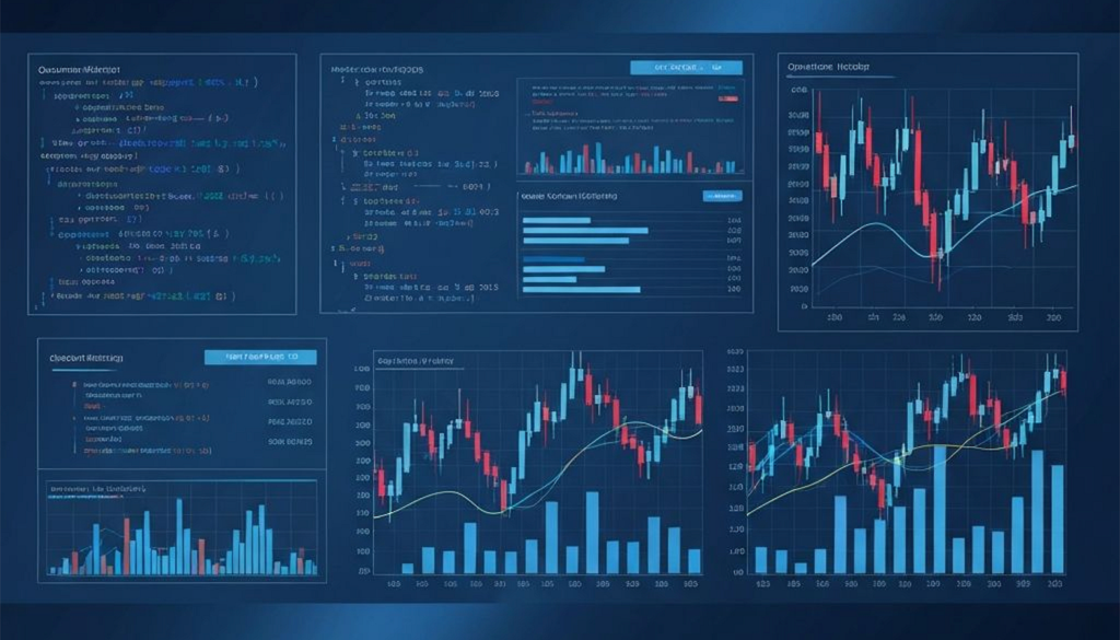
Each candle compresses four values across a fixed interval: open, high, low, close. The body spans open to close; the wicks mark the extremes reached and rejected within the period.
Wicks carry the underused signal. A long upper wick means price pushed higher and was sold back — sellers defended that level. A long lower wick means price fell and was bought back — buyers stepped in. When wicks repeatedly terminate at the same price across multiple candles, the market has tested and respected that level more than once, which is substantially more informative than a line drawn through closing prices.
Volume validates or invalidates everything
Price movement without corresponding volume is a weak signal. The relationships are consistent:
| Price | Volume | Reading |
| Rising | Rising | Broad participation supporting the advance |
| Rising | Falling | Conviction fading; fewer buyers at higher prices |
| Falling | Rising | Active distribution or forced liquidation |
| Falling | Falling | Drift rather than decisive selling; often exhaustion |
| Sharp move | Minimal | Thin liquidity — treat the price as unreliable |
That final row causes disproportionate losses. On a low-liquidity asset, a displayed price can rest on a handful of transactions and may not be obtainable in any size.
Indicators: what they are and what they are not
Technical indicators are transformations of price and volume data. They contain no information absent from the underlying data — they reformat it to make certain patterns easier to see.
- Moving averages smooth price into a trend line. They lag by construction; the smoother the average, the greater the lag.
- RSI measures the ratio of recent gains to recent losses on a 0–100 scale. “Overbought” above 70 does not mean a reversal is due — assets in strong trends remain overbought for extended periods.
- MACD measures the relationship between two moving averages, essentially tracking whether momentum is accelerating or decelerating.
- Bollinger Bands plot standard deviations around a moving average, expanding in volatile conditions and contracting in quiet ones.
The honest framing: indicators describe what has happened with more clarity than raw price. They do not predict. Anyone presenting them as predictive is selling something.
Part Three: Liquidity, Order Books and the Cost You Don’t See
This is the layer most retail participants never examine, and it determines real outcomes more than fee schedules do.
Market depth
An order book lists resting buy and sell orders at each price level. Depth describes how much volume sits within a given distance of the current price. A book with $3 million of bids within 1% of spot is deep; one with $30,000 is thin — regardless of what the 24-hour volume figure says.
Depth is what determines slippage: the difference between the price you expected and the price you received. Placing a market order larger than the resting liquidity at the best price consumes successively worse levels until filled. On a thin book, a moderate order can move the price several percent against itself.
Volume can be misleading; depth is harder to fake
Reported volume has historically been inflated on some venues through wash trading — trades executed between related accounts to create an appearance of activity. Depth is more robust as a signal because sustaining a deep book requires genuinely committed capital exposed to real risk.
A useful cross-check: compare an asset’s 24-hour volume to its market capitalisation. A very high ratio on a small-cap asset may indicate genuine activity — or artificial volume. Pair it with a look at actual book depth before concluding.
Maker, taker, and why the distinction exists
Maker orders add liquidity by resting on the book. Taker orders remove it by executing against resting orders immediately. Exchanges charge takers more, and often rebate makers, because resting liquidity is the product an exchange sells.
For anyone trading with any frequency, the practical implication is direct: limit orders that rest on the book cost less than market orders that cross the spread, in both fees and execution price. The saving compounds meaningfully over time.
Part Four: Evaluating Exchanges
Exchange selection determines execution quality, total cost, and whether assets remain accessible when conditions deteriorate. It deserves more scrutiny than it typically gets.
When comparing the best crypto exchanges 2026 offers, headline trading fees are the least informative data point available. Exchanges compete on that number publicly, which is precisely why it converges across venues and why the real differences sit elsewhere.
The criteria, in order of practical importance
- Liquidity on your specific pairs. Aggregate exchange volume is nearly irrelevant to you. What matters is book depth on the pairs you actually trade. Slippage on a thin book routinely exceeds the entire fee difference between venues, often by an order of magnitude.
- All-in cost. The visible maker/taker fee is one component of several:
| Cost Component | Typically Disclosed? | Notes |
| Trading fee | Yes, prominently | The number exchanges advertise |
| Spread crossed | No | Often the largest single cost on illiquid pairs |
| Slippage | No | Scales with order size relative to book depth |
| Withdrawal fee | Partially | Sometimes set well above actual network cost |
| Deposit / fiat rails | Partially | Varies substantially by payment method |
| Conversion fees | Frequently not | Applies when routing through intermediate pairs |
An exchange with a lower headline fee and a wide spread is more expensive than one charging more with tight execution.
- Regulatory standing. Which authority supervises the entity, which jurisdiction governs your contract, and what recourse exists if something fails. Irrelevant on ordinary days; the only thing that matters on the rare bad one.
- Custody, reserves and segregation. Whether proof-of-reserves attestations are published, how often, whether independently verified, and whether they cover liabilities as well as assets. An unaudited self-published snapshot of wallet balances is not equivalent to a verified attestation — a venue can display assets while owing more than it holds.
- Withdrawal reliability under stress. Every exchange processes withdrawals smoothly on a calm day. The meaningful question is behaviour during volatility spikes and heavy outflows, which is where queues, unexplained delays and sudden maintenance windows appear. Historical behaviour during past stress events is the best available evidence.
- Network and asset coverage. Whether the chains you use are supported for both deposit and withdrawal. An asset listed for trading is not always withdrawable to every network.
Centralised versus decentralised venues
| Dimension | Centralised Exchange | Decentralised Exchange |
| Custody | Exchange holds assets | You hold your own keys |
| Counterparty risk | Exchange solvency and conduct | Smart contract code risk |
| Liquidity | Typically deeper on major pairs | Varies; can be strong on newer assets |
| Access | Account, identity verification | Wallet connection |
| Cost structure | Trading fees, withdrawal fees | Network gas, pool fees, price impact |
| Recourse if something fails | Support, potentially regulator | Generally none |
| Order types | Full range including advanced | Limited, though improving |
Neither is categorically superior. The sensible approach for most people is matching venue to purpose: deep-liquidity centralised venues for size and fiat access, decentralised venues for newly listed or niche assets, and self-custody for anything held long term rather than actively traded.
Part Five: Momentum, Flow and Market Structure
Individual asset data tells you about an asset. Flow data tells you about the market it sits inside — and market-wide context usually matters more.
Reading a gainers board correctly
Scanning the biggest crypto gainers today is genuinely useful for one purpose: identifying where capital and attention are rotating. It is far less useful as a buy list, because it reports moves that have already occurred.
Three filters before any entry means anything:
Volume relative to market cap. The highest-signal filter available. A token up 180% on volume worth 2% of its market cap was moved by a handful of orders. A token up 20% on volume worth 40% of its market cap reflects broad participation. The second is a market event; the first is a price display.
Starting point. Percentage gains are measured from an arbitrary reference. An asset up 70% today after falling 75% over six weeks is retracing, not breaking out.
Identifiable cause. Listings, mainnet launches, index inclusions and major integrations produce explainable moves with some durability. An unexplained vertical move on an illiquid asset is a different category of event entirely.
Read the board as a pattern, not a list
The most valuable information is usually structural. When six or seven assets from the same sector cluster at the top, you are watching a narrative rotation — capital moving as a group, which tends to persist longer than an isolated spike. When the top entries are scattered micro caps sharing no theme, you are generally looking at noise.
Market-wide indicators worth tracking
- Total market capitalisation — the baseline context for everything else. An asset down 12% when the market is down 10% has barely underperformed.
- Bitcoin dominance — BTC’s share of total market cap. Rising dominance often indicates consolidation into Bitcoin during uncertainty; falling dominance frequently accompanies broader altcoin strength.
- Stablecoin market capitalisation — growing aggregate stablecoin supply indicates capital staged and available to deploy; contraction indicates capital leaving the ecosystem entirely.
- Open interest — total value of outstanding derivatives positions. Rising open interest alongside rising price indicates new leveraged longs; rising open interest with falling price indicates new shorts. High open interest raises the potential energy for liquidation cascades in either direction.
- Funding rates — periodic payments between perpetual futures longs and shorts. Persistently high positive funding means leveraged longs are crowded and paying to maintain position, a condition that historically precedes sharp unwinds.
Why crypto declines are often steeper than their causes
In leveraged markets, falling prices trigger forced liquidations, which generate market sell orders, which push prices lower, which trigger the next tier of liquidations. This reflexive cascade explains why a moderate piece of news can produce a violent move — and why sharp wicks frequently retrace within hours once forced selling exhausts. The move’s magnitude reflects positioning, not the significance of the news.
Part Six: A Structured Daily Routine
Comprehensive crypto market analysis does not require continuous screen time. Order matters more than duration.
- Market-wide context first. Total market cap and 24-hour change. Is today a market move or an asset move? This single step prevents the most common analytical error — attributing a broad decline to something specific about one holding.
- Bitcoin dominance and stablecoin supply. Where is capital positioned, and is it entering or leaving?
- Gainers, filtered by volume-to-market-cap ratio. Look for sector clustering, not individual entries.
- Losers, grouped by pattern. Sector-wide, market-wide, or isolated — each implies a different cause and response.
- Three timeframes on anything warranting attention. If the story changes between them, trust the longer view.
- Check upcoming supply events. Token unlock schedules are published in advance and frequently produce predictable sell pressure. Reviewing them before entering a position is among the highest-return five minutes in crypto research.
Common and Costly Errors
Treating percentage change as importance. Micro-cap percentages are mathematically inflated by small absolute movements. Weight every move by market-cap tier.
Comparing exchanges on headline fees. Spread and slippage typically dominate total cost. The advertised number is the smallest component for most traders.
Assuming displayed price equals executable price. On thin books these diverge substantially, particularly in size.
Anchoring to all-time highs. “Down 90% from ATH” describes history. Present market cap, supply schedule and current demand are the relevant inputs.
Ignoring the market-cap to FDV gap. A $50 million market cap against a $2 billion fully diluted valuation means roughly 97.5% of eventual supply has yet to reach the market — structural sell pressure independent of project quality.
Leaving long-term holdings on exchanges. Exchange custody is appropriate for active trading. For assets held over long horizons, it adds counterparty risk that earns nothing in return.
Frequently Asked Questions
How accurate are live crypto prices? They accurately record what has traded. They do not guarantee execution — on thin order books, achieved price can differ meaningfully from displayed price, particularly for larger orders.
Why do prices differ between exchanges? Each venue runs an independent order book with its own liquidity and participants. Arbitrage keeps major pairs aligned; gaps persist on illiquid assets, during extreme volatility, and where regional capital constraints apply.
What should I compare when choosing an exchange? Order-book depth on your specific pairs, all-in cost including spread and withdrawal fees, regulatory jurisdiction, proof-of-reserves practices and their verification quality, and documented withdrawal reliability during past stress events.
Are the biggest gainers worth buying? Not by default. The board reports completed moves. It is most useful for spotting sector rotation, and any individual entry needs filtering by volume relative to market cap and checking against longer timeframes.
What is slippage and how do I limit it? Slippage is the difference between expected and achieved execution price, caused by order size exceeding available liquidity at the best price. Limit orders, smaller order sizes, and trading on deeper books all reduce it.
Which chart timeframe should I use? The one matching your holding period, reviewed alongside at least two others. Reacting to short timeframes while holding long is among the most common and expensive mismatches in crypto.
What do funding rates indicate? They show which side of the perpetual futures market is paying to hold position. Persistently high positive funding indicates crowded leveraged longs — a condition historically associated with sharp unwinds.
Should I keep assets on an exchange? Exchange custody suits active trading. For long-term holdings, self-custody removes counterparty risk, at the cost of taking on full responsibility for key security.