While there are many businesses that operate without websites, global estimates show that approximately 70% of businesses have a website, and it is for good reason. After all, having a website lends your business credibility, improves your visibility to your target audience, enables you to serve your customers around the clock, and gives you the autonomy to shape the customer experience. Most importantly, it gives you a platform to nurture leads and convert them into sales.
But even with these perks, many businesses find that, despite having traffic to their site, they get few leads or sales. Why is that the case?
Let us look into why some websites have poor conversion rates.
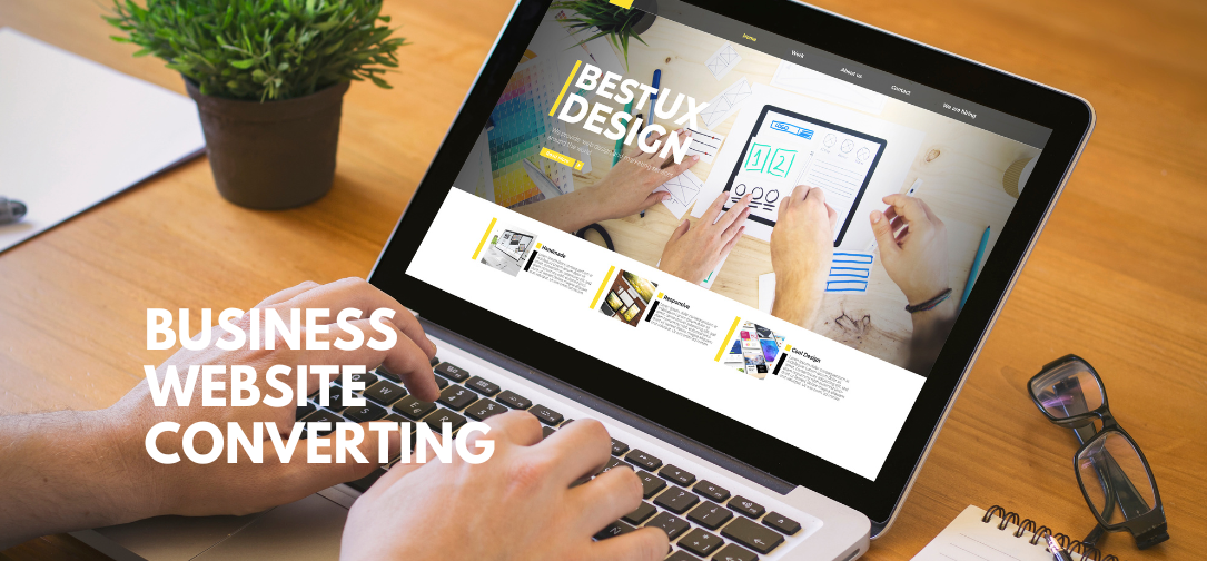
The 3 Reasons Most Websites Fail in Conversion
As a business owner, it can be quite disheartening to look at your site statistics and realise that people are clicking away instead of purchasing your products. But the truth is, if you are getting traffic, the issue is not that people dislike your products. Instead, it probably lies in the following issues:
Ambiguity
Have you ever noticed how direct the aviation industry is on its websites? Whether you are visiting an airline’s official website or an aviation service, you can immediately tell what they do and why.
Let us use Magnetic Group as an example, whose website is https://www.magneticgroup.co/. From the minute you click on that website, it is clear that this is an organisation centred on supporting aviation companies in their operations, doing so through various services, including repair and maintenance. You need not jump through hoops to figure out what they do and why.
But some websites are not that clear. Not only do many of them use jargon, but some just fail to include their value propositions on their homepages. As such, when visitors tour these sites, they are left wondering the following:
- What is on this site?
- Who is this site for?
- What am I supposed to do next?
Given that most visitors will spend only seconds on a homepage before deciding to leave or stay, you need to make the most of your value proposition. It should include what service you offer, who it helps, and how visitors can take the next step.
For example, instead of writing, ‘Revolutionary solutions for modern fitness,’ you can write something specific like ‘Home strength training kit for beginners. Grab yours today for $149.’
Friction
If you often find that many of your customers abandon their carts during checkout, you need to ask yourself, how many fields do your visitors have to fill out before they can purchase an item?
The truth is, we live in a fast-paced world where most people have become accustomed to instant checkout. That means if they have to fill out multiple fields to buy an item, they will likely give up and look for an alternative product on a different website with a simpler checkout process.
What does this mean for you? Unless you are required to request specific information from your customers to cover your bases, you should simplify the checkout forms. Even better, you can implement one-click payment options that speed up the payments.
Ineffective CTAs
Suppose a visitor is able and willing to purchase your product. Does the site guide them on how to do this? In some cases, you find that the call to action (CTA) is not clear enough. It could be that the link to the product is too far down on the page. It could also be that numerous buttons are competing for attention on the same page. In any of these scenarios, people are likely to give up on trying and just leave the page.
Luckily, you can solve this by making a visually appealing CTA that stands out on the page. To make it even more effective, use language that prompts visitors to act, such as “Book a strategy call” or “Get a free quote today.”