I’ve walked more food and beverage trade shows than I care to count. And every single time, Fancy Food Show, Natural Products Expo, SupplySide West, you name it, I see the same painful scene play out: a company that clearly spent serious money on product development standing behind a six-foot folding table with a branded tablecloth, some brochures fanned out like a poker hand, and a look on their face that says, ” Why isn’t anyone stopping?
Are you interested in Food and Beverage Shows here is the Full Calendar of US Edible Shows
Here’s the truth nobody tells you when you’re booking your first booth: the product isn’t enough. The buyers walking those aisles are overstimulated, undercaffeinated, and making split-second decisions about which booths deserve their attention. You’ve got, honestly, about four seconds to grab someone walking at full aisle speed. Four seconds. So let’s talk about how you actually design a food and beverage trade show booth that makes people stop, taste, engage, and eventually buy.
Start With the “One Thing” Rule in Food Shows
Before you think about booth size, graphics, or lighting, figure out your one thing. What’s the single message this booth needs to communicate the moment someone sees it from 30 feet away? Not three things. Not your full product line. One thing.
Maybe it’s a bold flavor claim. Maybe it’s your sustainability angle. Maybe it’s because your beverage has three ingredients, while everything else on the market has thirty. Whatever it is, that message needs to be large, clear, and visually dominant. Every other element in your booth, color, imagery, signage, even the way samples are laid out, should support that one idea.
I worked with a small hot sauce brand a few years back that kept trying to cram their entire backstory onto a 10×10 booth. Founder story, five SKUs, wholesale pricing, certifications, and a QR code leading to a YouTube video. Chaos. When they stripped it down to just “The World’s Most Honest Hot Sauce” in giant type over a clean red background, traffic doubled. That’s not a guess, they tracked it.
Design for the Senses in food & Beverage trade shows in U.S.
Food and beverage brands have an enormous advantage over almost every other trade show category: you can make people feel something through smell, taste, and texture. Most booths completely waste this.
Your booth design should be a sensory experience, not just a visual one. Think about how smell travels, if you’re sampling something with a strong, appealing aroma (fresh-baked, roasted, brewed), make sure your sampling station is near the front of the booth, not tucked in the back where the scent dissipates before it reaches the aisle.
Lighting matters more than most exhibitors think. Warm lighting makes food look appetizing. Harsh fluorescent or cool-toned LEDs? They make food look clinical, sometimes even unappetizing. Invest in warm LED strip lighting under shelving and directed spotlights on your hero products. It’s a relatively small cost with a big visual payoff.
Texture in your booth materials also signals quality. Raw wood, matte surfaces, linen backdrops, these communicate artisanal, premium, craft. Glossy plastic and shiny chrome say gas station. Match your materials to your brand positioning.
Your Food Trade Show Booth Layout is Story
A lot of food and beverage trade show exhibitors design their booths like performances, everything facing outward so people walking by can see. That’s fine for passive impressions, but it’s terrible for actually converting a curious passerby into a buyer conversation.
Think about how a great retail store works instead. You have a draw at the front (a sample, a demo, a bold visual). Then you have a natural flow that pulls people deeper. Somewhere near the back or side, there’s a spot for a real one-on-one conversation, away from the main traffic, where a buyer can ask questions without feeling rushed.
Open booths outperform closed ones almost universally. Remove as many barriers as possible between the aisle and your product. No tables blocking entry. No ropes. No “do not touch” energy. Make it feel like an invitation, not a checkpoint.
If your booth is 10×20 or larger, consider a dedicated “conversation zonein food and beverage trade show “, a couple of chairs, a small table, and maybe a monitor quietly showing brand content in the background. Buyers who are seriously interested need a place to land without feeling like they’re holding up traffic.
Booth Graphics That Actually Do Work
Booth graphics are probably the most over-complicated part of the whole process, and also the most commonly botched.
Here’s what buyers actually respond to: product photography that looks real, text they can read in three seconds, and a color palette that’s either ownable or clearly on-brand.
What they don’t respond to: lifestyle imagery that’s so abstract you can’t tell what the product is, tiny text listing nutritional specs, and every color in your product line crammed into one banner, trying to represent everything.
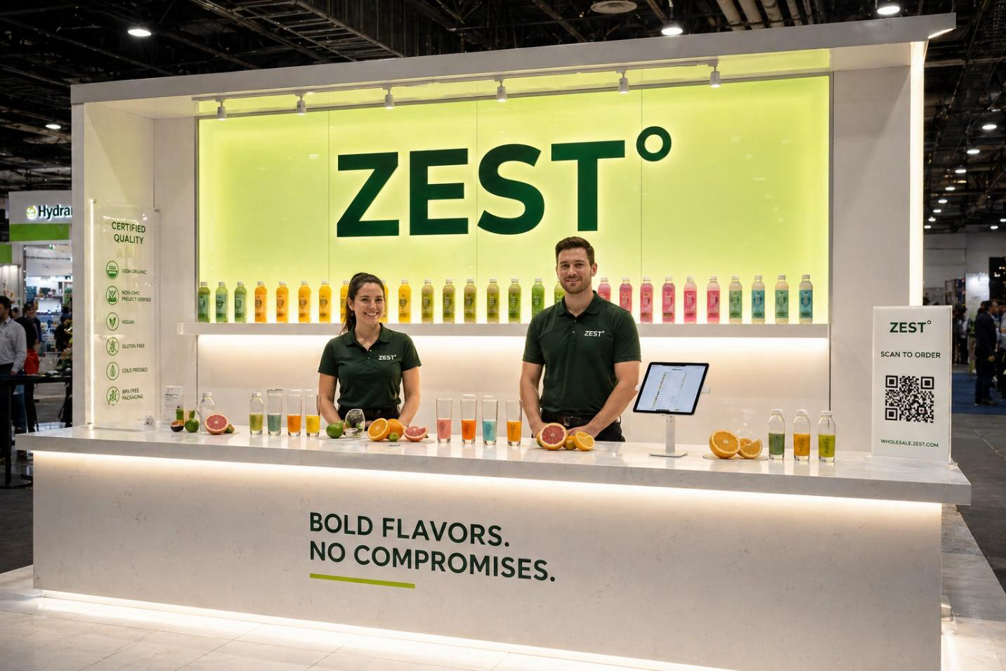
For food and beverage specifically, show the product in use. Not just the package. Show a glass of your drink with ice and condensation. Show the sauce on actual food. Show the moment of consumption, not just the SKU. People buy the experience before they buy the product.
Your company name and primary tagline should be legible from at least 20 feet away. Go print out your graphic and walk away from it. If you can’t read the headline from across a room, resize it. And please, work with a booth company that understands food industry aesthetics. A generic trade show vendor who primarily builds booths for software companies or industrial equipment will not intuitively understand that a kombucha brand shouldn’t look like a pharmaceutical display.
Sampling Strategy Is Part of Booth Design in food & Beverage exhibitions
You can’t talk about food and beverage booth design without discussing sampling, it’s not an afterthought; it’s a core design element. Where samples are positioned, how they’re presented, and how staff interact during sampling directly affect dwell time and conversion. Samples sitting unattended in a pile feel cheap. Samples that are actively handed to people by someone who immediately starts a conversation? That’s a completely different energy.
Design your sampling station to require engagement. Small cups were handed out one at a time, not grabbed from a tray. A question built into the handoff, “have you tried anything with monk fruit before?” or “do you typically work with natural flavoring brands?”, that instantly qualifies the buyer and starts a real conversation.
The physical setup matters too. Counter height, sight lines from the aisle, and refrigeration if needed. A warm beverage sample at a summer show, because your cooler wasn’t planned into the booth design, is a detail that kills the whole experience.
Technology Without the Gimmicks in your booth
Everyone wants to put an iPad in their booth. Half the time, it’s just showing a PDF of the sell sheet, which is also sitting in a stack on the counter. Use technology where it genuinely adds something. A product configuration screen that lets buyers customize an order, useful. A looping video that shows your manufacturing process or farm sourcing adds credibility. A QR code that goes to your full catalog with pricing, practical for buyers who want to do their homework later.
What doesn’t work: VR experiences nobody can figure out, touchscreens with broken apps, QR codes that go to a homepage with no clear buyer journey. If the tech doesn’t serve the buyer, pull it. remember renting the simple 10*10 Trade Show Booth may not be the smart option always!
One thing I’ve seen work really well lately, a simple digital lead-capture setup that emails the buyer a customized follow-up based on the products they indicated interest in right at the booth. It sounds complicated, but there are easy tools for this now. The follow-up email hits their inbox while they’re still at the show, before they’ve forgotten you? That’s timing that closes deals.
Staff Positioning and Training Is Trade Show Booth Design Too
Here’s a perspective shift that changed how I think about trade show booth design: your staff is a design element. Where they stand, how they engage, what they wear, how they’re trained to open conversations, all of it is part of the booth experience. Staff huddling at the back of the booth on their phones is a design failure just as much as a bad graphic is.
Train your team specifically on opening lines that don’t sound like a sales pitch. “Can I get you a sample?” is fine but weak. “We just launched in the Pacific Northwest, are you buying for that region?” is targeted and immediately signals that this conversation has potential for both parties.
Consider branded workwear that feels like an extension of the trade show booth aesthetic, not just a polo with a logo. A craft beverage brand whose staff is in denim aprons and hats looks cohesive and intentional. That signals brand investment, which signals buyer confidence.
Budget Smarter, Not Bigger
You don’t need a massive custom island booth to make an impact in food and beverage. Some of the most effective booths I’ve seen were 10×10 setups with one obsessively good hero graphic, smart lighting, a clean sampling station, and a team that knew how to work the room.
What kills ROI is spreading the budget across too many mediocre things. A decent booth with great staff beats a great booth with mediocre staff every time. A focused 10×10 with strong brand clarity beats an unfocused 20×20 every time.
Work with a local booth company if you can, especially for shows in major markets. They know the venue rules, the union labor requirements, and the advance warehouse deadlines. A local partner means fewer surprises and someone who can actually help if something goes sideways at 7am before the show opens.
Final Thoughts on food & Beverage trade shows design
Designing a food and beverage trade show booth that actually attracts buyers comes down to a few things that are honestly pretty unsexy: clarity, sensory experience, smart layout, and staff who know what they’re doing. No single gimmick replaces those fundamentals.
Start with your one message. Build a sensory experience around it. Design for the buyer’s journey, not your ego. And give your team the tools and training to convert curiosity into real conversations. The buyers are out there. They want to find great products. Make it easy for them to find yours.