BENTONVILLE, ARKANSAS
Digital Services Are Becoming More Intelligent – and More Essential
Retail, financial services, healthcare, education, logistics, government services and enterprise software increasingly depend on digital applications that must serve users quickly and reliably. At the same time, Generative AI is introducing new expectations for conversational and model-driven experiences. The intersection of these trends creates a broad engineering challenge: advanced capabilities must be integrated without sacrificing performance, accessibility, security or usability.
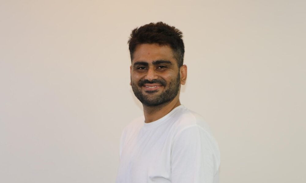
Sohail Sayed’s professional work sits within that intersection. A Senior Software Engineer with more than a decade of experience, he has worked across web interfaces, mobile applications, enterprise software, APIs, application performance and, more recently, Generative AI.
Large-Scale Engineering in Retail Technology
Since August 2024, Sayed has served as a Senior Software Engineer at Walmart in Bentonville, Arkansas, working on React.js and React Native experiences in a large-scale retail technology environment. His professional record associates his contributions with a 50 percent improvement in page-load performance and a 20 percent increase in conversion rates across high-traffic digital journeys.
The same record describes mobile-first engineering efforts associated with a 20 percent increase in mobile traffic, along with reusable component development, RESTful services, NPM tooling and more than 90 percent Jest/TDD test coverage. These practices demonstrate the type of software discipline required in platforms that support large numbers of users and important commercial activity.
Experience Across the Modern Application Stack
Before Walmart, Sayed worked at Instrument from December 2020 to February 2024, developing React.js and Next.js applications that included server-side rendering and SEO-focused experiences. His professional record reports an 80 percent improvement in web application performance through CDN utilization, asset optimization, lazy loading and rendering improvements.
Earlier, at Pro-tek Consulting, his work with React.js, Vue.js, Next.js, GraphQL, dashboards and data visualizations was associated with a 40 percent increase in user engagement and improved team productivity. At Saleem Trading EST, he also worked with JavaScript, Storybook, React, Redux, accessibility, Agile/Scrum and CI/CD practices.
Preparing Digital Platforms for AI Adoption
Sayed’s recent work has expanded into OpenAI API integrations, LLM-enabled web applications and conversational interfaces. He developed a ChatGPT-style application that combined the OpenAI API with REST services for authentication, authorization and related functionality.
This type of architecture is increasingly relevant as organizations embed AI into established systems. The model itself is only one part of the experience. Applications must still manage access, latency, state, responsiveness, testing and user interaction across devices. In that sense, the future of AI adoption depends heavily on the quality of the surrounding software engineering.
A Skill Set With Cross-Industry Relevance
The technical problems Sayed has worked on are not limited to one company or one industry. Performance optimization, mobile-first architecture, accessible interfaces, API integration, automated testing and AI-enabled user experiences are relevant anywhere digital systems support essential services or high-volume interactions.
Sayed holds a Master of Science in Computer Engineering from California State University, Fullerton, and a Bachelor of Engineering in Electronics and Telecommunication from the University of Mumbai. His career reflects a broader shift in the U.S. technology economy: as AI capabilities mature, the demand will increasingly be for engineers who can integrate them into reliable digital infrastructure that people and organizations can use at scale.