
Waterfall Chart Logic: Visualising the Cumulative Effect of Sequential Positives and Negatives

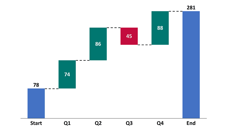
A lot of business reporting still relies on side-by-side bar charts that tell you what changed but not why it changed. That gap matters when teams need to explain performance quickly and credibly—especially in finance reviews, product scorecards, and operations meetings. The real value of a waterfall chart is its logic: it turns a start value into an end value through a sequence of increases and decreases, making the “bridge” auditable. If you are learning reporting fundamentals in a data analysis course in Pune, this is one visual you should understand deeply because it trains you to think in drivers, not snapshots.
1) The core logic: a bridge, not a decoration
A waterfall chart is built on one simple idea: every bar after the first is a change (positive or negative), and the chart keeps a running total as you move left to right. So the viewer sees three things at once:
- The starting point (baseline).
- The list of drivers (each step adds or subtracts).
- The ending point (final total).
This is why waterfall charts work best when your question is “What caused the gap?” rather than “What is the level?” You use them to explain variance between two states: budget vs actual, last quarter vs this quarter, opening balance vs closing balance, or planned vs delivered.
A practical rule: if your drivers don’t add up cleanly to the final number, your waterfall chart will expose the mismatch immediately. That “forced reconciliation” is not a limitation; it is the reason the visual is trusted in executive reviews.
2) Building blocks that make the chart logically correct
Most errors with waterfall charts come from sign logic and ordering. To keep the chart precise, follow these building blocks:
Start and end values must be totals. The first and last bars are not “changes”; they are full totals. Treat them differently from the middle bars.
Middle bars must be deltas (changes). Each middle bar is the difference caused by one driver: price increase, churn, refunds, hiring, shipping delays, rework, policy change—whatever applies.
Sign discipline matters more than colour. A driver is positive if it increases the running total and negative if it reduces it. That sounds obvious until you meet “discounts”, “returns”, “cost savings”, or “risk provisions”. For example, “cost savings” is positive for profit but negative for cost. Your sign must match the metric you’re bridging.
Order drivers in the way humans reason. The best waterfalls group drivers logically (volume → price → mix, or demand → supply → operations, or revenue → costs → one-offs). Random ordering may still sum correctly, but it reduces comprehension.
Use subtotals when the story has chapters. A subtotal bar after a group (for example, “Revenue drivers subtotal” and “Cost drivers subtotal”) helps the reader hold the narrative in memory.
A quick illustrative example (profit bridge):
- Start: ₹10.0M operating profit
- +₹1.2M higher volume
- −₹0.8M higher logistics cost
- −₹0.5M returns and refunds
- +₹0.6M vendor renegotiation savings
- End: ₹10.5M operating profit
Even with simple numbers, the logic is clear: each step explains a piece of the final outcome.
3) Where waterfall charts earn their place in real work
Waterfall charts are not “finance-only”. They are driver charts, and driver thinking applies everywhere. Common high-value uses include:
Budget vs actual variance (monthly or quarterly). You can show whether the gap came from demand, pricing, utilisation, marketing efficiency, or cost inflation.
Revenue bridge. A subscription business can break revenue change into new sales, churn, upsell, downsell, and price revisions. A services business can bridge it via billable hours, billing rate, utilisation, and write-offs.
Cash flow reconciliation. Opening cash → operating cash movements → investing → financing → closing cash. The forced-add-up property is perfect here.
Operational throughput and delay analysis. Start with planned output, then subtract downtime, quality failures, staffing gaps, and supply shortages, and add recoveries like overtime or process fixes.
In many Pune-based organisations—manufacturing units, IT services teams, and fast-moving retail ops—the hardest part is not collecting data, but aligning stakeholders on what the “drivers” truly are. A well-built waterfall chart becomes a shared language. It is also why learners in a data analysis course in Pune often find waterfall exercises useful: they turn vague explanations into measurable components.
4) Common mistakes—and a simple audit checklist
Here are the mistakes that make waterfall charts misleading, plus how to prevent them:
Mistake: mixing levels and changes.
Fix: only first and last bars are totals; everything else is a change.
Mistake: double counting a driver.
Fix: define drivers so each transaction belongs to exactly one bucket.
Mistake: hiding the “other” bucket.
Fix: if minor items exist, group them into “Other (net)” so totals still reconcile.
Mistake: confusing direction of goodness with direction of change.
Fix: the chart shows arithmetic direction (up/down), not whether it is “good/bad”. Write labels that reflect meaning (e.g., “Cost increase” instead of “Costs”).
Audit checklist (fast and reliable):
- Do the deltas sum to (End − Start)?
- Are signs correct for the metric (profit vs cost vs revenue)?
- Are drivers ordered logically for interpretation?
- Are major drivers separated and minor drivers grouped sensibly?
- Can a stakeholder explain the story in 30 seconds without extra context?
If you can tick these off, your waterfall chart is not just visually neat—it is logically defensible.
Conclusion
A waterfall chart is a discipline disguised as a graphic: it forces clean definitions, consistent signs, and driver-based thinking. When used well, it reduces debate, shortens review meetings, and makes performance explanations auditable rather than opinion-driven. If you are building reporting skills through a data analyst course, treat waterfall charts as more than a “nice visual”—they are a practical method for reconciling numbers and communicating the real causes behind change.
Business name: ExcelR – Data Science, Data Analytics Course Training in Pune
Address: 101 A ,1st Floor, Siddh Icon, Baner Rd, opposite Lane To Royal Enfield Showroom, beside Asian Box Restaurant, Baner, Pune, Maharashtra 411069
Phone: 098809 13504







Comment