Financial data visualization sounds like a tooling decision and behaves like a communication discipline. The choice of charts, the design of dashboards, and the editorial decisions about what to highlight and what to omit determine whether the audience walks away with the right understanding or with confidently wrong impressions. The U.S. financial institutions that produce visualizations the leadership trusts have built specific disciplines around the work. The institutions whose visualizations get second-guessed in every meeting usually have not.
This piece looks at where financial data visualization in U.S. finance has settled in 2026, the design disciplines that distinguish trustworthy visualizations from misleading ones, the supervisory considerations that increasingly shape regulated reporting, and the operational realities that determine whether a visualization gets used or ignored.
Chart selection as a substantive decision
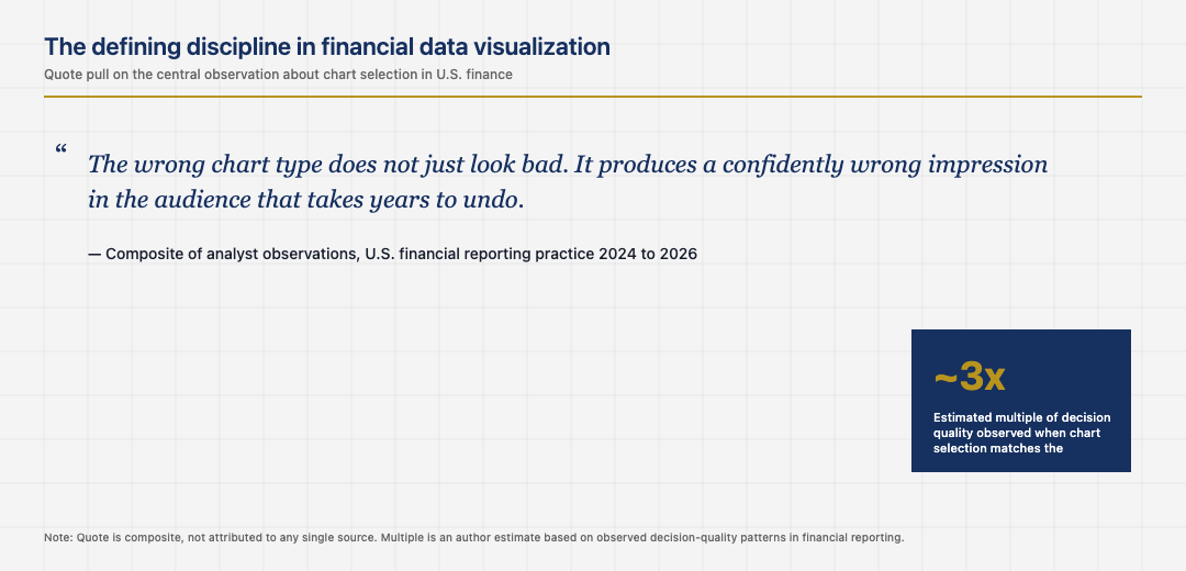
Chart selection is the most consequential design decision in financial data visualization, and it is consistently underestimated. The wrong chart type can hide variance, exaggerate trends, or obscure the comparison the audience actually needs. The mature pattern is selecting chart types based on the comparison the audience needs to make, not based on what looks impressive.
Time-series data benefits from line charts. Composition benefits from stacked bars or treemaps depending on hierarchy. Two-dimensional positioning benefits from scatter plots. Distributions benefit from histograms or violin plots. The institutions that respect these matches produce visualizations the audience reads correctly. The institutions that default to dashboards full of pie charts and three-dimensional column charts usually produce visualizations the audience misreads, often without realising it.
Annotation and the editorial responsibility
The chart is half the work. The annotations are the other half. A well-annotated chart tells the audience what to notice, what context applies, and what the analyst’s interpretation is. A chart without annotations leaves all of that work to the audience, who often does not have the time or the context to do it. The mature pattern is treating annotations as a primary deliverable, not as decoration added at the end.
The institutions that invested in annotation discipline produce visualizations decision-makers can act on. The institutions that left interpretation to the audience usually find that decision-makers either ignore the visualization or read it in ways the analyst did not intend. The cost of strong annotations is small. The benefit, in the rate at which decisions actually flow from the analysis, is large.
Color, accessibility, and the audience question
Color in financial data visualization is a substantive concern, not an aesthetic one. Color blindness affects roughly one in twelve men, which is enough that visualizations that depend on color discrimination will be misread by a meaningful share of any large audience. The mature pattern is using color sparingly, with redundant encoding through shape or texture for any distinction the audience needs to make.
The institutions that built accessibility into their visualization standards produce charts that the entire audience can read. The institutions that did not have a small share of audience members who consistently misread the visualizations, often without complaining about it. The discipline of accessibility-first design is unglamorous and has a quiet payoff in audience reach. The supervisory environment is also gradually moving toward accessibility expectations for regulated disclosure, which adds a regulatory reason to discipline that already had editorial reasons. Operating teams who internalise the discipline catch errors earlier in the production cycle, which compounds across every visualization the team ships.
Dashboards and the operational use case
Operational dashboards in U.S. finance are a specific use case with specific design requirements. They need to be readable at a glance, surface the most important metrics first, hide the rest behind drill-downs, and refresh on a cadence that matches the operational need. The mature pattern is treating dashboards as decision-support tools designed around specific operational workflows, not as data exploration interfaces designed for analysts.
The institutions that designed dashboards around specific operational workflows have dashboards that operators use. The institutions that built data exploration interfaces and called them dashboards usually have surfaces that analysts use occasionally and that operators ignore. The cost of designing for the actual use case is the cost of understanding the workflow first. The benefit is dashboards that drive operational behaviour, which is the entire reason for building them.
The next phase of financial data visualization
The next phase is shaped by the integration of natural language interfaces over visualization tools, the increasing use of AI to suggest chart types and annotations, and the supervisory environment around accessible regulated disclosure. The institutions that built strong visualization disciplines in the previous phase will absorb these changes cleanly. The institutions that did not will continue to produce dashboards and reports that do not drive the decisions they were intended to drive.
Read across the full picture, financial data visualization in U.S. finance in 2026 is a mature discipline with specific patterns: chart selection as substantive choice, annotations as primary deliverable, accessibility as both editorial and regulatory concern, and dashboards designed around workflows. The institutions that respect them produce visualizations decision-makers trust. The institutions that miss any one usually produce visualizations that get second-guessed in every meeting.
Looking back across the full sweep makes one final point clear. The American financial system has accumulated its strength through the patient layering of standards, institutions, and supervisory expectations on top of an active commercial layer. The application layer captures attention because it is visible and fast-moving. The institutional layer captures durability because it is invisible and slow-moving. Operators who learn to read both layers at once tend to outlast operators who only read the visible one, and the discipline of doing so is not glamorous but it is the discipline that consistently shows up in the firms that compound through multiple cycles instead of just the one they happened to start in.
The same lesson shows up in the founders who quietly build through down cycles that catch the louder ones flat-footed. Reading the institutional rebuild as carefully as the product roadmap is what separates the long-lived operators in 2026 from the ones whose names appear only in retrospectives. The competitive position of the next decade will turn less on the surface features that draw press attention and more on the structural features that draw supervisory attention. The two are increasingly the same set of features, and the operators who recognise that early are the ones who position correctly while the rest are still arguing about whether the rules apply to them.
One last consideration is worth carrying forward. Cross-cycle perspective sharpens any single decision. Looking at how peer ecosystems have handled the same question, what they got right and where they stumbled, almost always reveals something about the decisions that the U.S. system is in the middle of making right now. The operators who travel intellectually as well as commercially tend to make better forecasts about which infrastructure layer will matter most in the next phase, and which segment is being quietly reset under the noise of the daily news. The disciplined version of that practice is what the next ten years of American FinTech will reward most consistently.