Somewhere between the first sale and the first real launch, every business hits the same small moment. You need a version of your logo that looks like an object — for a product shot, a title card, a piece of packaging, a launch post. So you open a tool and type your company name into it.
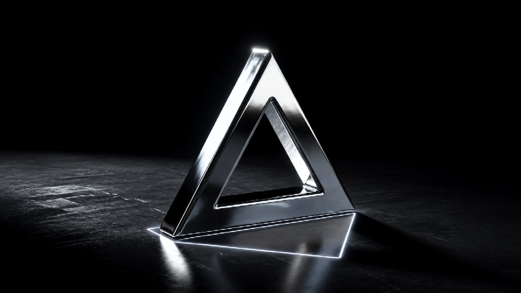
A polished mark with the outline it was rendered from still glowing beneath it. The shape that went in is the shape that came out.
And the tool gives you a logo. A nice one. Slightly different from yours.
That difference is the most expensive thing in this article.
This is general guidance about a design decision, not legal advice. For anything involving a registered mark, talk to a trademark attorney.
What is the actual choice here?
There are two ways to get a three-dimensional version of a logo, and they are not variations on one method. They are opposites.
You can render the mark you already have. Your existing artwork is taken as-is, given depth and a surface, and lit. The outline that goes in is the outline that comes out. Nothing about the shape is invented.
Or you can generate a new mark. You describe what you want, and software produces something plausible for that description. Plausible is the operative word: it will be a logo, and it will be like yours, and it will not be yours.
For a business with no logo yet, generating is a legitimate starting point. For a business that already has one — printed on something, filed somewhere, recognised by somebody — it quietly replaces an asset with a lookalike.
Why does an approximate logo cost you anything?
Because the value of a logo is not that it looks good. It is that it is always the same.
Three specific problems follow from that, and they compound.
Similarity to somebody else’s mark. Tools that generate designs by pattern-matching across everything they have seen can return something that resembles a mark already in use. Trademark practitioners have been flagging this consistently. If you adopt a design that turns out to be confusingly similar to a registered mark, the assessment is made on what you actually used, not on what you intended to create.
Ownership of the artwork itself. Where the final design is purely a machine output, claiming copyright in it is difficult, and the usual professional advice is to keep a clear record of human authorship. When you render a mark you already own, that question never arises: the authorship sits in the original artwork, which is already yours.
Drift. This is the one that gets underestimated, and it is the one that will actually happen to you. A generated logo is not anchored to a fixed source, so running the same request again in six months returns something close rather than something identical. Now you have two logos. Then three. A brand identity is only an identity because it repeats, and a mark that varies slightly across every use is weaker evidence that it is yours, harder to defend, and quietly less recognisable to the people you spent money reaching.
So when is generative software the right tool?
When you are making an object, not reproducing a mark.
This is not an argument that the technology is bad. It is an argument about which job it is for, and the split is clean.
| What you need | How to get it |
| A 3D version of the logo you already own | Render your existing artwork — the outline is preserved exactly |
| A brand new mark, from nothing | Design work, with a person making the decisions |
| A product, prop, or scene object | Generate it — plausible is exactly what you want |
| A packaging mockup with your logo on it | Generate the package, render the logo, combine the two |
The middle two rows are where generative tools genuinely shine. The first row is where they cost you something, and it is also the row most businesses are actually standing in when they open one.
What should you keep on file?
Enough to prove the 3D version is your mark, rendered — and enough to make the same one again in two years when the person who made it has left.
Three things cover it. The original artwork, in vector form, as the single source everything descends from. The settings that produced the render — depth, edge, finish, angle — written down somewhere a colleague can read, because a render you cannot reproduce is a one-off illustration rather than a brand asset. And the terms of whatever tool you used, specifically whether it claims any rights over what you upload or what comes out. That last one is worth reading before you upload a mark that has not been announced yet. The better tools publish a plain-language page on who owns a logo made in them rather than leaving you to parse the terms of service.
Where should the 3D version not go?
Onto your trademark record, and onto anything that flattens it.
A registration wants an unambiguous mark. A render adds highlight, depth and surface that are not part of what you are claiming, and a registrar may read them as if they were. Keep the flat original as the registered mark and treat the dimensional version as one more approved expression of it — the same way you treat a one-colour version or a reversed version.
The same logic covers everything that physically cannot carry a rendered surface: embroidery, engraving, single-colour print and favicons. In each case the flat original is the deliverable, and the beautiful 3D file is the wrong one to send.
The question worth asking any tool
Does it change my outline?
That is it. That is the whole test, and it has a right answer.
If a tool cannot tell you plainly that the shape you gave it is the shape it returns, you are not making a three-dimensional version of your logo. You are making a different logo that resembles it. Which might be fine — if you know that is what you are doing, and if the mark is not yet registered, printed, or recognised by anyone.
It is not fine as a surprise, discovered when the packaging arrives.