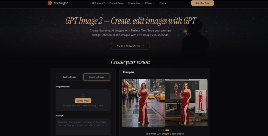
Walk down any main street and you will see them: the café with a hand-scrawled sidewalk sign that nobody can read from a car, the bakery whose Instagram looks like a different brand every week, the hardware store whose printed flyer was clearly made in a word processor by someone who is not a designer because the owner is also the accountant, the stock manager, and the weekend cashier. Local businesses have always faced a visual problem that big brands solve with in-house creative teams and monthly retainers. Every dollar spent on design is a dollar not spent on inventory, equipment, or staff. The promise of AI image generation for these owners has been obvious for years — type what you want, get a usable visual — but the reality until recently was that the output rarely survived contact with a real commercial need. The text on the menu would scramble. The logo would morph. The promotional banner would look like it came from an alternate universe where English is only approximately spelled. That changed when a new generation of autoregressive image models appeared, and gpt image 2 is a third-party platform that wraps one such model into a browser tab. I tested it as if I were running a small business, generating the kind of visuals a real owner would need to put in front of paying customers this week.
Why the Old Tools Failed the Storefront Test
Most AI image generators before this generation were trained to win photography awards, not to print a legible price tag. They excelled at lighting and texture but treated text as decoration rather than information. For a small business, that is backwards. A café poster that looks like a Renaissance painting but misspells “cappuccino” damages credibility more than a plain text flyer ever would. The shift in this platform comes down to an autoregressive approach that treats the image — text included — as a sequence of tokens where each part knows about everything that came before. In practical terms, the words you ask for are the words you get, and the layout respects the logic of real-world commercial design conventions rather than assembling fragments that merely look design-adjacent. For a business owner who cannot afford two rounds of revision with a freelance designer, this is the difference between usable and unusable.
The Business Owner’s Three-Step Routine
The interface presents exactly what a time-pressed owner needs: no tutorials, no jargon, no features that require reading a manual. It is a prompt field, a few output settings, and a generate button. Making it fit into a real business day means knowing how to phrase what you need quickly.
Step 1 — Describe the Asset with Its Real-World Job
Instead of listing abstract visual qualities, the most effective prompts in my testing described the asset’s intended use and format first. “A printed A5 flyer for a weekend plant sale” gave the model enough context to produce correct proportions, appropriate text hierarchy, and a layout that looked like a flyer rather than a generic image with words pasted on. The platform invites specific description of composition, colors, and text, and the model rewards that specificity.
Lead with the Format, Then the Content
For every business asset I generated across three storefront scenarios, prompts that opened with physical format and placement — “a chalkboard-style sidewalk sign,” “a printed trifold brochure,” “an Instagram Story graphic for a flash sale” — outperformed those that described only the subject matter. The model appears to draw on a strong internal library of format conventions, so giving it the container first allows it to fill that container logically.
Step 2 — Choose Settings That Match the Final Output Medium
The platform offers resolution options up to 4K and output formats of PNG, JPEG, and WebP, along with a transparent background toggle for PNG exports. The choices here are straightforward, but they have practical consequences for a business. A 4000-pixel image is useful for a large print banner. A 1024-pixel square is fine for social media. Selecting the right one avoids unnecessarily long generation times and file sizes that clog a shared inbox.
Transparent Backgrounds Save a Step
One small feature with outsized practical value is the transparent PNG option. When I generated a logo variant for a fictional bakery, exporting it with a transparent background meant I could drop it onto any colored menu, bag, or receipt header without cutting it out manually. For an owner who does not have photo-editing software, this eliminates a major friction point.
Step 3 — Refine Without Rebuilding
The platform supports conversational editing after the first generation. If the flyer’s headline needs to be larger, the date needs to be changed, or an unwanted decorative element appeared, you simply describe the change in plain English. The model re-renders the image with the adjustment while preserving the rest of the composition. This is not an instant process, but it is far faster than starting over.
Making Edits During a Busy Shift
I simulated the kind of quick edit a busy owner might need — changing a sale percentage from “20% off” to “30% off” on an existing promotional graphic. The edit executed correctly in one instruction. In a more complex change where I asked to replace a background color and resize text simultaneously, the output required a second clarification to get the text weight exactly right. Planning for one or two conversational rounds per revision is realistic, but that is still a matter of minutes rather than the hours or days of a typical design revision cycle.
Three Storefront Assignments with Real Commercial Stakes
To test the platform as a business tool rather than a creative toy, I tackled three assets that a local owner might genuinely need in a given week. Each is evaluated on its readiness to be printed, posted, or published.
A Printed Café Menu — One Page, Multiple Text Elements
The test asked for a single-page printed menu for a fictional coffee shop, with a header reading “Morning Menu,” five drink items with short descriptions and prices, and a small footer with opening hours. Printed menus have been a nightmare for AI tools because the text density invites errors, and a single mangled price can confuse a customer. The output delivered exactly the requested structure: header text large and clean in a serif typeface, five items listed vertically with consistent alignment, each price legible, and the footer hours correctly rendered. Across five generations of the same prompt, four were error-free. The fifth transposed two digits in the opening hours — a small error, but exactly the kind a business cannot afford.
What This Means for the Owner
For a printed menu that will be typeset once and used for months, a single error in five generations is acceptable because you can generate a few versions and pick a clean one. The time saved versus manually typesetting a menu in Canva or Word is substantial. However, the existence of any error at all means a business owner should budget five minutes to proofread every text element before sending a file to the printer.
A Sidewalk Sign — Outdoor Visibility at a Glance
The prompt described a chalkboard-style A-frame sidewalk sign with large text reading “Fresh Pastries Inside,” a smaller line with “Open Until 3PM,” and a simple illustrated croissant. The challenge was outdoor legibility — the text needed to be bold enough to read from a passing car and composed in a way that feels handmade without looking amateurish. The model produced a dark chalkboard background with white chalk-like lettering, the headline large and centered, the croissant illustration simple and recognizable, and the “Open Until 3PM” line in a slightly smaller but still bold weight. The lettering had the slight irregularity of real chalk, which added to the handmade feel without compromising readability. No errors occurred across three generations.
The Handmade Illusion Holds
The model’s ability to produce stylized text — not just clean digital fonts but approximations of chalk, paint, or marker lettering — was a pleasant surprise. Previous tools struggled with stylized text, often blurring the line between stylistic irregularity and actual illegibility. The output here would be usable as printed signage without further editing.
A Social Media Promotion — Flash Sale Graphic with Urgency
The final test simulated a weekend flash sale promotion for a local boutique. The required elements were a 1080×1080 Instagram graphic with the text “Weekend Flash Sale — 30% Off Everything,” a sub-line with “Saturday & Sunday Only,” the store’s handle, and a background that felt warm and inviting rather than aggressive. The output placed the main headline prominently in a rounded sans-serif, the sale percentage in a contrasting accent color, the sub-line in a readable smaller size, and the handle at the bottom edge. The background gradient was warm coral to cream, which suited a boutique context. The text was fully accurate across three generations, and the visual hierarchy correctly guided the eye from the sale hook to the date constraint to the brand handle.
Social Media Speed Without a Social Media Manager
For a business owner who wants to post a sale announcement at 9 PM on a Friday and does not have a content calendar or a designer on retainer, being able to generate this graphic in minutes and post it immediately is a tangible operational change. The quality is not that of a polished agency campaign, but it clears the bar for a local business feed and does so without the visual errors that signal “cheap AI” to a scrolling customer.
What the Platform Changes for Local Business Visuals
The table below compares what a small business owner could historically expect from AI image tools with what this platform delivers in practice, based on my own commercial-task testing.
| Commercial Visual Need | This Platform’s Practical Delivery | Previous Generation AI Tools |
| Printed Menu with Prices | Accurately rendered multi-item lists; occasional digit transposition requires proofreading | Text was frequently garbled; menu creation required external layout software |
| Outdoor Signage with Stylized Lettering | Legible chalk, paint, or marker-style text with aesthetic consistency | Stylized text often blurred or lost legibility; digital-only fonts dominated outputs |
| Social Promo with Urgency Copy | Correct spelling, logical hierarchy, and format-appropriate composition | Text errors undermined credibility; manual correction was almost always needed |
| Iterative Editing During a Workday | Natural-language corrections without software; one to two rounds typically suffices | Changes required re-prompting or exporting to a separate tool |
| Transparent Asset Export | Ready-to-layer PNGs for logos and reusable brand elements | Inconsistent support; often required third-party background removal |
Where the Business Owner Should Stay Cautious
Using this tool to produce customer-facing visuals comes with responsibilities that no AI platform can fully shoulder.
First, the model produces its best work when given specific, structured prompts. A vague request like “a nice poster for my bakery” yields a visually pleasant but generic result that could belong to any bakery. The differentiation — the thing that makes your business recognizable — requires you to describe your brand elements explicitly. This is not a flaw but a reality: the tool executes instructions, it does not embody your brand identity by itself.
Second, text accuracy is high but not perfect. The error rate I observed was perhaps one in twenty complex text strings, which is dramatically better than the near-certain failure of earlier tools but still demands a final human check. A printed menu with a wrong price or a misspelled item name can erode customer trust quickly.
Third, the platform is a third-party interface and does not represent an official product from the model provider. Its privacy policy states it does not permanently store user images and deletes uploads within one hour, but these claims are not independently verified. For a business handling customer data or pre-launch promotional material, evaluate this accordingly.
Who Should Bookmark This Tool This Week
The owner-operator who wears every hat, the small franchisor who needs to supply local outlets with customizable assets, the market-stall vendor who wants to post today’s specials before the morning rush — these are the profiles for whom this tool is not a novelty but a genuine operating expense reduction. The value is not in replacing professional design for flagship campaigns. It is in filling the vast gap between those rare big-budget moments and the daily need to show up visually in a world where customers scroll past anything that does not look intentional.
The gpt image 2 platform, tested through the lens of a main-street business rather than a tech-savvy creative, held up where it needed to: the text read correctly, the layouts looked appropriate for their commercial context, and the editing process was fast enough to fit into a working day. For the local business owner who has been waiting for AI images to stop looking like AI images, the wait appears to be over. What remains is the same thing that has always separated memorable storefronts from forgettable ones — the human decision about what to say and how to say it.