
How to Create Social Media Graphics Without Photoshop: A Practical Guide

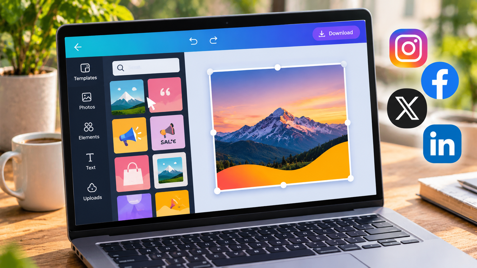
You don’t need expensive software or a design degree to make graphics that stop the scroll. Most of what small businesses, creators and marketers post, like announcements, quotes, product photos, event flyers and carousel tips, can be made in a few minutes in a web browser. Professional tools like Photoshop are powerful, but most everyday social content only needs a fraction of what they can do.
This guide walks you through a simple, repeatable process for making social media graphics that look polished and consistent, whatever your design experience.
Why good graphics matter
Social feeds are crowded. People scroll quickly and decide in under a second whether to stop. A clear, well-designed image gives your post a chance to be noticed, and a consistent visual style helps people recognize your brand before they read your name. The good news is that “well-designed” mostly comes from a few simple habits, not artistic talent.
Step 1: Start with the right size
Every platform crops and displays images differently, so the first decision is always the canvas size. Common dimensions include:
- Instagram post: 1080 × 1080 px (square) or 1080 × 1350 px (portrait)
- Instagram and Facebook Stories, Reels covers, TikTok: 1080 × 1920 px
- Facebook and LinkedIn link images: about 1200 × 630 px
- YouTube thumbnail: 1280 × 720 px
- Pinterest pin: 1000 × 1500 px
Set the size before you add anything, so you don’t have to crop your design awkwardly later. Most browser-based editors include presets for these formats. For example, Fotocaja, a free online photo editor, lets you pick a social media size and start designing right away, with nothing to download or install.
Also keep a “safe zone” in mind. On Stories, for example, the top and bottom of the screen are covered by profile icons and reply boxes, so keep important text toward the center.
Step 2: Use a template as a starting point
A blank canvas can be intimidating, and starting from scratch every time is slow. Templates give you a layout that already works, with balanced spacing, readable fonts and a clear visual hierarchy. You just swap in your own photos and words.
The trick is to customize templates enough to make them yours. Change the colors to match your brand, replace the fonts with your own, and adjust the layout slightly. After a few edits, nobody will know you started from a template.
Step 3: Keep text short and readable
People see a social graphic for a second or two, so treat the text like a billboard, not a brochure. A good rule is one headline plus at most one supporting line. Put the details in the caption.
A few typography tips:
- Use no more than two fonts: one for headlines, one for supporting text.
- Make the headline big. If it’s hard to read on a phone screen, it’s too small.
- Make sure text stands out from the background. Light text on a dark background, or the reverse, works best.
- Place a semi-transparent shape behind text when it sits on top of a busy photo.
- Avoid long blocks of capital letters, which are harder to read than mixed case.
Step 4: Edit photos lightly
Photos are often the heart of a social graphic, and small adjustments go a long way. Crop to focus on the subject, raise the brightness slightly if the image looks dull, and add a little contrast and saturation to make colors pop.
Resist heavy filters. They date quickly, and for product photos they can make items look different from reality, which leads to disappointed customers. Consistency matters more than drama. If you apply the same few adjustments to every image, your feed will look unified even when the photos come from different sources.
Step 5: Build a simple brand kit
Consistency is what makes a brand recognizable. Before you design a batch of posts, decide on:
- Two or three brand colors, plus one neutral color for backgrounds
- One or two fonts
- Your logo, in a version that works on both light and dark backgrounds
Many online editors let you save these in a brand kit so they’re always one click away. Using the same colors and fonts on every post saves time and helps people recognize your content before they read the caption.
Step 6: Use layout and white space
Beginners often fill every corner of the canvas. Empty space, often called white space, is what makes a design feel calm and professional. It guides the eye to what matters.
Decide what the single most important element is, whether that’s a product, a headline or a face, and make it the biggest and most prominent thing on the canvas. Align elements with each other rather than placing them randomly. Most editors show alignment guides as you drag objects, which makes this easy.
Step 7: Think in series
Carousel posts and multi-slide content often get more engagement than single images, because each swipe keeps people on your post longer. They work well for tips, step-by-step guides, before-and-after comparisons and product collections.
Design all the slides in one multi-page document so fonts, margins and colors stay identical from slide to slide. The same approach works for printed materials like restaurant menus, event programs and simple presentations.
Step 8: Export in the right format
The right file format keeps your graphic sharp and loading quickly:
- PNG for graphics with text, logos and flat colors, because it keeps edges crisp.
- JPEG for photo-heavy images, because the files are smaller.
- WebP for images on your own website, because it gives good quality at small file sizes.
- PDF for anything printed or anything with several pages.
Common mistakes to avoid
- Too much text: if the graphic needs a paragraph, it belongs in the caption.
- Low-resolution images: small or blurry photos look unprofessional when enlarged.
- Inconsistent styles: switching fonts and colors every post weakens your brand.
- Ignoring mobile: most people will see your post on a phone, so always check your design at phone size before posting.
- Forgetting the safe zone: text near the edges of Stories often gets covered.
Save time by batching
The most efficient creators don’t design one post at a time. Set aside an hour or two each week, pick your templates, and create all the week’s graphics in one session. Once you have a brand kit and a few go-to layouts, each new post becomes a quick swap of photos and text.
Final thoughts
Good social media graphics come from a few simple habits: the right size, short and readable text, light photo edits, a consistent brand kit and enough white space. You don’t need Photoshop or years of training. With a template, a browser-based editor and a little planning, you can produce a week’s worth of polished posts in an afternoon. Start with one format, build your style, and let consistency do the rest.







Comment