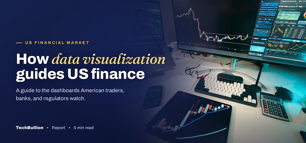
A trading floor at dawn is a wall of color, not a wall of numbers. Red and green tiles, sloping lines, and glowing dials tell a manager in one glance what a spreadsheet would take an hour to reveal. That translation from raw data into something the eye can read instantly is what financial data visualization does, and it has become standard equipment across the US financial market. The data visualization tools market was valued at USD 9.22 billion in 2022 and is projected to reach USD 22.12 billion by 2030, growing at an 11.4% annual rate, according to Grand View Research.
What financial data visualization means
Financial data visualization is the practice of turning numbers into charts, dashboards, and maps so people can understand them faster. A balance sheet becomes a waterfall chart. A portfolio becomes a treemap. A year of returns becomes a single line. The goal is not decoration but comprehension, because a well chosen chart can reveal a trend that a table of figures hides.
The discipline sits at the meeting point of data, design, and finance. It takes the output of the models and databases that run a firm and presents it in a form a human can act on. Done well, it shortens the path from data to decision. Done poorly, it misleads, which is why the craft matters as much as the tools.
Color and shape carry meaning that numbers alone do not. The human eye spots a broken pattern in a chart far faster than it spots an odd value in a column, which is why a single well drawn line can do the work of a page of figures. Visualization leans on that wiring, using position, length, and color to let a viewer compare quantities at a glance instead of reading them one by one.
How the technology works
A modern visualization tool connects to live data, applies a chart type, and updates as the numbers change. Behind a dashboard sits a pipeline that pulls from databases, cleans the data, and pushes it to the screen, often in close to real time. The shift in recent years has been from static reports, printed once a quarter, to live dashboards that anyone can open on a laptop or phone.
The newest layer adds intelligence. Tools now suggest the best chart for a dataset, write a plain language summary of what changed, and let a user ask a question in words rather than build a query. That capability rides the same wave of agentic AI tools entering the finance industry, and it draws on the big data foundations described in this profile of a next generation voice in financial big data analytics.
Interactivity is what separated the modern era from the printed chart. A static report shows one view, but a live dashboard lets a user filter by region, zoom into a quarter, or hover for the exact figure behind a bar. That ability to ask follow up questions without waiting for an analyst is a large part of why firms moved their reporting onto these platforms in the first place.
Where US firms use it
The uses span the whole industry. Portfolio managers watch risk and return on live dashboards. Risk teams map exposures across markets. Compliance officers track flagged transactions on a single screen. Executives read the health of the business in a handful of charts rather than a stack of reports.
Retail finance has embraced it too. The budgeting apps that millions of Americans use are, at heart, visualization tools, turning spending into pie charts and trends into bars. That consumer familiarity raises expectations inside firms, where employees now want the same clarity from their work tools that they get from their banking apps. Some of this momentum overlaps with the broader push toward future ready AI solutions across industries.
Benefits and the traps to avoid
The benefits are speed and shared understanding. A good dashboard lets a room of people see the same picture and argue about the decision rather than the data. It catches outliers that a table buries, and it makes a complex portfolio legible to a client in seconds. The growth of the field, with one estimate from Mordor Intelligence putting the market at USD 10.92 billion in 2025 and rising to USD 18.36 billion by 2030, reflects how much firms value that clarity.
The traps are real. A chart with a misleading axis can exaggerate a small change into a crisis. A dashboard crowded with every metric tells the viewer nothing. And a beautiful visual built on bad data is worse than no visual, because it lends false confidence. The skill of the field is restraint: choosing the one chart that answers the question and leaving the rest out.
Accessibility is the quiet frontier. Good visualization also means charts that work for colorblind viewers, that stay readable on a phone, and that do not hide the source of their data. Firms that ignore these details build dashboards that look impressive in a demo but fail the people who actually rely on them each day, so the better teams treat clarity for everyone as part of the job rather than an afterthought.
The long-term outlook
The direction is toward dashboards that explain themselves and reach more people. Expect tools that narrate a chart in words, alert a manager the moment a number crosses a line, and let a non technical user explore data by asking questions. As the broader AI in fintech market that Grand View Research tracks grows, visualization will be the surface where most people meet that intelligence.
There is a cultural shift underneath all of this. As more employees learn to read and build charts, data literacy is becoming a basic job skill in finance rather than a specialist one, and firms that invest in that training get more value from the same tools. For the US financial market, the chart has become the interface. The firms that treat visualization as a serious discipline, with honest design and clean data behind it, will make better decisions faster than those that still squint at spreadsheets.