
NDIS Web Design Melbourne: Building Websites That Participants Actually Use

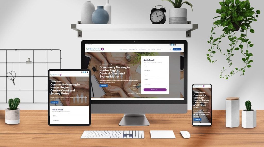
A website is often the first real interaction a participant or their family has with your NDIS service. Before anyone picks up the phone, they land on your homepage, form an impression in seconds, and decide whether to keep reading or hit the back button. For NDIS providers in Melbourne, that first impression carries enormous weight, and it is decided almost entirely by design.
Good NDIS web design is not about looking modern for the sake of it. It is about making the site genuinely usable for people who may navigate the world differently, building instant trust with cautious families, and guiding visitors smoothly toward getting in touch. Get it right and your website becomes your hardest working team member. Get it wrong and you lose enquiries you never even knew you had.
This guide walks through what separates an effective NDIS provider website from an ordinary one, and why design choices matter more in this sector than almost any other.
Why Web Design Is Different for NDIS Providers
Designing a website for a disability support service is not the same as designing one for a retail brand or a corporate firm. The audience, the stakes, and the standards are all different, and a generic template rarely meets any of them well.
Your visitors include people with a wide range of access needs. Some use screen readers. Some navigate with a keyboard rather than a mouse. Some have low vision, cognitive differences, or motor challenges that make cramped, cluttered layouts genuinely difficult to use. A site that ignores these realities quietly excludes the very people it exists to serve.
The emotional context is different too. Families researching supports are often stressed, time-poor, and protective of someone they love. They are not browsing casually. They are making a considered decision about care. Your website has to reassure them quickly that you are legitimate, capable, and safe to contact.
Accessibility Is the Foundation, Not an Afterthought
For an NDIS provider, accessibility is where every design decision should begin. It is both an ethical baseline and, increasingly, an expectation your audience will judge you against.
Accessible design means following recognised standards so that people using assistive technology can move through your site with ease. That covers strong colour contrast so text stays readable, properly structured headings that screen readers can follow, descriptive alt text on images, and forms that are clearly labelled and easy to complete.
It also means thinking about clarity. Plain language, generous spacing, readable font sizes, and simple navigation help everyone, not only people with disability. When a participant can find what they need without frustration, they are far more likely to stay and reach out.
There is a practical payoff as well. Search engines favour accessible, well-structured sites, so building for inclusion also strengthens your visibility. Doing the right thing and ranking well are not in conflict here. They pull in the same direction.
Design That Builds Trust in Seconds
Trust is the currency of the NDIS sector, and your website either earns it or erodes it within moments of someone arriving.
A clean, professional design signals stability. When a site looks dated, broken, or thrown together, visitors quietly assume the service behind it might be the same. When it looks considered and cared for, that impression transfers to your organisation.
Trust signals deserve prominent placement. Your registration status, genuine participant stories shared with consent, clear information about your team, and easy ways to contact you all reassure a cautious family. Hiding these details deep in the site wastes their power. Surface them where people will actually see them.
Photography matters more than many providers realise. Authentic, respectful images of real support in action connect far better than generic stock photos. They show a human, capable service rather than a faceless business.
Making It Easy to Take the Next Step
A beautiful website that does not lead anywhere is a missed opportunity. Every page should gently guide visitors toward a clear next action, whether that is calling, filling in a form, or booking a conversation.
Contact options should be obvious on every page, not buried in a menu. A phone number in the header, a simple enquiry form, and clear calls to action remove friction for someone who is ready to reach out but easily discouraged by a confusing path.
Forms in particular need care. Long, demanding forms scare people off. Short forms that ask only for what you genuinely need at first contact convert far better. You can always gather more detail once a real conversation begins.
The journey through your site should feel logical. Someone arriving on a service page should be able to understand what you offer, see that you are trustworthy, and find a way to contact you without hunting for it. Every extra click or moment of confusion costs you enquiries.
Mobile First, Always
A large share of NDIS searches happen on phones, often by carers grabbing a spare moment between other responsibilities. If your website only works well on a desktop, you are failing most of your audience.
Mobile design is not simply a shrunken version of the desktop site. Buttons need to be large enough to tap comfortably. Text needs to stay readable without pinching and zooming. Menus need to be simple to operate with a thumb. Pages need to load quickly, because a slow site on mobile data is a site people abandon.
For an audience that may already face access challenges, a smooth mobile experience is not a luxury. It is the difference between someone completing an enquiry and giving up halfway.
Speed and Performance Cannot Be Ignored
No matter how polished a site looks, a slow one loses people. Visitors expect pages to appear almost instantly, and patience runs even thinner when someone is stressed or navigating with assistive technology.
Fast performance comes from thoughtful design and clean build practices, such as optimised images, efficient code, and reliable hosting. These technical details are invisible when done well, but painfully obvious when neglected. A site that stalls or stutters undermines every other good decision you have made.
Speed also feeds directly into search rankings and conversions. Faster sites rank higher and keep more visitors engaged, so performance work pays for itself twice over.
Content Structure That Guides the Reader
Design and content work together. Even a visually striking site struggles if its information is disorganised or overwhelming.
Break content into clear sections with descriptive headings so visitors can scan and find what they need. Long walls of text intimidate readers, especially those with cognitive differences. Short paragraphs, plain wording, and logical grouping make your services genuinely easy to understand.
Each core service ideally has its own well-structured page, explaining what it is, who it suits, and how to begin. This clarity helps participants self-identify quickly and helps search engines understand exactly what you offer.
Getting Your NDIS Website Right in Melbourne
The Melbourne NDIS market is competitive, and participants have plenty of choice. A website that is accessible, trustworthy, fast, and easy to act on gives you a genuine advantage over providers still relying on outdated or generic sites.
You can pursue this in-house, but web design for the disability sector carries nuances that general designers often miss, from accessibility standards to the specific reassurances families look for. Working with specialists who understand both the technical and human sides of this space usually delivers a stronger result. If you want a site built specifically for this sector, explore dedicated NDIS Web Design Melbourne services created with providers and participants in mind.
Your website is working around the clock, whether it is helping you or holding you back. Making it genuinely usable is one of the most valuable investments a provider can make.
Frequently Asked Questions
What makes a good NDIS provider website? The best NDIS websites combine accessibility, clear trust signals, fast performance, and an obvious path to contact you. They work smoothly on mobile, use plain and respectful language, and are structured so that participants and families can find what they need without frustration.
Why does accessibility matter so much for NDIS websites? Your audience includes people with a wide range of access needs, and a site that is hard to use quietly excludes the very people you serve. Accessible design is both the right thing to do and a practical advantage, since it also improves usability for everyone and supports stronger search rankings.
How long does it take to build an NDIS website? A well-planned provider website typically takes several weeks from initial strategy through design, content, and testing. Rushing the process often means cutting the accessibility and trust elements that matter most, so a considered timeline usually produces far better results.
Can a better website really bring in more participants? Yes. A site that loads quickly, builds trust instantly, and makes contact effortless converts far more of its visitors into enquiries. Many providers lose potential participants simply because their website creates friction or fails to reassure, and fixing that has a direct impact on enquiries.







Comment