
How Personal Color Preferences Shape the Way People Build Their Wardrobes

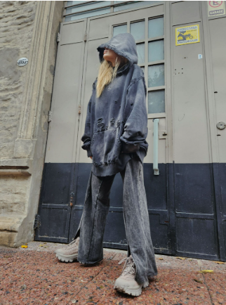
Some people instinctively reach for blue, others keep returning to earth tones, and some feel most like themselves in bright color. These choices can seem minor, but they influence which garments are worn repeatedly, which purchases sit untouched, and how easily a wardrobe comes together. Personal color preference is not a strict system for deciding what someone should wear. It is a useful observation about taste: noticing the shades that attract you can clarify what belongs in your closet and why certain pieces feel more natural than others.
Preference comes before a color rule
Advice about flattering colors often turns into a set of rules based on skin tone, hair, or seasonal categories. Those frameworks can be interesting for people who enjoy color analysis, but they do not replace personal preference. A shade can be theoretically recommended and still feel wrong to the person wearing it; another may be outside the usual palette and become a favorite because of memory, mood, or cultural associations. A workable wardrobe begins with noticing what you genuinely choose, rather than treating every purchase as a test you can pass or fail.
Look at the clothes you reach for on ordinary days rather than only the items you admire in stores. If most of your favorite pieces are navy, gray, and cream, that pattern is useful information. A Denim Tears Hoodie in a familiar shade may earn more wear than a brighter piece that looked exciting at the time but is hard to combine with anything else. Repetition is not a lack of imagination. It can indicate that a color feels easy to live in, photographs as expected, and makes the rest of getting dressed simpler.
Memory and mood influence what feels wearable
Color carries personal associations. A person may love green because of the outdoors, associate red with a favorite sports team, or prefer washed black because it reminds them of music scenes they care about. Those connections rarely fit neatly into a universal palette, yet they affect the emotional response to clothing. A wardrobe can reflect these associations without needing to announce them. The important point is not to explain every choice; it is to recognize that clothes are selected by people with experiences, not by abstract color wheels.
Build around the colors already in rotation
A practical way to use color preference is to identify a small group of shades that work together in your existing closet. The group might be warm neutrals plus olive, or cool neutrals plus navy and burgundy. It does not need to be a capsule wardrobe with a strict limit. The purpose is to reduce isolated purchases that look good alone but rarely fit into a real outfit. Before buying a new color, think of at least two pieces you already own that could sit beside it. If nothing comes to mind, the item may require more planning than you want to give it.
Use contrast intentionally. Some people enjoy high contrast, such as cobalt with white or red with black; others prefer adjacent shades that blend quietly. Neither approach is inherently more sophisticated. The effect depends on the wearer, setting, and garment. An Oversized Hoodie with a prominent print may become the most colorful piece in a muted wardrobe, while an understated sweatshirt can fit easily into a mostly saturated palette. Decide whether a new item should extend the colors you already wear or introduce a clear interruption.
Separate experimentation from everyday reliability
A wardrobe can include both dependable colors and a few exploratory choices. Keep the shades you rely on for work, errands, or travel in readily combinable positions, and try more unusual colors in lower-cost or easily returned pieces. This creates room for discovery without asking every purchase to become a wardrobe staple. Sometimes an unexpected color turns into a favorite after several wears. Sometimes it remains interesting but impractical. Both outcomes are useful if you learn something about what you enjoy wearing instead of treating unused clothes as evidence of poor taste.
Let context broaden the palette
The same color can behave differently in different settings. A saturated orange may feel expressive at an outdoor event but too conspicuous for a conservative workplace. A pale color may be appealing in summer yet impractical for someone who works around dust or children. Consider not only the shade but also the fabric, the frequency of wear, and how easy the garment is to care for. Color preference does not exist apart from daily life; it gets shaped by what a person does and where the clothing needs to function.
You do not need to eliminate a favorite shade because it is hard to wear in one situation. Instead, change its role. A bright color can live in a T-shirt or accessory rather than a coat intended for professional settings. A neutral can be the main garment while a preferred hue appears in a cap, lining, or print. This flexibility keeps a wardrobe personal without making every outfit a negotiation between taste and circumstance.
Review your closet as evidence, not a verdict
Every few months, look at what is actually being worn. Repeatedly used colors show what is working; untouched pieces may be too difficult to combine, less comfortable than expected, or simply not right for you. Avoid turning that review into a harsh assessment. Preferences change, and a shade that felt compelling a few years ago may no longer fit your life. For further technology and consumer-culture reading, the broader lesson is to observe what people actually choose and wear. A useful wardrobe is not built by obeying an ideal palette; it grows from noticing the colors that support the way you want to dress.







Comment