What’s a business without a website? It’s the digital age and if your customers can’t get in touch with you online, you are losing the race. As of now, almost 60% of the global population uses the internet – that’s significantly more than half! This figure would only have increased by the time you read this article.
But is it enough to just have a website? Not anymore. With a massive increase in global traffic, website designs have also evolved based on the browsing patterns that have been observed. If you are planning to create a website or to improve an existing one, this list of seven mistakes to avoid while building a business website should help you get started.
1) Oddly named domains
The reason you have a website is very simple – you have a product, and you have a customer base you want to tap into. The more complex you make things for them, the more would they be doubtful about doing business with you. Keep your domain names unique, but simple.
A good practice would be to simply keep the name of your business without adding any embellishments to it. If you do want to add something more, keep in mind what the customer would be searching for, and how relevant that addition would be to your business. Avoid adding anything that is hard to pronounce or remember – your goal must be to stay on top of your customers’ minds at all times.
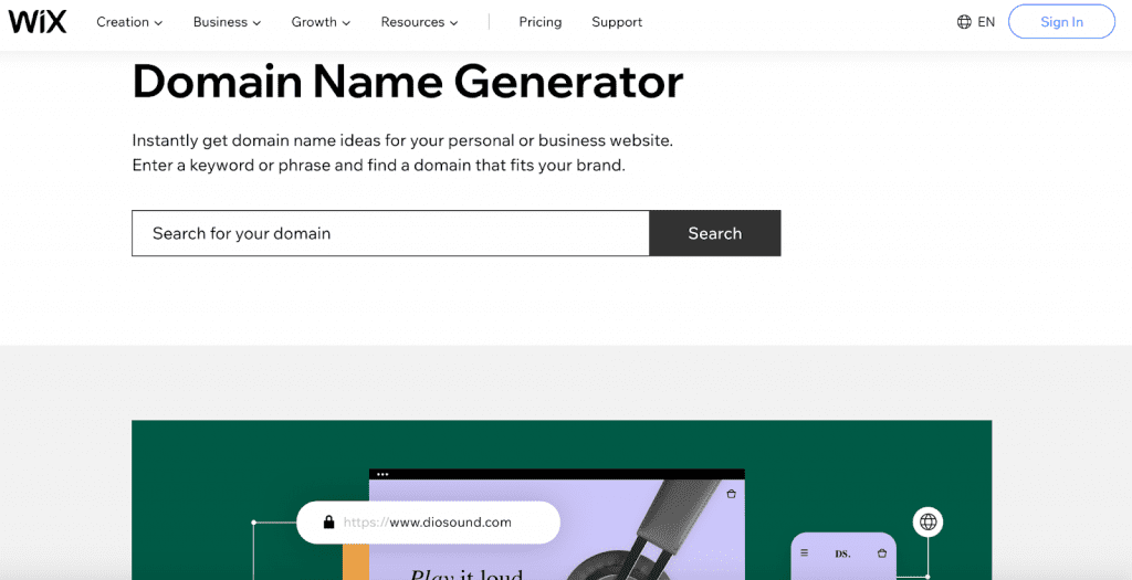
Choosing the right name for your site can be tricky, but there are many free tools available to help you out. If you need some inspiration, try using this domain name generator.
2) Too much info
Information overload is a big NO-NO, especially on Home pages. Today, good websites focus on giving maximum information with minimum words. Nobody likes long paragraphs, especially if they are simply beating around the bush, leading nowhere.
For instance, if you are a supplier of pebbles for home and commercial gardens, you don’t have to go into the details, importance and types of pebbles right on your homepage itself. Hard-selling with long pieces of content is somewhat redundant here because there is a good chance that your site visitor is already aware of these things – which is probably why s/he is there in the first place.
Use this space to talk about why you are a good option for your potential client. Present examples of projects you have done previously, or what your existing customers have to say. Remember, customers who are browsing the net have a very short attention span. If you don’t manage to capture it in the very first words they see, you have lost the game.
3) Visual chaos
Just as too much content can drive away visitors, so can clutter on your site. Visuals are great – in fact, pictures and videos really are very appealing to site visitors. However, you have to avoid certain things that can really dampen the experience of your potential customers:
- Auto-playing content: As a businessman, you have no way of knowing where your site visitor is, or what the circumstances around him/her are at the time of browsing your site. This is extremely important to remember because a lot of businesses put up auto-playing videos or music on their sites which can cause embarrassment and annoyance to the visitor. Imagine your potential client is checking out your website at a funeral, and you own a party-planning company with a website that has auto-playing media. The rest needn’t be explained -with auto-playing media, you could end up creating a possibility for your business to be associated with embarrassing situations!
- Heavy colors: Heavy colors can not only make the page look very cluttered but can also come across as harsh and tacky. Good websites always have lighter color themes. If you do need to use stronger colors because the theme of your branding is such, make sure to balance it out with an equal or larger amount of something neutral – like just plain white. Also, be mindful that the colors of your written and visual content match.
- Too many elements: Never bombard your visitor with random elements all stuffed on the page together. If you do have a number of things to communicate, make sure they are all going in a sensible flow. Let one section deal with only information that it is supposed to. Putting everything together will simply annoy your customers.
4) Not investing in good quality content
If there is one thing that can really put off a visitor, it is pictures that are of poor quality, pictures with watermarks all over them, pictures that simply mean nothing and so on. Similarly, written content that is full of errors, are nonsensical, or simply copy-pasted from different sections can really harm your brand image. The visual and written content must always be high-quality, meaningful and in sync with each other. Browsing through your website should be an enjoyable experience.
5) Complex designs
Unless your business is specifically targeted towards a market that will know to appreciate it, always avoid going for builds that are too futuristic and complicated for customers. As we discussed earlier in the first point, the goal must be to keep things simple for your customers. Your visitors should be able to navigate smoothly at the click of a button. Remember, functionality always comes above style – whatever web design you choose, always check if it comprises functionality in any way. If it does, it is perhaps a bad idea.
Similarly, it is very important that the navigation experience of your site also be simple and flowing in a logical sequence. The ease of scrolling and going back to a former page, finding something on the sitemap, and so on, should take a split second for the customer.
A great practice that businesses are adopting today for their websites is the inclusion of a live web-chat bubble on their page. Tools such as Acquire provide a live chat-feature that takes the customer experience to a whole new level because visitors can simply type in their query and have their doubts cleared easily without having to waste much time looking for things on the site.

6) Not hiring the experts
Every penny counts when you are running a business. This doesn’t mean that you should keep saving money, it actually means that you must make good, sensible investments for your business. Hiring an expert to build your website is one such great investment. Don’t trust your website with just anyone because it is cheaper. You will end up spending more time and/or money to fix the problems that came from being cheap with your website from the start.
7) Not planning your site well enough
You may have planned your business model beautifully – but if your site is not planned just as well, then you would be making a great mistake. Unplanned sites can leave your customers confused and frustrated, thereby leading them to simply leave. Here are a few elements that must go into planning a good business website:
- Knowing your customers: knowing the kind of customers who would be interested in what you have to offer is very important to set the right tone for your site. This can also prove to be vital to create a personalized customer experience.
- Knowing your competitors: knowing what your competitors are doing can be of vital help – not because you should copy them, but because you can know what they are doing right and what they are doing wrong. There is a lot to learn from what your competitors are doing wrong.
- Telling a story: From the first page to the last, the content you present to your visitors should be positioned in such a way that they flow smoothly, just as a story does.
8) Not having a mobile-friendly version
And finally, the biggest mistake of all in today’s age – not having a mobile-friendly version of your site. Think about it this way – not everyone has a computer – but almost everyone has a phone. Having a mobile-friendly version of your site literally means that your business is going to be at the fingertips of your customers!

One may argue that customers can still access sites on their phone browsers. While that may be true, the site in this case has been designed for a large screen. Features that are meant to work on a computer may not work well on a phone. The agony you put your customers through by forcing them to access your entire desktop site cramped on a small screen is simply criminal. In fact, it was found that 92.6% of internet users use their phones to go online. When almost all internet users around the world access the internet on their phones, wouldn’t it be a grave mistake for businesses to not make mobile-friendly versions of their sites?
Conclusion
Are these seven the only mistakes you could make when you create a business site? Not really. However, these seven points are vital to keep in mind to help you get started. Not only have we shown you seven mistakes, but also suggested ideas as a bonus on what you should do in order to make your website a digital success. Above all, remember to research, research again and then research some more. Start with websites that you yourselves really love and usually go to for your requirements. Do tell us what you find
– we would love to hear from you too.