Your website’s navigational hierarchy is the first thing most visitors look at to acclimate to your site. Your nav bar should move users from Point A to Point B without a pause. If your nav menu’s conversions are lacking, it’s time to work on some improvements.
The goal is to achieve high conversion rates at a low cost per acquisition. Averages vary depending on where you advertise and how well your site performs for your target audience. According to WordStream, the average Google ad across industries has a 4.4% conversion rate. Website conversion rates also vary widely.
There are some clear steps you should take to figure out your conversion rate and learn how to fix any issues.
1) Know Your Averages
Your first step is figuring out what your current conversion rates include. Add up how many people land on your page and what they do from there. Do they click on specific categories on your nav bar? How many of them convert into leads? Is your menu enough to push them through to the next stage of the buyer’s journey?
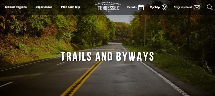
When you land on the Discover Tennessee Trails and Byways page, you see a sticky nav menu. It follows you as you scroll down the page. The elements in the nav bar all point to planning a trip to Tennessee. There is one objective, no matter what link you click on.
2) Narrow Your Categories
If your site is larger, having dozens of categories creates confusion for site visitors. Instead, utilize a mega menu. Narrow your choices down to a handful and then use subcategories on hover to show the user what else is available. As the person goes through the different options, they are placed into a narrower sales funnel until they are at the point of decision and convert from browsers into customers.
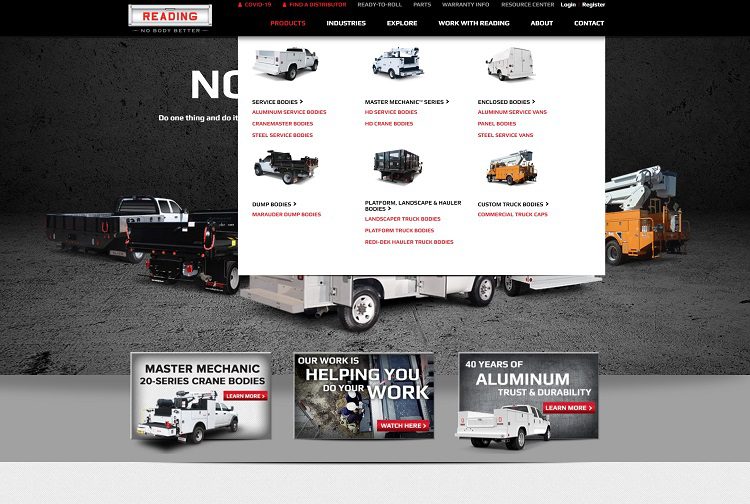
Reading Truck Body utilizes a gorgeous mega menu. When the user hovers over one of six primary tabs on the nav menu, the choices expand, including subcategories and images. The menu engages users and encourages them to discover more about what the company offers.
3) Consider Spacing
Spacing your menu so that it is aesthetically pleasing but also usable requires a lot of insight. Even the words chosen for your categories impact the look of your nav bar. Think about how you can keep the language simple while still making the category name lengths somewhat similar. Play around with different options until you find one that makes sense to users while remaining pleasing the eye.
Your menu spacing and layout choices have a significant impact on how clickable your bar is. Don’t forget that many of your users may access your site via mobile devices. Think through how the categories and menu convert on smaller screens.
4) Customize the Menu Layout
Where you place different items within your menu layout also matters. People are used to seeing a contact button on the far right and a home button on the far left. If you stray too far outside design norms, site visitors might grow confused and bounce away from your site in frustration.
Instead, stick with a similar layout to what others use. Don’t try to think outside the box too much when it comes to navigation. You don’t want to use cutesy names no one understands but you. Be simple and straightforward with phrasing and keep everything as predictable as possible.

Move over dating apps! We3 is a friend finder app. Their navigation is very straightforward. They offer two choices — Find Friends or Download the App. The home button is the logo, linking you back to the main page from anywhere on the site.
5) Add Animations
Want to draw attention to some of the categories on your nav menu? Animations are relatively simple to integrate into your design and help entice the user into clicking. For example, if you want your shopping page to be the highlight of the nav bar, add an animated arrow or make that portion underlined over and over again. Think about what works with the overall aesthetic of the page to draw attention.
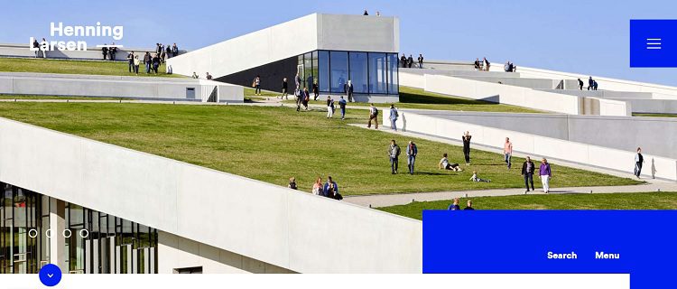
Henning Larsen uses some subtle animations to draw attention to where the user is in the menu. The initial menu is collapsed into a hamburger icon. When you click on it, different options appear. As you hover over each one, a line fades in from the side and highlights the selection.
6) Contrast With the Background
If you want people to notice and interact with your menu, you must make it contrast sharply with the background. The goal is drawing attention to the options after the person lands on your homepage. You can include anything in the menu, from a call to action (CTA) to simple categories. The key is making sure the nav bar is easy to find and use.
Test New Features Regularly
You’ve probably noticed more sites using video streaming or adding animations. As people’s internet connections get faster and screen resolutions on mobile devices improve, expect more features and people to try different methods to grab attention through the nav bar.
For your part, try out new methods and see what your target audience responds best to. Know your numbers, conduct split testing and even survey your customers to see what they like and don’t like. With a little effort, your conversion rates will soar and you’ll sell more than ever before.


