
Basics of Mobile-Friendly Analytics Dashboards: A Guide for the Data-Driven

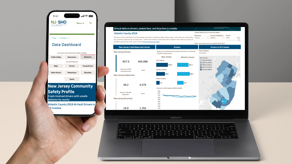
In the fast-moving digital world of today, business decisions are taken on the go—whether during meetings, while having a coffee, or even while halfway through a commute. If analytics dashboards were compared to cars, then a mobile-friendly one would be like a sleek, high-performance sports car: nimble, quick to respond to, and built for speed. But how do you design a dashboard that doesn’t just function on a mobile device but actually excels on it? Let’s look at that in more detail.
1. Mobile-first dashboards are similar to Swiss Army knives.
Picture yourself as a chef in a busy kitchen. You’ll need tools that are capable of adapting; for instance, one minute you’re chopping vegetables, the next you’re uncorking a bottle of wine. Just as a Swiss Army knife can do all these things, so too can a well-designed mobile dashboard.
Standard desktop dashboards usually overwhelm users with cumbersome menus and small amounts of text. A mobile-first approach changes this by focusing on the most important metrics, making navigation simpler, and ensuring quick loading even on poor 4G connections. Whether you are a CEO looking at KPIs or a data analyst in Bangalore who is refining reports, mobile dashboards should be just as easy to use as opening a multitool.
2. The four pillars of mobile dashboard design
Speed: Don’t let users wait as if they were stuck in a traffic jam
People who use mobile devices have a short patience level; a dashboard that takes five seconds to load is like a road that has been blocked—frustration increases and as a result users give up. The solution is to:
Reducing heavy visuals (use simplified charts)
Caching frequent queries to minimize server requests
Lazy-loading secondary data
Should you decide to enrol in a data analytics course in Bangalore, pay close attention to backend optimization since slow dashboards undermine insights more quickly than poor data does.
Clarity: It is better to be simple (comparing it to a haiku rather than an epic poem)
A dashboard is not a novel, it is a condensed snapshot; it’s similar to composing a haiku—each word (or each metric) has to justify its inclusion.
State 3 to 5 key performance indicators at the beginning (for example, revenue, conversions, traffic).
Use progressive disclosure (drill-downs for details)
Avoid rainbow-colored charts—stick to 2-3 contrasting colors
The user interface should have a touch-friendly design with buttons that aren’t finely detailed.
Hasn’t anyone ever tried tapping the small checkbox on a mobile device? It’s similar to trying to thread a needle while jogging. Here’s some design advice concerning the use of thumbs:
Big, tappable elements (minimum 48×48 pixels)
Ample whitespace to prevent misclicks
Navigation that is suitable for swiping (for example, horizontal scrolling for time filters)
Offline Capabilities: Like a Backup Generator
Offline capabilities act like a backup generator. They let users keep working even when the internet goes down. Apps save data on the device. When the connection comes back, the app syncs everything. This helps avoid losing work or progress during outages.
Mobile connectivity is not reliable—this can be verified by anyone who has been in a basement meeting room. A good dashboard should function without a network connection and then sync the data once it has reestablished a connection. Features such as Progressive Web Apps (PWAs) or cached reports make it so that you won’t be data blind.
3. Tools for creating mobile dashboards without having to use coding skills
It is not necessary for you to have programming skills in order to create sleek dashboards. For example, there are platforms such as:
Tableau Mobile (drag-and-drop, optimized for touch)
Google Data Studio (free, integrates with Sheets)
Power BI (robust, Microsoft ecosystem)
If you want to customise things more, a course in Bhubaneshwar in data analysis can teach you about SQL or Python hooks—but these tools deal with 90% of the cases right out of the box.
4. Testing: Deal With It As You Would A Flight Simulator
Before launch, test your dashboard like a pilot runs pre-flight checks:
Does the device work on the iPhone SE and a Galaxy Tab?
Simulating 3G speeds (will this cause a crash?)
Ask some colleagues whether they can find the X metric in three seconds.
A mistake would be to think that the logic applicable to desktop systems can also be applied to mobile devices; therefore, carry out relentless A/B testing.
5. The Future: AI and Voice-Activated Dashboards
It will soon be as straightforward to ask your dashboard for insights as it is to ask Siri for the weather. Voice queries (for example, “Show me Q3 sales trends”) and AI-generated alerts (such as “Unusual dip in conversions—check Region A”) will be the norm. People who are among the early adopters of data analytics courses in Bangalore are already looking into these integrations.
Final Thoughts: Your Pocket-Sized Command Center
A dashboard that is mobile-friendly is not merely a smaller version of its desktop counterpart; it is a completely new design, tailored to be easy to use with a thumb. If you focus on speed, clarity, and reliability, you will be able to turn raw data into decisions regardless of your location.
So the next time you’re designing a dashboard, ask yourself whether it would function as smoothly as a Swiss Army knife does in a chef’s hand; if the answer is no, then you’ll have to go back to the drawing board.
If you want to become proficient at dashboard design, you can take a data analyst course in Bhubaneswar or enroll in a data analytics course in Bangalore to improve your abilities.
Name:ExcelR – Data Analyst & Gen AI Course in Bhubaneswar
Address: 3rd Floor, BMC Bhawani Mall, Saheed Nagar, Bhubaneswar, Odisha 751007
Phone number:7026017870






Comment