A small technology company rarely struggles to produce just one image. The harder problem appears when a launch needs a landing-page hero, a social announcement, a sales-deck visual, and several ad concepts at the same time. If every asset is created independently, the team may get variety, but it also gets more variables than it can evaluate.
That distinction matters. An experiment needs a question, a controlled change, and a way to judge the result. Without those elements, reviewers often debate personal taste while the business objective disappears.
Small teams can avoid that trap by treating visual production as a decision system: create a limited set of useful alternatives, keep the brand recognizable, and learn enough to make the next decision easier.
The real risk is uncontrolled variation
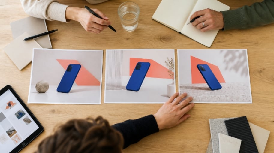
Imagine a software company preparing to launch a workspace-planning app. The approved key visual shows a cobalt-blue phone against a warm coral geometric background. It is distinctive enough to anchor the campaign, but the team is unsure which mood will work for the launch: energetic and bright, calm and editorial, or dark and technical.
The fastest response may seem to be asking several people to create as many alternatives as possible. That produces output, but it weakens the comparison. One version changes the background, another changes the phone angle, a third introduces a person, and a fourth uses a different color system. If reviewers prefer the fourth image, they cannot tell whether the winning factor was the palette, the composition, the human presence, or something else entirely.
Uncontrolled variation also creates a brand problem. When product shape, colors, camera angle, and mood all move at once, the result may no longer feel related to the approved campaign.
The remedy is simple: decide what the experiment is allowed to change before producing the first alternative.
Start with a one-page test card
A useful visual brief does not need to be long. It needs to make the decision visible. Before opening an editor, write a compact test card with five fields:
- Business question: What decision will this image help the team make?
- Audience and placement: Who will see it, and where will it appear?
- Invariant: What must remain recognizable in every version?
- Variable: What single visual dimension may change?
- Decision rule: What would make one direction more useful than another?
For the workspace-planning app, the business question might be: “Which visual mood gives the launch enough energy without making the product feel difficult to use?” The invariant is the cobalt-blue phone, its three-quarter angle, and the coral accent geometry. The variable is the environment around it. The decision rule is whether the visual remains clear at landing-page and social-card sizes while supporting the intended tone.
The card gives reviewers a shared frame. Instead of saying “I like version B,” they can say “version B communicates energy, but the background competes with the phone at a small size.” The next iteration can use that observation.
Protect the brand by naming the invariants
Brand consistency is easier to manage when it stops being a vague feeling. Invariants may include the product silhouette, a hero color, the amount of empty space, or the visual weight of the main subject.
Not every invariant belongs in every test. If the team is exploring a new campaign identity, the palette may be allowed to change. If it is adapting an approved campaign for a new channel, the palette may be fixed while crop and background density change. The useful question is not “What must our brand always look like?” but “What must stay stable for this particular comparison to remain meaningful?”
For broad exploration, an AI photo editor can help turn a written direction into visible options by changing elements such as background, lighting, color, or scene treatment. The tool is useful at this stage because an abstract idea becomes something the team can inspect. It should not replace the test card: without a declared variable, quick exploration can still become random output.
Keep the first batch deliberately small. Three distinct directions create a clearer discussion than a wall of minor alternatives. If none answers the business question, revise the brief.
Match the editing method to the uncertainty
Different experiments need different levels of freedom. A team exploring an entirely new campaign mood may allow large changes. A team adapting an approved launch visual for several channels should constrain the process much more tightly.
When the source image already contains the right product, angle, and composition, an AI image-to-image tool gives the experiment a reference-led starting point while the prompt describes what may change. The source image carries the invariants; the instruction defines the permitted variation. That makes the method a natural fit for testing a new atmosphere, background, lighting direction, or degree of visual density without beginning from a blank canvas.
The prompt should state both sides of the boundary. “Create a darker technical mood” is incomplete. A stronger instruction would be: “Keep the same cobalt-blue phone, three-quarter angle, coral geometry, and open space around the device. Change only the background treatment to a darker technical environment with restrained reflections.”
That wording will not guarantee a perfect result, and it does not remove the need for review. It does, however, make drift easier to detect. A reviewer can compare the output against explicit constraints rather than an unspoken expectation.

Review the experiment, not the prettiest image
Visual reviews go wrong when the team chooses the most impressive image instead of the one that answers the test. Dramatic lighting and extra detail can feel exciting even when they weaken the message or campaign continuity.
A short review sequence keeps the decision grounded:
- Check the invariant first. Is the product still recognizable? Are the required colors, angle, and visual hierarchy intact?
- Check the variable. Did the intended change actually occur, and is it different enough to evaluate?
- Check the placement. Does the image still work at the size and crop where it will be published?
- Check the message. Does the result support the business question on the test card?
- Check production risk. Are there distorted objects, accidental text, implausible details, or rights concerns that require correction or rejection?
This order matters. If an image fails the invariant, there is little value in debating its mood. If it survives the first four checks but contains a visible defect, the team can decide whether a precise manual correction is justified. Review becomes faster because every comment has a place in the decision.
Run experiments in rounds, not one giant batch
The first round should test direction, not polish. Use a common source, one variable, and a small number of genuinely different options. Select the direction that best answers the test card, then start a second round for refinement.
For the app launch, round one might compare bright, editorial, and dark technical environments while keeping the phone and coral geometry fixed. If the editorial direction wins, round two can test two levels of background texture or two crops for the landing page. The question becomes narrower as the team learns.
This staged approach prevents a common waste pattern: polishing five directions before anyone has agreed which direction deserves more work. It also makes human judgment more valuable. Reviewers are not being asked to search a huge gallery for a surprise winner. They are making one bounded decision at a time.
Stop when the next round is unlikely to change the decision. More variants may create an impression of thoroughness, but they can also delay publication and reopen choices the team has already settled.
Preserve the reasoning, not just the final file
At the end of the experiment, save a small decision record alongside the selected image. It should contain the original source, the test card, the prompt or edit instruction, the versions reviewed, the chosen output, and one sentence explaining why it won.
That record turns a finished asset into operational knowledge. When the team prepares the next product announcement, it can reuse what was learned about crop, mood, density, and review criteria without copying the old visual. It can also see when a previous decision was tied to a specific channel or audience instead of treating it as a permanent brand rule.
For a small technology company, this is the practical advantage of a controlled visual workflow. The team does not need a complicated creative-operations system. It needs a clear question, a stable reference, one meaningful variable, and a stopping rule. With those pieces in place, AI-assisted editing becomes part of a disciplined experiment rather than a machine for producing more options.