A landing page provides an excellent opportunity to make a first impression on your potential customers. Whether you’re looking to increase conversions or simply promote brand awareness, a well-designed landing page is critical.
This article will look at many landing page design tips businesses can implement today, which will help them to improve their business’s conversion rates. With even a tiny percentage increase in conversions potentially resulting in more sales, it’s worth considering which tips might work best for your specific needs.
1. Keep it as simple as possible
While there are as many as 13 types of landing pages that a company might use, there is one thing that all landing pages have in common: they need to be simple. In practical terms, your landing page should have a clear and concise message that is easy for visitors to understand. The last thing you want is for visitors to feel confused or overwhelmed by too much information.
Businesses often want to present as much information to their visitors as possible, thinking that more is better. However, when it comes to landing pages, less is more. Whitespace is one effective way to keep your page clean and uncluttered. This means leaving plenty of blank space around your text and images, making them easy to digest.
This also applies to giving ‘breathing room’ to the essential elements of your landing page. From a design standpoint, you’ll want to use contrast to ensure that your key elements (including your headlines, CTA buttons, etc.) stand out from the rest of your page. If you’re not confident in your abilities to design a landing page that will convert visitors into customers or leads, it may be worth considering hiring a professional website development firm. Website design agencies have teams of experienced web designers and developers who are passionate about helping businesses succeed online.
2. Make your CTA button impossible to miss
Your CTA button is arguably essential on your entire landing page, so it must be designed to make it impossible for visitors to miss. This means using a contrasting color that stands out from the rest of your page and ensuring that the button is big enough and in a prominent location.
Some companies like to use an animated button or other visual elements to make their CTA more attention-grabbing. However, you’ll want to be careful with this approach, as too much animation can be distracting and take away from your overall message.
The text you use for your CTA is also essential to consider. It should be clear and concise and convey value to those about to click on it. For example, if you’re offering a free ebook, your CTA might say something like, “Download your free e-book now.”
You can also introduce a surprise element by using an unexpected CTA contrary to what visitors might expect. For example, instead of saying, “Sign up now,” you could say, “See what all the fuss is about.”
As another example, if you want to land new clients as a freelancer, some types of CTAs can be much more effective than others. “Download my portfolio” or “See my work” can be relatively bland and generic, while something like “Let’s chat about your next project” can be much more inviting and likely to result in a conversion.
Your CTA button also provides a definitive split test (more on this later) you can run, allowing you to see which text works better for your business.
3. Use images that convey meaning
The expression, “an image is worth a thousand words,” is accurate regarding landing pages. People are visual creatures, and a compelling image can go a long way in helping your page visitors understand your overall message.
At the same time, you’ll want to be careful not to use images that are too busy or confusing. Stick with images that are simple and easy to understand and that convey the emotion you want visitors to feel. Use a tool to remove background from images to make them clearer.
Images can also be used to help break up text on your page, making it easier for visitors to digest your landing page’s content
4. Use testimonials
People naturally distrust businesses and want to ensure that others have had a positive experience before they’re willing to hand over their hard-earned cash. This is where testimonials come in. When used effectively, testimonials can be a powerful way to build trust with your page visitors and increase conversions.
When selecting testimonials to include on your landing page, choose ones relevant to what you’re selling that come from various sources. You’ll also want to ensure that your testimonials are genuine, so avoid any that sound like the company itself could have written them.
Testimonials are essential for all types of businesses. From a home appliances company like Slyman Bros, which shows testimonials of customers that found the right fit for their appliances, to a small business that sells handcrafted jewelry and includes a photo of the customer with their new purchase, there are endless possibilities for how you can use testimonials on your landing page.
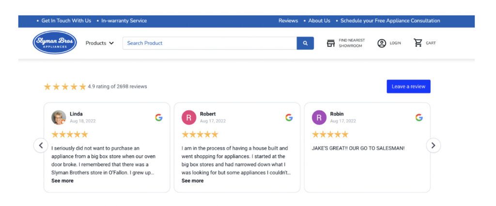
Image credit: Slyman Bros
5. Use social proof
This is another one that many are simply not using to its full potential when it comes to landing pages. Whereas testimonials are a subtype of social proof, the focus is on the individual experiences of your customers. On the other hand, social proof is more about demonstrating that other people are using and enjoying your product or service.
Think about it this way: if you see a long line of people waiting to get into a new restaurant, you’re more likely to want to try it out for yourself. The same goes for landing pages. If you can show visitors that many others are already using your product or service (as per the below), they’ll be more likely to convert.
With various ways to convince a customer to buy from you, here are some key examples of social proof that one can immediately start using on their landing pages:
- Social likes and shares: Showing how many people have liked or shared your product on social media is a great way to increase trust and confidence in your brand.
- Trust signals: Including security seals, awards, and accreditations can help show visitors that your business is trustworthy and credible.
- Case studies: Sharing detailed information about how other companies have used your product or service to achieve success is a great way to show potential customers what your products can do for them.
- Celebrity or influencer endorsements: If a well-known celebrity or influencer has endorsed you, mention it on your landing page. This can be a great way to add some extra social proof.
- Earned media: if you’ve been featured in the news or other media outlets, mention it on your landing page, especially if it’s relevant to your niche.
6. Keep the copy short and sweet
A 3D camera website specializing in creating real-time 3D images and readings for print and share sessions uses three short paragraphs that deal with these features to convey the message concisely and straightforwardly.
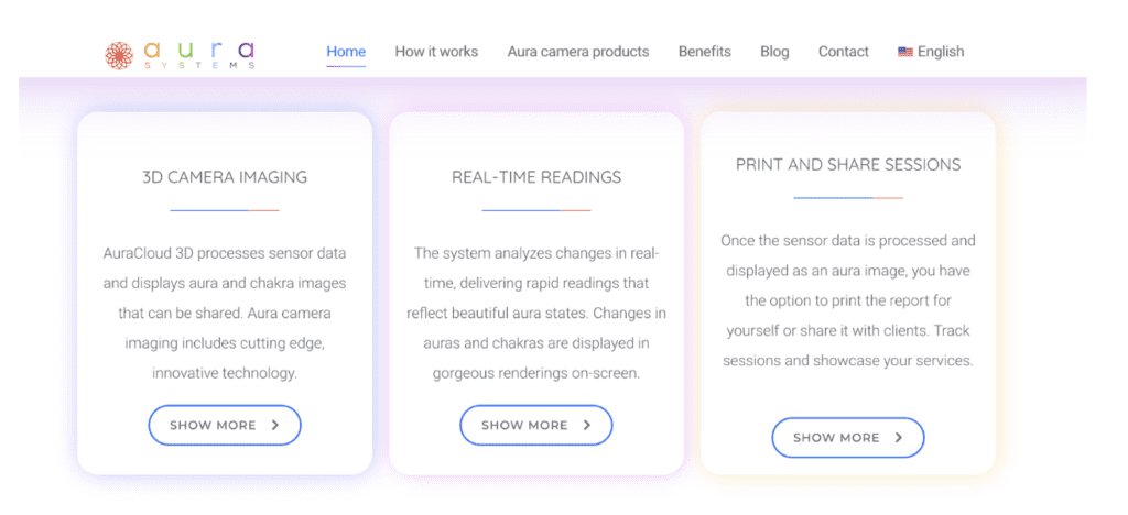
Image credit: Aura
When creating a landing page, it’s a good idea to use short-form copy because you’ll want website visitors to know precisely what you can offer, and at the same time, you don’t want to overwhelm them with too much information.
This type of concise copy is essential on landing pages where you want to make it as easy as possible for visitors to understand what you’re offering. Unique text on landing pages creates more visitor engagement, so use a sentence rewriter to avoid fluff on your headlines and paragraph. To make their intention in clicking the CTA or any other learn more button.
7. Tell a story
People love listening to the right stories. That’s why telling a story on your landing page can greatly increase conversions.
When you tell a story on your landing page, you’re not only providing visitors with information about your product or service but also creating an emotional connection that can be powerful in influencing their decision to convert.
Think about it this way: if you were considering buying a new car to travel with, which would you be more likely to buy? The one that’s described as “a reliable and affordable car with great gas mileage” or the one that’s described as “the perfect car for a family of four that loves to go on road trips?”
The answer is probably the latter. That’s because the second option tells a story that resonates with us on an emotional level. And when we feel emotionally connected to something, we’re more likely to take action.
So, to increase conversions on your landing page, tell a story that will create an emotional connection with your visitors while also including all the facts that need to be shared. This is a great way to increase trust and confidence in your brand and convince visitors to take action.
8. Make the pricing clear (if applicable)
While some companies want people to reach out to them for pricing information, others want to be very upfront about how much their product or service costs.
There’s no right or wrong answer here. It depends on your business and what you’re trying to sell. However, if you are selling a product or service with a set price, it’s generally a good idea to include that information on your landing page.
People are often hesitant to buy something if they don’t know how much it costs. Including the price on your landing page can increase transparency and build trust with your visitors. This is especially important if you sell a more expensive product or service.
Whether you are selling an online course, a subscription to your SaaS tool, or selling your services, having the price displayed on the landing page can increase your conversion rate optimization.
Below is an example of a people search records tool known as US Search, which clearly shows the pricing and renewal policy.
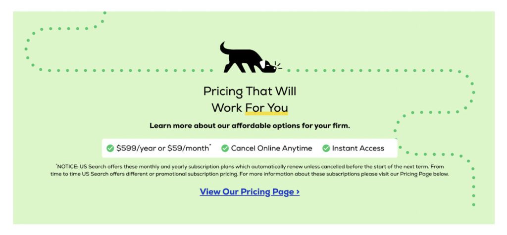
Image credit: US Search
9. Offer the right freebie in exchange for contact details
If you’re building a list through your landing page (which you should be), the value you offer in exchange for someone’s contact information should be relevant to what you’re selling. For example, if you’re selling a course on how to start a business, offering a free e-book on the best online course platforms would be an ideal way to increase conversions.
On the other hand, offering a free trial would be a more relevant freebie if you’re selling a software program that helps businesses track their expenses.
The key is offering something valuable to your target market, which will help you generate leads that are likely to convert into customers.
10. Make it mobile-friendly
With more than 50% of web traffic coming from mobile, ensuring your landing page is optimized for mobile devices is essential.
If your landing page isn’t mobile-friendly, you’re likely losing out on many potential conversions. That’s because people are more likely to convert when they can easily view and navigate your landing page on their mobile devices.
Try testing your landing page on different devices to ensure your landing page is mobile-friendly. You can also use Google’s Mobile-Friendly Test tool to check if your page is optimized for mobile.
11. Use A/B testing
A/B testing, also known as split testing, loads up two versions of a landing page to random visitors to see which performs better (i.e., converts higher).
This is a great way to test different elements of your landing page to see what works best for your target market. For example, you can try other headlines, images, or calls to action to see which one people respond to the best.
A/B testing can be a bit technical, so if you’re not comfortable with it, there are plenty of tutorials online. Google Analytics also has a built-in A/B testing tool that can be used to test different elements of your landing page.
12. Include the most popular categories on your page
For eCommerce stores, it can be helpful to include the most popular categories on the landing page. This helps people find what they’re looking for more quickly without clicking on various sub-menus.
An example of this is an electrical and lighting company, American Electrics featuring the most popular categories on their landing page, making it easy for visitors to find what they’re looking for.
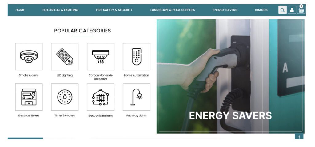
Image credit: American Electrics
Whether you’re in the market for smoke alarms or home automation devices, this straightforward user experience makes it easy to shop and buy from this company.
13. Make any form easy to fill out
Apart from having the action, you want people to take above the fold (i.e., people don’t have to scroll down the page to get to the right section), having as few fields as possible in the form provided is essential in keeping your conversion rate high.
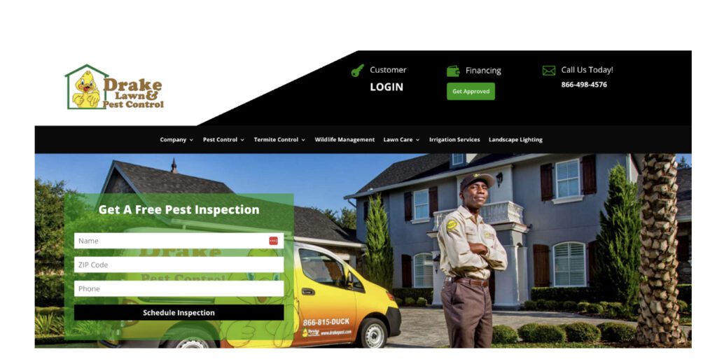
Image credit: Drake Pest
The more fields there are, the higher the probability a person will abandon the form altogether. A pest control company that offers a free inspection asks for just the name, zip code, and phone. These are the only essential pieces of information needed to provide this service. You can see how the form is short and easy to fill out, which helps increase conversions.
Summing up
The above landing page design tips will help you create a landing page that converts. By following these tips, you can increase leads and sales for your business. The key takeaway is always to try and provide a better user experience and consistently test out different elements to see what works best for your target market.