For many small businesses, getting people to visit a website is only half the challenge. The bigger question is what happens after someone arrives.
A business can invest in SEO, social media, paid advertising, and other marketing channels, yet still struggle to generate enough inquiries or sales. In many cases, the problem is not the amount of traffic. It is the website experience that visitors encounter once they arrive.
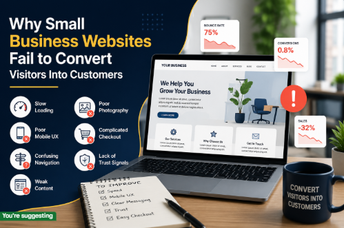
A website can look professional and still fail to convert visitors into customers. When the messaging is unclear, navigation is difficult, pages load slowly, or visitors cannot find a clear next step, potential customers have little reason to stay.
Here are some of the most common reasons small business websites struggle to turn visitors into customers.
1. Visitors Cannot Understand the Offer Quickly
People should not have to study a website to understand what a business does.
One of the most common problems with small business websites is vague messaging. Headlines such as “Your Partner for Business Success” may sound professional, but they do not tell visitors what the company actually provides.
A stronger homepage should answer three basic questions quickly:
- What does the business offer?
- Who is it for?
- What should the visitor do next?
The clearer the message, the easier it becomes for visitors to decide whether they are in the right place.
For example, a web development company could simply say that it provides “digital solutions.” A more useful message would explain the actual services and the type of businesses it helps.
Clarity reduces friction and allows visitors to move through the website with confidence.
2. The Website Has No Clear Conversion Goal
A website should have a purpose.
For some businesses, the primary goal may be generating phone calls. For others, it could be collecting inquiries, booking appointments, selling products, or getting visitors to request a quotation.
Problems arise when a website tries to make every action equally important.
If the homepage contains several competing buttons such as “Learn More,” “Our Services,” “Contact Us,” “View Portfolio,” “Get Started,” and “Subscribe,” visitors may not know which action matters most.
A better approach is to establish a primary conversion goal and design the website around it.
Supporting actions can still exist, but the main next step should be obvious.
3. Poor Website Navigation Creates Friction
Visitors should be able to move around a website without having to think too much.
Complicated menus, unclear page names, excessive dropdowns, and poorly organized services can make even a good website frustrating to use.
A small business website usually benefits from a simple structure where important information is easy to find.
For example, a service-based business may need clear access to:
- Services
- About
- Portfolio or Case Studies
- Reviews or Testimonials
- Contact
The exact structure depends on the business, but the principle remains the same: visitors should be able to find important information quickly.
Good navigation does not attract attention to itself. It simply helps people get where they need to go.
4. Slow Performance Drives Visitors Away
A website can have excellent content and design, but visitors may never see it if the pages take too long to load.
Large images, unnecessary plugins, excessive scripts, poorly optimized themes, and other technical issues can affect website performance.
This becomes particularly important for mobile users, who may be browsing on slower connections or less powerful devices.
Small businesses should regularly test their websites and look for opportunities to improve performance.
Some common improvements include:
- Compressing large images
- Removing unused plugins and scripts
- Optimizing website code
- Using efficient hosting
- Reducing unnecessary animations
- Improving mobile performance
Speed is not simply a technical concern. It is part of the customer experience.
5. The Website Does Not Build Enough Trust
A visitor who has never heard of a business before will naturally have questions.
Is this company legitimate?
Are other customers satisfied?
Can I trust them with my money or business?
A website that provides no evidence of credibility makes these questions harder to answer.
Small businesses can strengthen trust by showing genuine customer reviews, testimonials, case studies, business information, professional contact details, clear policies, certifications where relevant, and examples of previous work.
Trust signals should be authentic rather than excessive. A page filled with generic badges and exaggerated claims may have the opposite effect.
Real evidence is usually more convincing than decoration.
6. The Website Talks Too Much About the Business
Another common problem is making the website entirely about the company rather than the customer.
Businesses naturally want to explain their experience, history, services, and achievements. However, potential customers are usually more interested in understanding how the business can solve their particular problem.
Instead of simply saying:
“We are an experienced company with a dedicated team.”
A stronger approach is to explain:
“We help small businesses build faster, easier-to-use websites that make it simpler for customers to contact them.”
The second message focuses on an outcome that matters to the visitor.
Every major section of a website should answer a question the customer is likely to have.
7. The Website Is Not Designed Properly for Mobile
A website may look impressive on a desktop screen and still provide a poor experience on smartphones.
This is particularly damaging for small businesses because many visitors discover businesses through mobile searches, social media, messaging apps, and online advertisements.
Common mobile problems include:
- Text that is difficult to read
- Buttons that are too small
- Menus that are difficult to use
- Images that break the layout
- Forms that are too long
- Pop-ups covering important information
- Excessive scrolling
A responsive website should not simply shrink the desktop version. The layout should be designed to remain easy to use across different screen sizes.
8. Contact Forms Create Too Much Work
A potential customer who wants to make an inquiry should not have to complete a lengthy questionnaire just to start a conversation.
Long forms can discourage visitors, particularly when the business does not need all of that information immediately.
A better approach is to request only the information needed to begin the conversation.
Depending on the business, that might be:
- Name
- Email or phone number
- Business name
- A short description of the requirement
Additional information can be collected later.
The easier it is for a qualified visitor to contact a business, the fewer unnecessary barriers exist between interest and inquiry.
9. The Website Does Not Match the Traffic Source
Not every visitor arrives at a website for the same reason.
Someone searching for “Shopify development services” has a different intent from someone searching for “how to start an online store.”
If both visitors are sent to the same generic homepage, the experience may not match what they expected.
Landing pages can solve this problem by connecting the visitor’s original intent with highly relevant information.
For example, a business running an advertisement for a particular service can send visitors directly to a page dedicated to that service rather than making them search for it on the homepage.
The closer the website experience matches the visitor’s expectations, the easier it becomes to move them toward a decision.
10. The Website Was Built to Look Good Instead of Perform
Visual design matters, but appearance alone does not make a website effective.
A successful business website needs to combine design with usability, performance, clear messaging, search visibility, trust, and conversion strategy.
This is why professional website development involves much more than selecting a template and adding company information.
The technical structure, content, user journey, mobile experience, calls to action, and overall business goals should work together.
Businesses looking to improve their online presence can work with an experienced web development team such as Xperlet to create a website that is designed around both user experience and business objectives.
How Small Businesses Can Improve Their Website
The first step is not necessarily a complete redesign.
Business owners can start by reviewing the existing customer journey.
Open the website as if you were a new visitor and ask:
- Do I immediately understand what this business does?
- Can I find the service or product I need?
- Is the website easy to use on my phone?
- Does the website load quickly?
- Do I see enough evidence that this business is trustworthy?
- Is there a clear next step?
- Can I contact the business without unnecessary effort?
Analytics can provide another layer of insight. If a page receives significant traffic but produces very few inquiries, that page deserves closer attention.
Similarly, if visitors leave quickly from an important landing page, the problem may be related to the content, user experience, speed, or mismatch between the visitor’s intent and the page.
Final Thoughts
A small business website should do more than establish an online presence. It should help visitors understand the business, build confidence, find the information they need, and take the next step.
More traffic will not automatically solve a conversion problem.
If visitors encounter unclear messaging, poor navigation, slow pages, weak trust signals, complicated forms, or a frustrating mobile experience, marketing efforts can produce far fewer results than expected.
The most effective approach is to treat the website as part of the sales process rather than simply an online brochure.
When design, content, technology, and customer experience work together, a small business website can become a much more valuable tool for generating leads, building trust, and turning visitors into customers.