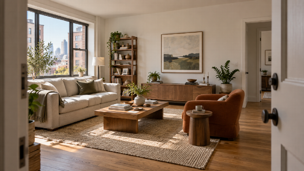
A room can look finished from the doorway and awkward from the sofa. The artwork lines up, the rug frames the seating, and the window gives the whole scene a flattering wash of daylight. Then someone sits down and notices that the chair blocks half the view, the lamp shade is at eye level, or the television dominates an otherwise calm wall.
This happens because rooms are often planned around a single “hero view.” It is the angle used in a listing photo, a mood board, or the first rendering shown to a client. That view matters, but it represents only a few seconds of daily life. People experience a room while entering it, sitting in it, crossing it, and looking out from it. A design that holds together from those ordinary positions usually feels better for longer.
The hero view hides everyday problems
The widest angle in a room tends to be forgiving. It makes circulation feel more generous and allows the eye to take in the furniture as one composition. It can also hide the backs of chairs, the side of a storage unit, or the blank wall beside a window.
That is useful for photography, but it is a weak test of how the room works. A coffee table may appear centered from the entrance while sitting too far from the sofa. A tall plant can look elegant against the window but reduce the light reaching a reading chair. A console may anchor the main wall while leaving everyone seated in the room staring at cords and device lights.
The problem is rarely that one object is wrong. More often, the relationships change when the viewer moves. Scale, balance, glare, and visual clutter all depend on where the eye is located. Good planning accounts for that movement before heavy furniture arrives or new holes are made in the wall.
Start with the places where people pause
There is no need to model every possible angle. Four honest viewpoints are usually enough to expose the important decisions.
First, check the entrance. This view establishes the room’s initial sense of order and reveals whether furniture interrupts a natural path. It also shows which object becomes the focal point before a visitor has time to look around.
Next, check the primary seat. In a living room, that may be the sofa; in a bedroom, it is often the bed. This is where people spend time, so small distractions become more noticeable. Look for blocked windows, exposed storage, harsh lamp glare, and screens that pull too much attention.
Then check a secondary activity point, such as a desk, dining chair, or reading corner. The room may need to support concentration, conversation, or a quieter view from that spot.
Finally, check the main route through the space. Stand where someone turns a corner or moves between rooms. This angle exposes protruding furniture, narrow passages, and items that appear tidy only when viewed straight on.
Keep the room fixed while the viewpoint changes
The most useful comparison comes from holding the design steady. Keep the furniture, finishes, lighting, and time of day the same, then change only the viewpoint. If every image introduces a new sofa or a different wall color, it becomes impossible to tell whether the layout works or the styling is simply more attractive.
Free AI room design can help at this stage by turning one room idea into several visual checks before the physical setup changes. Use the same brief for each view, and treat the results as a way to compare sightlines rather than as separate design proposals. The homeowner or designer still decides what stays consistent and which tradeoffs matter in the real space.
Label the views in plain language: entrance, sofa, desk, and passage. Put them side by side if possible. Repeated problems become obvious. If the lounge chair blocks the window in three views, moving it deserves attention. If an empty wall feels quiet from one seat and appropriately calm from every other angle, it may not need decoration at all.
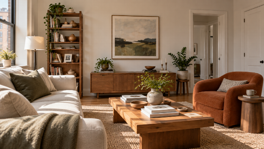
The same living room from a seated position, revealing the everyday relationship among the sofa, chair, window, and focal wall.
Look for friction, not perfect pictures
The goal is not to create four photographs that would all belong in a magazine. Some viewpoints should be visually quiet. A seat facing an uncluttered wall can offer relief, while a doorway view may carry more contrast and detail.
Instead, look for friction. Does a chair back interrupt a long sightline? Does opening a cabinet interfere with the walking route? Is the brightest window reflected in a television or computer screen? Does a tall object make a low ceiling feel lower? Can someone enter the room without walking through the center of a conversation area?
Visual weight deserves the same attention. A dark bookcase, large television, or dense gallery wall may feel balanced from across the room but heavy from a nearby seat. That does not always mean the object must go. A lighter neighboring surface, more space around the piece, or a modest shift in position may solve the imbalance.
Once a promising arrangement appears in several views, verify it in the actual room. Mark furniture edges with painter’s tape, walk the usual routes, sit at eye level, and measure the clearances that matter. The images help reveal questions; the physical check confirms that the answers fit the space.
Let one change improve several views
When a room looks uneasy from one angle, the first impulse is often to add something. Another picture fills the blank wall. A basket hides a cable. A side table occupies the open corner. These fixes can improve a single frame while making the room busier everywhere else.
A stronger response is to find one adjustment that helps several viewpoints. Rotating a chair slightly can open the entrance, improve conversation, and reduce window blockage. Lowering artwork can connect it more closely to the furniture and give a seated viewer a better focal point. Moving a floor lamp behind the sofa can free a passage while putting useful light where it is needed.
The best room is not the one with a flawless front. It is the one that remains comfortable as people move through it. Before buying the final accessory or approving the final layout, leave the doorway, sit down, and look again.