At Above Bits, we’ve spent nearly two decades watching web design trends come and go. Some trends have genuinely revolutionized user experience, while others have, let’s be honest, made the internet a more frustrating place. If you’ve ever landed on a site and felt trapped in an art project with no escape button, you know exactly what I mean.
As a web design professional, I’ve worked with businesses across industries, helping them create functional, stunning websites that serve a purpose. But along the way, I’ve also seen some of the most eye-catching, modern, and downright annoying design trends take over the web. Today, we will dissect these trends, expose why they’re secretly terrible, and, most importantly, talk about what to do instead.
And if you’re a business looking for website design in Charlotte, trust me—these mistakes can cost you actual customers.
The Curse of Autoplay Videos: Because Nothing Says ‘Welcome’ Like Sudden Noise
Remember the golden days of web design when a simple, static homepage was enough? Neither do I—because the internet is in a perpetual race toward the next big thing. And one of the “biggest” things over the last decade has been autoplay videos.
Autoplay videos sound great on paper: they instantly engage users, set the tone, and dynamically deliver key messages. Except, in practice, they do the exact opposite. There’s nothing quite as panic-inducing as opening a website in a quiet office (or worse, a library) only to have a full-volume promotional video start blaring in your face.
And let’s not forget the impact on page load speed. According to a 2023 study by Google, websites with autoplay videos take 30% longer to load on average. This is a significant problem, considering that 53% of mobile users will leave a page if it takes longer than three seconds to load. For businesses focused on website design in Charlotte, losing over half your potential customers because of an autoplay video is not just annoying—it’s financially disastrous.
What to Do Instead: Give Users Control
If you must include a video, let users choose to play it. This way, they engage with your content on their terms without feeling like they’ve been ambushed. Above Bits recommends embedding videos with clear play buttons and muted previews, ensuring users aren’t forced into an unwanted multimedia experience.
Infinite Scrolling: When a Website Becomes a Black Hole
The idea behind infinite scrolling is simple: keep users engaged by continuously loading content instead of making them click through pages. This works wonderfully for social media platforms like Instagram, TikTok, and Twitter (or X, if we’re pretending Elon’s rebranding made any sense). However, infinite scrolling often does more harm than good for business websites.
A key issue is that users lose their sense of location. If you’ve ever tried to go back and find an article you scrolled past on a news site, you know how frustrating it can be. Studies by the Nielsen Norman Group show that infinite scrolling can reduce user engagement by 20% on non-social media websites because visitors get lost in the content and forget why they were there in the first place.
Additionally, SEO takes a hit. Search engines struggle to index content that constantly reloads rather than being structured in a logical, paginated way. Businesses that invest in website design in Charlotte must consider how their content is indexed by Google—because if your site isn’t ranking, your customers aren’t finding you.
Instead of an endless scroll, consider smart pagination or a “Load More” button that gives users a clear stopping point. This allows them to retrace their steps easily while enjoying a seamless experience. Above Bits often implements a hybrid approach, balancing usability with modern design to keep users engaged—without trapping them in an infinite content loop.
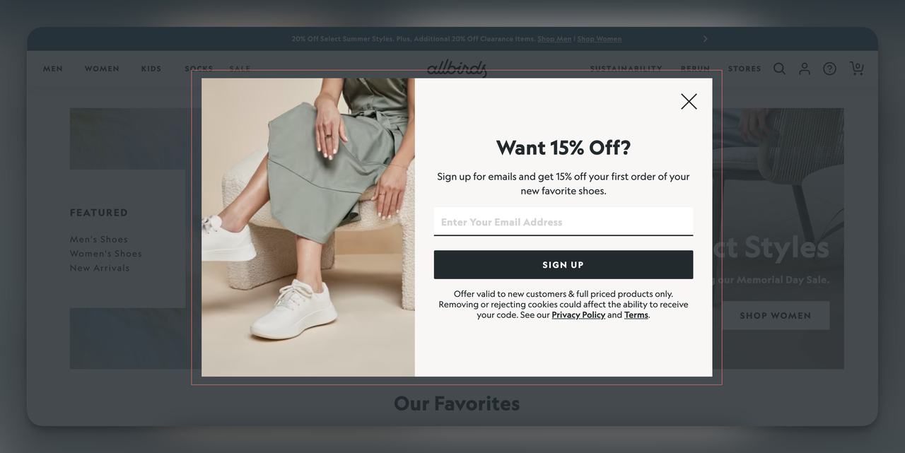
Pop-Ups Everywhere: Because We Love Being Interrupted
There was a time when pop-ups were considered a relic of the early 2000s, banished to the same digital graveyard as MySpace and dial-up internet. But somehow, they’ve made a comeback—and they’re more intrusive than ever.
Pop-ups are used for everything from newsletter sign-ups to discount offers and, in some cases, guilt-tripping exit-intent messages. (“Are you sure you want to leave? This is a once-in-a-lifetime deal!”) If I had a dollar for every time a pop-up ruined my browsing experience, I’d have enough to buy Twitter from Elon Musk and fix it.
A 2023 HubSpot study found that pop-ups reduce user satisfaction by 72% when they appear within five seconds of landing on a page. And let’s not forget Google’s crackdown on intrusive interstitials, which can penalize websites that make content hard to access because of aggressive pop-ups.
For businesses focusing on website design in Charlotte, annoying potential customers before they even interact with your content is the exact opposite of good marketing.
Instead of aggressive pop-ups, consider slide-in messages, sticky banners, or exit-intent overlays that appear only when necessary. This way, you still capture leads without frustrating users into clicking away. At Above Bits, we prioritize non-intrusive engagement methods that guide users gently rather than shoving promotions in their faces.
Overuse of Dark Mode: When “Sleek” Becomes “Unreadable”
Dark mode has taken over in the last few years, and while it looks sleek, it’s not always the best option. Initially popularized by tech giants like Apple and Google, dark mode provides a low-light interface that reduces eye strain—at least, in theory.
In practice, not all websites are suited for dark backgrounds. Many designers fail to adjust contrast properly, leading to low readability and eye fatigue rather than relief. A 2022 MIT study found that reading comprehension drops by 14% on websites that poorly implement dark mode.
For businesses working on website design in Charlotte, dark mode might seem trendy, but it shouldn’t come at the expense of accessibility.
Rather than forcing dark mode on all users, allow them to switch between light and dark themes. Websites incorporating user-controlled themes tend to have higher engagement rates because visitors can choose what works best.
When Fancy Fonts Become a Nightmare for Readability
Typography is crucial in web design, but some designers take “creative” fonts too far. If you’ve ever squinted at a website to decipher if it says “Welcome” or “Waic0me,” you know what I’m talking about. Decorative fonts may look impressive in a designer’s portfolio, but they often fail miserably in real-world usability. A 2023 Adobe study found that poor typography choices contribute to a 40% higher bounce rate, as users quickly leave a site when they struggle to read the content.
This is a significant concern for businesses focused on website design in Charlotte. Fancy scripts and ultra-thin fonts might seem stylish, but if a user has to try to read your content, they won’t bother. Many companies have learned this lesson the hard way. Remember Airbnb’s 2018 redesign? They introduced a modern font that looked stunning in promotional materials but was almost unreadable in small sizes. The backlash was swift, and they had to roll out an update months later.
Instead, you can stick to readable, scalable typography. A good rule of thumb is to use visually appealing and readily legible fonts across all devices. Above Bits recommends Google’s most readable fonts, such as Roboto, Open Sans, or Inter, which maintain clarity across various screen sizes. When designing for businesses in website design in Charlotte, we ensure typography enhances the user experience rather than becoming an obstacle.
The Overuse of Parallax Scrolling: When Design Overwhelms Functionality
Parallax scrolling was once hailed as the next big thing in web design, adding depth and movement to pages. While it can create a visually engaging experience, excessive parallax effects can disorient users, slow down site performance, and reduce accessibility. A 2023 user experience study by Baymard Institute found that parallax-heavy websites led to a 23% increase in motion sickness complaints—yes, that’s real!
From an SEO perspective, excessive parallax animations can harm site rankings due to complex rendering processes. Google has explicitly warned that animations should not interfere with usability or load speeds. Yet, many designers still overuse this effect, sacrificing practicality for aesthetics.
For businesses investing in website design in Charlotte, the goal should be to enhance visual appeal without making users feel like they’re on a rollercoaster. At Above Bits, we take a minimalist approach to animations, ensuring they enhance the experience rather than distract from it.
Striking the Right Balance Between Innovation and Usability
Web design is an ever-evolving field, and new trends will continue to emerge. Some will improve user experience, while others will fade away as quickly as they arrive. The challenge is knowing which trends serve users and which exist purely for the “wow” factor.
The lesson for companies seeking website design in Charlotte is simple: users value clarity, speed, and ease of use over flashy gimmicks. At Above Bits, we balance modern aesthetics with practical, results-driven design. At the end of the day, the best websites aren’t the ones that simply look cool—they’re the ones that make visitors want to stay, explore, and ultimately convert.
Don’t Let Bad Trends Ruin a Good Website
Trendy doesn’t always mean effective. Many of these web design fads started with good intentions but quickly became a source of frustration for users worldwide. Whether it’s autoplay videos that disrupt, infinite scrolling that disorients, or pop-ups that annoy, businesses must recognize that user experience always trumps flashy design.
For those looking for website design in Charlotte, the key takeaway is this: great design should always serve the user. At Above Bits, we’ve built our reputation on crafting visually stunning, functional, and user-friendly websites that don’t just look good but also perform exceptionally.
If you’re ready to build a site that engages visitors without driving them insane, reach out to Above Bits. Because, in the end, a website should be an asset—not an obstacle.