Website layout is an essential aspect of modern web design that plays a significant role in the success of a website. It involves organizing and structuring the content of a web page in a way that is visually appealing, user-friendly, and easy to navigate. A well-designed website layout can help to attract and retain visitors, improve user experience, and increase engagement and conversion rates.
In this post, we will explore the top 5 website layout ideas suggested by the experts doing web design in Toronto. These include the use of whitespace, grid-based layouts, asymmetrical designs, mobile-first layouts, and minimalist designs. Each of these layout ideas has its unique advantages and can be tailored to suit different website types and purposes. By considering these website layout ideas, you can enhance the user experience, make your website stand out, and ultimately achieve your online goals.
-
Full-width Background Image With Centered Content
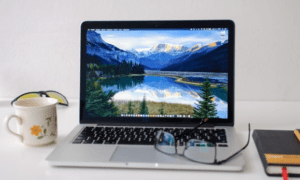
The full-width background image with centered content layout is a popular website design trend that involves using a large, high-quality image as the background of a web page, with the page’s main content centered on top of it. The background image fills the entire width of the page, creating a visually stunning effect that immediately captures the user’s attention.
The centered content is typically placed in a container or box that has a fixed width, providing a clear separation between the content and the background. This layout is often used for home pages, landing pages, or other pages that need to make a strong visual impact and draw the user’s attention to important content.
One of the main benefits of using this layout is its ability to create a memorable first impression and convey a strong message or brand identity. The full-width background image can be used to showcase products, services, or other visual elements that are relevant to the website’s content. This can help to create an emotional connection with the user and encourage them to engage further with the website.
Some examples of websites that use this layout effectively include Apple’s website, which uses high-quality images of its products to showcase its design and features. Another example is the website of Airbnb, which uses stunning images of travel destinations to inspire users to book their next vacation. The layout can also be used effectively for personal blogs or portfolios, as seen on the website of photographer Zack Arias, who uses a full-width background image of one of his photos to showcase his work.
-
Card-based Layout
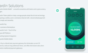
A card-based layout is a web design trend that involves using rectangular or square-shaped cards to display content, such as text, images, and links. These cards are typically arranged in a grid or other formation, creating an organized and visually appealing website layout.
The card-based layout is highly flexible and can display a significant amount of content in a user-friendly manner, making it an ideal choice for e-commerce websites, blogs, and news websites. Each card contains a small amount of information, such as a title, description, and image, and can be clicked on to lead to a more detailed page or action.
This layout is highly responsive, making it a great choice for mobile-first design, as it can be easily adapted to different screen sizes and devices. The card-based layout is also customizable, allowing for the cards to be easily rearranged or removed, creating a dynamic and tailored website design.
Many successful websites utilize the card-based layout effectively, including Pinterest, which displays images in card-based tiles, and Medium, which uses cards to showcase articles and authors. The card-based layout is also frequently used by e-commerce websites such as Etsy and Amazon to showcase their products in a grid format.
Overall, the card-based layout is an excellent option for websites that need to display a significant amount of content in an organized and visually appealing way, while also remaining flexible and responsive to different devices and screen sizes.
3. Asymmetrical Layout
Asymmetrical layout is a web design trend that breaks the traditional grid-based layout and instead utilizes an uneven, unpredictable arrangement of elements. This layout relies on the strategic placement of text, images, and other design elements to create an intentional imbalance that catches the viewer’s attention.
The asymmetrical layout is ideal for websites that want to create a unique and memorable visual experience. This layout creates a sense of movement and flow, allowing the designer to guide the viewer’s eye deliberately. This can be especially useful for websites that aim to tell a story or lead the viewer through a specific journey.
One benefit of an asymmetrical layout is that it allows for greater creativity and flexibility in design. Designers can create unique and unexpected layouts that stand out from the competition. Additionally, asymmetrical layout can add an element of playfulness and excitement to a website, making it more engaging and memorable.
Some examples of websites that use asymmetrical layouts effectively include Dropbox, with its overlapping shapes and bold typography, and Woven Magazine, with its visually striking layout that asymmetrically combines text and images. Another example is the website for the Museum of Science and Industry, which uses an asymmetrical layout to create a sense of movement and excitement, showcasing its exhibits dynamically and engagingly.
4. One-page Scrolling Layout
The one-page scrolling layout is a popular web design trend that presents all of a website’s content on a single page, which users can navigate by scrolling. This design eliminates the need for multiple pages and provides a continuous and uninterrupted user experience.
The layout usually features a fixed or sticky navigation bar that remains visible as users scroll down the page, enabling them to access different sections easily. The one-page scrolling layout is highly versatile and can be used for a variety of website types, such as portfolios, landing pages, and event websites.
One of the main advantages of the one-page scrolling layout is its ability to keep users engaged with the content, as it creates a sense of flow and continuity. Additionally, it simplifies the navigation process and eliminates the need for users to click through multiple pages to find the information they need.
Some examples of websites that use the one-page scrolling layout effectively include Nike’s “Better World” website, which showcases its sustainability efforts through a dynamic, scrolling narrative, and Apple’s “Watch” website, which provides an immersive and interactive experience by featuring all the product’s features on a single page.
-
Grid-based Layout
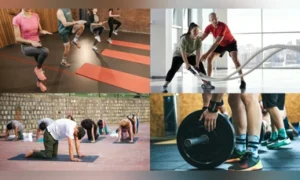
A grid-based layout is a common web design technique that involves using a grid system to organize content on a website. This design structure provides a framework for designers to create a clean and structured website that is visually appealing and easy to navigate.
The grid-based layout typically features a series of vertical and horizontal lines that create a visual grid, which designers can use to align content elements. By utilizing this design structure, designers can create a balanced and organized layout that is aesthetically pleasing to the user. One of the primary benefits of using a grid-based layout is its ability to simplify the design process and create a cohesive visual hierarchy. By aligning elements to the grid, designers can create a sense of order and flow, making it easier for users to navigate the site and find the information they need.
To Sum Up
There are several effective website layout ideas that designers can use to create visually appealing and engaging websites. Ultimately, the best website layout idea will depend on the specific needs and goals of the website. Designers should carefully consider the purpose of the website, the target audience, and the content to choose a layout that best supports the website’s goals and creates an engaging user experience. By selecting the right website layout, designers can create websites that not only look great but also effectively communicate their message and drive user engagement.


