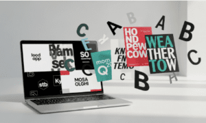
A brand style guide is a blueprint of how to communicate your brand both internally and externally. Having one that is clear and consistent is key to making sure the brand image is delivered in a way that aligns with your company’s vision and tone.
Style guides are easy enough to make, but a good one will really set you apart. “A brand for a company is like a reputation for a person,” states Amazon CEO Jeff Bezos. The key to building that reputation lies within a well-thought-amazonout guide.
What is a Brand Style Guide?
Brand style guides should function as a sort of outline for your company and can work to humanize your brand. “Think of it as your brand’s personality,” says Ann McFerran, CEO of Glamnetic. “No matter what you create, your brand personality should shine through.”
“Think of a company like Disney. Their brand is so strong that they have their own font! Any time you see something from Disney, you can be sure there is going to be a strong personality attached to it. It will always be familiar and friendly. Your company should strive to do the same,” added Ted Toledano, Founder of Modloft.
Your brand style guide should be a professional document that you feel comfortable sharing internally and externally. Make sure to spend a lot of time with it to make sure it’s professional and consistent.
Elements
Style guides tend to include the following elements: brand story, logo, typography, tone of voice, image guidelines, and color palette. If you have been around for a little while, there is a good chance that you already have some of these in place, but bringing them all together and creating an outline for each will serve you well. After all, “Your brand is the single most important investment you can make in your business,” says Steve Forbes, Editor-in-Chief at Forbes.
Brand Story
“A great brand needs a story,” according to Hector Gutierrez, CEO of JOI. “People are drawn to [stories]. So if you share how you got your start, it will resonate with consumers. People want to hear what drives you.”
A good story is crucial to your style guide because it influences everything that follows. They encapsulate your vision, mission statement, and core values in an easy-to-digest manner. This part of your style guide should always come first because what you say in your brand story and how you say it will influence everything that comes after it.
“Use your brand story to grab your customers and reel them in. Even if your story isn’t going to be something that they will see, it will permeate the rest of your brand if it is done correctly,” says Vino Jeyapalan, CEO and Founder of Kabo. “Ask yourself: who are we? Why do we do this? Big questions like these are going to help guide the process of designing your brand identity.”
Logo
Sometimes on the same page as the brand story, the logo plays just as big of a role. These include full logos, secondary logos, and icons. A good logo will embody your brand and serve as a symbol that is easily recognized and unique.
“The logo is the flag of your company. It should fly high and be identifiable instantly,” says Ann McFerran, CEO of Glamnetic. “Use your brand story as an inspiration and use your creative side to see if there are symbols, colors, or shapes that reflect it.”
There are generally seven main categories of logos. Monograms have prominent letters or initials; think Facebook. Wordmarks are focused on the name of the business in a special font (Disney). Pictorial logos focus on creating an icon, an image that will be associated with the brand. Target uses a pictorial logo. Abstract logos take it a step further. They are not an obvious image but something that becomes tied to your brand. Adidas is an example. Mascots are logos that incorporate a person or animal (Wendy’s; Puma). Combinations use both mascots and typography. Patagonia’s typeface laid over the mountains is a combination. Finally, Emblems have a font inside of a symbol or icon. The Starbucks Siren does this well.
“Don’t pick something just because it looks cool; focus instead on finding something that has real meaning to you and your brand. Even seemingly banal logos have an intricate meaning and story if you ask the person who created them. Don’t believe me? Just look up ‘story behind blank company’s logo,’ and you will be shocked at what you find,” commented Seb Evans, Co-Founder of Banquist.
Typography
Typography really comes down to your brand’s font styles, sizes, and spacing. There were only a few fonts to choose from back in the day, but now, there are limitless styles and configurations your company can use to stand out.
Think of your typography less as fonts for the words that will be in your marketing materials and more of graphic elements and illustrations that will bring your brand to life, offers Jared Hines, Head of Operations at Acre Gold.
“We spent a lot of time looking through different fonts that matched our overall ‘energy.’ Some fonts are just too jagged and come off as curt or overly formal. We wanted to have a font that felt lowkey and approachable. It sounds funny to think of a font that way, but just look at the difference between Times and Courier and tell me they don’t invoke different feelings.”
There is no wrong answer when it comes to choosing a font. It all comes back to what you are trying to communicate to consumers.
Fonts tend to fall into different families. Serif fonts are classic and safe. Sans-serif is similar but more modern and has a sleeker feel. Slab serif fonts are almost bold in appearance. Honda uses a slab serif font. Script is a sort of cursive, like the Instagram logo. Handwritten fonts are close to script, but they are more artistic and unique. They appear to be handwritten by someone in the company. Decorative fonts like the Disney logo we spoke about up top are much more dramatic than the others.
These will likely only be used when writing out your company’s name or in headers on external documents. You will need to choose different fonts for the rest of your company’s marketing materials and internal and external content. Style guides will also include guidelines on when to use what font where.
Tone of Voice
The tone you choose to take in your external and internal communication will strongly impact how your brand is perceived. Your tone of voice should really convey the attitude you want customers to feel when they interact with your brand.
“You have to make a decision up top on how you are going to speak to your customers. Some brands are fans of the funny and friendly vibe, while others want to keep it more professional. Think about your product and services. Should a healthcare company be using puns in every sentence? Probably not. But a sunglasses brand? Yeah, that will probably translate well. Know your audience,” mentioned Shaun Price, Head of Customer Acquisition at MitoQ.
The tone of voice you decide on can vary and doesn’t have to be one-hundred percent friendly or professional. Some style guides will write out the exact percent they want of each. You might include something like “70% serious and 30% funny” as a guide for others to follow. Make sure to clearly fall on one side of the other in terms of picking a tone. If not, you can wind up not having a clear voice at all.
Image Guidelines
Think of image guidelines as a mood board for your company. The images you include in your brand style guide will help define the look and feel of your brand. “How do you want things to look? Do you want your brand to look more artistic, or do you want it to be more commercial? Should images be close up and claustrophobic or more spacious? The images you choose will help convey a feeling,” says Chris Vaughn, CEO of Emjay.
This portion doesn’t need to include actual product images; you may not have those yet. What it does need to include are images that approximate the imagery you want to be associated with your brand. Jeremy Goldstein, CEO of Navitar, recommended “…to include words to go with your images. We specified wanting images that feel bombastic and neon. That helped our graphic designers when creating product images.”
Use colors, photos, and illustrations as examples.
The Color Palette
Brand colors are important to brand recognition. As humans, we are hardwired to respond to color. It is in our genes and the reason we are able to identify more shades of green than any other species. Keeping your core brand colors consistent and easily identifiable will make your brand’s style stand out from the pack.
“Netflix red and Facebook blue, ever heard of them? There are two brands that you just can’t picture without seeing those colors,” says Omid Semino, CEO and Founder of Diamond Mansion.
There are many, many colors to choose from. Start primary and then work your way out to secondary. Don’t fall for the trap of being overly complex; your color palette can be as simple as one color.


