Do you ever wonder how data science has revolutionized our world and transformed the way we work, live, and interact? From predicting healthcare outcomes to advancing the efficiency of transportation systems, data science has become an indispensable tool in nearly every industry. In this exciting blog post, we will dive into the real-world applications of data science that have had a profound impact on society. Get ready to be amazed as we uncover the hidden gems behind this groundbreaking technology and explore how it has shaped our present and holds immense potential for our future. Join us as we embark on a journey through time and witness firsthand the incredible impact of data science!
Introduction to Data Visualization and its Importance in Data Science
Data visualization is the graphical representation of data and information through visual elements such as charts, graphs, maps, infographics, and dashboards. It is an important tool in data science that allows us to easily understand and interpret large amounts of data.
The primary goal of data visualization is to communicate insights and patterns hidden within complex datasets. By using visual elements, it makes it easier for humans to process and comprehend the information compared to traditional methods of viewing raw numbers or text-based reports. This makes data visualization an essential part of any successful data science project.
One of the key advantages of data visualization is its ability to reveal trends and relationships between different variables in a dataset. With the help of various types of charts such as line graphs, bar graphs, pie charts, scatter plots, etc., analysts can identify patterns that may have been difficult to spot otherwise. These insights can then be used by businesses or organizations to make better decisions based on evidence rather than intuition.
In today’s digital age where we are bombarded with large amounts of data from various sources such as social media, internet activity, consumer behavior, etc., being able to visualize this overwhelming amount of information has become more important than ever before. Data visualization not only helps us understand the complexities within these datasets but also enables us to communicate our findings effectively with others.
Benefits of Using Data Visualization to Communicate Insights
Data visualization is the graphical representation of data and information using visual elements such as charts, graphs, maps, and diagrams. It is a powerful tool in the field of data science that helps individuals and organizations communicate insights derived from large and complex datasets. In today’s data-driven world, the ability to present information visually has become essential for effective decision-making. In this section, we will discuss some of the key benefits of using data visualization to communicate insights.
1. Enhanced Understanding and Clarity:
One of the primary advantages of data visualization is that it simplifies complex data sets into easily understandable visuals. The human brain processes images faster than text or numbers, making it easier for individuals to grasp intricate concepts through charts or graphs. Additionally, with interactive visualizations, viewers can manipulate different variables to gain a deeper understanding of the underlying patterns and relationships within the dataset.
2. Efficient Communication:
Data visualization allows us to convey information quickly and efficiently. With just one glance at a chart or graph, viewers can understand patterns and trends without having to go through pages of raw data. This saves time for both the presenter and audience during meetings or presentations where time is limited. Moreover, with advancements in technology, it is now possible to share interactive visualizations online, enabling efficient communication even across remote teams.
3. Engaging Presentations:
Using visually appealing charts and graphs makes presentations more engaging than traditional text-heavy slideshows. Visuals help break down complex concepts into digestible chunks that grab people’s attention more effectively than text. This can be especially useful when trying to convey complex data or insights to non-technical stakeholders who may not have a deep understanding of the subject.
4. Discovering Hidden Patterns and Trends:
Data visualization can help uncover hidden patterns and relationships within data that may not be apparent at first glance. By visualizing data, we can identify correlations, outliers, and trends that would otherwise go unnoticed in traditional tabular data formats. These visual cues can lead to valuable insights and inform decision-making processes.
5. Increased Data Literacy:
Data literacy refers to the ability to understand, analyze, and interpret data to make data-driven decisions. By using data visualization, individuals can become more familiar with different types of charts and their applications, making it easier for them to understand and communicate complex information in various contexts. This increased understanding of data leads to better decision-making across all levels within an organization.
6. Customizable and Interactive:
With advancements in technology, it is now possible to create highly customizable and interactive visualizations that allow users to manipulate variables effortlessly. This makes it easy for viewers to explore data further and gain insights tailored to their specific needs and interests.
Types of Charts and Graphs for Effective Data Visualization
The use of charts and graphs is an essential aspect of data visualization in the field of data science. These visual representations allow us to understand and interpret complex data sets in a much more accessible format, making it easier to identify patterns, trends, and relationships within the data. In this section, we will discuss some common types of charts and graphs used in effective data visualization.
1. Bar Charts:
Bar charts are one of the most commonly used types of charts for visualizing categorical data. They consist of rectangular bars that represent each category’s values, with the height or length of the bar corresponding to its value. This type of chart is ideal for comparing different categories’ quantities and identifying which category has the highest or lowest values.
2. Line Graphs:
Line graphs are excellent tools for visualizing trends over time. They use a line to connect individual data points, allowing us to see how a particular variable changes over time continuously. Line graphs are useful for identifying patterns, such as growth or decline in a trend.
3. Pie Charts:
Pie charts are circular diagrams divided into sectors that represent each category’s proportionate share within the whole dataset. This type of chart is perfect for showing what percentage or portion each category contributes to a total value.
4. Scatter Plots:
Scatter plots show the relationship between two numerical variables by plotting them as points on a graph. The position of these points indicates where they are positioned on each axis based on their respective values, making it easier to visualize correlations between the two variables.
5. Histograms:
Histograms are similar to bar charts but are used for visualizing continuous data rather than categorical data. In a histogram, the bars represent ranges of values instead of individual categories, making it easier to identify the distribution and frequency of data within a specific range.
6. Heat Maps:
Heat maps use colors to represent different values on a grid or map. They are useful for visualizing large datasets and identifying patterns or trends based on location or geography.
7. Bubble Charts:
Bubble charts are similar to scatter plots but use bubbles or circles of varying sizes to represent each data point’s value. This type of chart is ideal for comparing three numerical variables at once by using the x-axis, y-axis, and bubble sizes to represent each variable.
8. Treemap:
Treemaps use nested rectangles or squares to represent hierarchical data in a visually appealing way. The size and color of each rectangle can be used to display different values, making it easy to compare quantities between categories.
9. Radar Charts:
Radar charts, also known as spider charts, are useful for comparing multiple variables at once by plotting them on a circular graph with each variable represented as a separate axis. This type of chart is ideal for identifying similarities and differences between categories.
10. Waterfall Charts:
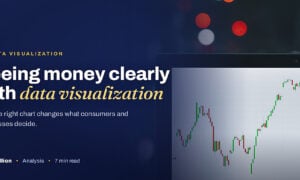
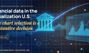
Waterfall charts are used to show the cumulative effect of positive and negative changes on an initial value. They are ideal for visualizing financial data, making it easy to see the overall profit or loss over a period of time.
Tools and Techniques for Creating Compelling Data Visualizations
Data visualization is an essential tool in the field of data science, as it enables us to comprehend and communicate complex information effectively. In recent years, there has been a significant increase in the amount of data being generated and analyzed, making it crucial for data scientists to present their findings in a visually compelling manner. In this section, we will explore some of the top tools and techniques used by data scientists to create captivating visualizations.
1. Data Visualization Tools:
There are many powerful tools available for creating data visualizations, each with its unique features that cater to specific needs and preferences. Some popular ones include Tableau, Power BI, QlikView, Google Data Studio, and Plotly. These tools offer user-friendly interfaces with drag-and-drop options to customize charts and dashboards according to one’s requirements. They also provide versatile options such as integrating external datasets from multiple sources, real-time updating capabilities, interactive elements like filters and drill-downs, pre-built templates for different types of visualizations, and much more.
Another popular tool among the coding community is Python’s Matplotlib library – a comprehensive 2D plotting library that allows users to create visually appealing charts using simple syntaxes. It offers various customization features along with advanced functionalities like subplots and animations.
2. Interactive Data Visualizations:
Static charts have long been used in presentations and reports; however, interactive data visualizations have gained immense popularity over time due to their ability to engage users actively. These types of visualizations can range from simple hover-over tooltips to more complex click-and-drag interactions. They are widely used in dashboards, websites, and mobile applications, enabling users to explore data at their own pace.
One such technique is the creation of interactive heat maps using tools like GeoDa or D3.js, where users can zoom in and out on a world map to view data for different regions. Similarly, tree maps can be animated to show changes in size and color as the user interacts with them.
3. Storytelling through Data Visualizations:
Storytelling is a powerful way to make an impact with data visualizations. It involves constructing a narrative around the information presented in charts and graphs to create a compelling story that resonates with the audience. This technique is particularly useful when used for business presentations, explaining complex concepts or trends, or even highlighting social issues.
A popular tool used for storytelling through data visualization is Adobe Illustrator, which allows users to create visually appealing infographics by combining text, graphics, and charts.
4. Dashboard Design Principles:
Dashboards provide an overview of multiple data points at once and serve as an effective means of summarizing large amounts of data. However, designing an effective dashboard requires careful consideration of various principles such as layout, color palette , consistency, and simplicity. Using a combination of charts such as bar graphs, line charts, and scatter plots to effectively showcase data is also crucial.
One popular design principle used by data scientists is the “less is more” approach, which involves limiting the number of elements on a dashboard to avoid clutter and confusion. Another essential principle is using a consistent color palette to represent different types of data to enhance readability and cohesiveness.
5. Infographics:
Infographics are a popular method for presenting statistical information in a visually appealing and easy-to-understand format. They combine text, illustrations, and charts to convey complex data points in a simple yet effective manner.
Tools like Canva or Piktochart offer drag-and-drop interfaces for creating infographics without any design expertise. These tools provide pre-designed templates that can be customized with one’s own data and visuals.
In conclusion, creating compelling data visualizations requires a combination of the right tools, techniques, and design principles. With the ever-increasing amount of data being generated and analyzed, it has become even more important for data scientists to have strong visualization skills to effectively communicate their findings to various stakeholders.
Best Practices for Designing Visualizations that Tell a Story
Visualizations are powerful tools for conveying information to an audience, especially when it comes to data science. They allow complex and abstract data to be presented in a visually appealing and easily understandable manner. However, not all visualizations are created equal – some are more effective than others in telling a compelling story with the data. In this section, we will discuss the best practices for designing visualizations that tell a story and how they can have a major impact on the field of data science.
1. Understand your Data:
The first step in creating impactful visualizations is to thoroughly understand the data you are working with. This involves analyzing the dataset, understanding its structure and relationships between variables, as well as identifying any patterns or trends that may exist. Without a deep understanding of the data, it is difficult to create meaningful visual representations.
2. Know your Audience:
To tell a powerful story through visualization, it is important to know who your audience is going to be. Consider their level of knowledge on the topic at hand and use appropriate language and visuals that they can easily comprehend. For example, if presenting to a non-technical audience, avoid using complex charts or technical jargon that may confuse them.
3. Choose the Right Chart Type:
Selecting the right type of chart or graph is crucial in effectively communicating information through visualization. Different types of charts work better for different types of data – for example, pie charts are useful for showing percentages while bar graphs are best suited for comparing quantities.
4.Clean
Real-life Examples of Successful Data Visualization in Action
The use of data visualization in real life has become increasingly crucial in today’s data-driven world. With the rapid advancements in technology and the growing availability of large datasets, companies and organizations are turning to data visualization to extract meaningful insights and improve decision-making processes.
In this section, we will explore some real-life examples of successful data visualization in action. These examples showcase how various industries have leveraged data visualization techniques to gain a competitive advantage and drive business growth.
1. COVID-19 Dashboard by Johns Hopkins University:
At the onset of the pandemic, Johns Hopkins University created an interactive dashboard using data visualization tools to track the spread of COVID-19 globally. The dashboard utilizes maps, charts, and graphs to represent evolving trends and provides up-to-date information on confirmed cases, deaths, and recoveries. It has become a go-to resource for policymakers, healthcare professionals, and the general public seeking reliable information about the pandemic.
2. Spotify’s ‘Wrapped’ Campaign:
Every year, music streaming giant Spotify releases its ‘Wrapped’ campaign that showcases personalized listening habits of its users over the past year through visually appealing infographics and charts. By presenting users with their top songs, genres, artists, time spent listening to music on the platform, Spotify creates a highly engaging experience for its users while also demonstrating its capabilities as a vast repository of user-generated data.
3. Uber’s Movement Tool:
Uber’s movement tool is a digital platform that offers access to anonymized trip-level traffic patterns derived from millions of Uber trips. The tool displays traffic speeds, travel times, and journey distances in an easy-to-understand map interface. This data visualization tool helps city planners and policymakers make informed decisions on infrastructure improvements and urban mobility policies.
4. New York Times Election Coverage:
During the 2020 US Presidential election, The New York Times used interactive data visualizations to offer real-time updates on election results. Through various charts and maps, readers could track voting trends at the national, state, and county levels. The use of data-driven visuals enabled the newspaper to provide a comprehensive and engaging coverage of the election.
5. Nike’s Data-Driven Strategy:
Nike has been utilizing data visualization for years to inform its product design and marketing strategies successfully. Using data from customer demographics, preferences, purchase history, and other relevant factors, Nike creates personalized visualizations that help them understand their customers’ needs better. This enables them to tailor their product offerings to meet specific customer demands effectively.
6. NASA’s Earth Observatory:
NASA’s Earth Observatory uses satellite imagery to create stunning visualizations of our planet’s changing landscape over time. By studying these visuals over extended periods, scientists can analyze patterns like climate change or deforestation accurately.
Challenges and Pitfalls to Avoid in Data Visualization
Data visualization is an essential tool in the field of data science, allowing us to visually represent complex and large datasets in a more understandable and insightful manner. However, despite its numerous benefits, there are still challenges and pitfalls that may arise when creating and interpreting data visualizations. In this section, we will discuss some of the common challenges and pitfalls to avoid in data visualization.
1. Misrepresenting Data: One of the biggest mistakes in data visualization is misrepresenting or distorting the data being presented. This can happen through manipulation of axis scales, truncating or omitting certain data points, or using misleading visuals such as 3D charts that make it difficult to accurately determine the values being displayed. To avoid this pitfall, it is crucial to carefully select appropriate chart types and scales that accurately reflect the data without adding any biases.
2. Overcrowded Visuals: When working with large datasets, it can be tempting to try and include all the information on a single visualization. However, overcrowding a visual with too much information can result in cluttered visuals that are difficult to interpret and may even lead to incorrect conclusions. To avoid this challenge, it is important to prioritize the key insights you want to convey through your visualization and use multiple visuals if needed rather than including everything on one chart.
3. Failing to Consider Audience Needs: Another common mistake is creating visualizations without considering the audience’s needs or level of understanding of the subject matter. It is essential to understand who will be viewing your visualization and what their level of understanding is to create visuals that effectively convey the intended message. For instance, a visual designed for technical experts might include more details and complexity compared to a visual created for a general audience.
4. Lack of Context: A data visualization without proper context can lead to misinterpretation or confusion. It is essential to provide relevant contextual information such as labels, captions, and descriptions to help viewers understand the data being presented accurately. Without context, data visualizations may be open to different interpretations that deviate from the intended message.
5. Inaccurate or Outdated Data: Data visualizations are only as good as the data they are based on. Using inaccurate or outdated data can lead to incorrect conclusions and insights, undermining the purpose of visualization in the first place. To avoid this pitfall, it is crucial to ensure that the data used in visualizations is up-to-date and accurate.
6. Poor Design Choices: Visual design plays a significant role in creating effective and impactful data visualizations. Poor design choices such as using too many colors, fonts, or inappropriate chart types can detract from the message being conveyed and make it difficult for viewers to understand the insights being presented. To overcome this challenge, it is essential to follow best practices in data visualization design, such as choosing an appropriate color scheme, decluttering visuals, and using consistent design elements.
7. Bias and Assumptions: Data visualizations are created by humans and can reflect the biases and assumptions of the creator. For instance, a chart or map that highlights only certain data points or regions may give a skewed representation of the data. To avoid this pitfall, it is important to be aware of your biases and assumptions when creating visualizations and try to present the data objectively without filtering it through your own perspectives.
Conclusion
Data visualization has evolved significantly over the years, and its potential impact on business decision-making is immense. As more and more data is generated and collected, the need for effective visualization techniques to analyze and understand this data becomes crucial. In this blog post, we explored some of the real-world applications of data science and its impact on various industries. Now, let’s delve deeper into the future of data visualization and how it can revolutionize business decisions.