Introduction:
In the world of design, color holds tremendous power. It has the ability to evoke emotions, communicate messages, and create a lasting impact on the viewer. Mastering color combinations is essential for designers seeking to create visually striking and effective designs. In this article, we will explore the art of visual impact through the skillful use of color combinations.
Understanding Color Theory:
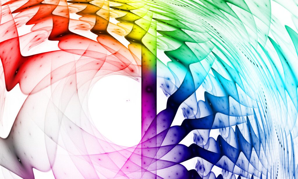
Before delving into color combinations,Having a colorful understanding of color theory is crucial.The color wheel, consisting of primary, secondary, and tertiary colors, provides a foundation for creating harmonious combinations. It is essential to grasp concepts like complementary, analogous, and triadic colors, as they form the basis for effective color schemes.
Creating Contrast:
One of the fundamental principles of visual impact is creating contrast. Contrast helps elements stand out, grabs attention, and adds depth to the design.When working with color, contrast can be achieved through variations in hue, value, and saturation, resulting in a colorful and visually engaging composition.
Combining light and dark colors, warm and cool tones, or vibrant and muted shades can create striking visual contrasts that captivate the viewer.
Harmonious Color Combinations:
Harmony is key to a successful design.Colorful color combinations create a vibrant sense of unity, balance, and coherence. Some popular harmonious schemes include complementary colors, which are opposite on the color wheel, and analogous colors, which are adjacent to each other. These combinations create a visually pleasing and balanced effect.
Exploring Monochromatic Palettes:
A monochromatic color palette, derived from a single hue, can be a powerful tool for creating a sophisticated and cohesive design. By using different shades, tints, and tones of a single color, designers can achieve a harmonious and elegant aesthetic. Monochromatic palettes are often used in branding to create a consistent and memorable visual identity.
Bold and Vibrant Color Combinations:
For designs that aim to make a bold statement, vibrant color combinations can be employed. These combinations often involve complementary or triadic colors and create a visually energetic and impactful effect. However, it’s crucial to use vibrant colors judiciously, as excessive use can overwhelm the viewer. Strategic placement and balancing with neutral elements can help achieve a visually balanced composition.
Considering Color Psychology:
Color psychology plays a vital role in design, as different colors evoke specific emotions and perceptions. Understanding the psychological impact of colors can help designers effectively communicate messages and align designs with desired objectives. For example, blue might convey a sense of calmness and trust, while red can evoke passion and urgency. By harnessing the power of color psychology, designers can enhance the impact of their creations.
Conclusion:
Mastering color combinations is an art form that requires a blend of technical knowledge, creativity, and intuition. Designers who understand the principles of color theory, contrast, and harmony can create visually striking and effective designs that leave a lasting impact on viewers. By experimenting with different color combinations, understanding their psychological impact, and considering the objectives of the design, designers can elevate their work to new levels of visual impact and achieve their desired outcomes. Embrace the art of color combinations and unleash the full potential of your designs.