Choosing the right tile for a space is a big decision, but there’s one part of the process that’s often overlooked grout color. Many people treat grout as a technical necessity rather than a design element. But the truth is, the shade you choose plays a major role in how the entire tile layout looks, feels, and performs over time.
It’s not just about sealing gaps between tiles. Grout color affects visual contrast, the perceived size of a room, and how easily stains or dirt are noticed. It can quietly complement your tile or become a bold feature in your design. That’s why picking the best color for grout isn’t something to rush or leave to chance.
Let’s explore how grout color influences tile design, which shades work well with different tile styles, and how to make confident choices for kitchens, bathrooms, and other areas in your home.
Why Grout Color Deserves Attention
Grout color decisions often come at the end of a tile project, when budgets and energy are running low. But taking time to choose the right shade can be the difference between a finished space that feels cohesive and one that feels off.
Grout does more than hold tiles together. It frames them. It emphasizes shape or mutes it. In a large tiled area, like a shower wall or a kitchen backsplash, the color of grout creates rhythm and pattern. Even a small variation in shade can change how the layout is perceived.
Think about a white subway tile wall. With white grout, the surface appears smooth and continuous. With black or dark gray grout, every tile pops and the design becomes much more graphic. Neither choice is right or wrong it depends on the mood you want to create.
Also, think about lighting. In bright spaces, darker grout adds depth. In dimmer rooms, light-colored grout can reflect more light and create a more open feeling. The grout you choose should support the room’s existing features, not fight against them.
Understanding Color Relationships
Grout color works hand in hand with tile color. But it’s not just about light or dark. It’s about relationships how colors work together, how they contrast, and what feeling they create.
When tile and grout are similar in tone, the surface reads as a whole. This makes tile shape less noticeable and can be great in calm, minimalist interiors. On the other hand, a clear difference in tile and grout color highlights the tile’s edges. It draws attention to pattern, texture, and layout.
If you’re working with patterned tile or intricate shapes, neutral grout tones can help avoid visual clutter. With large tiles, subtle grout lines keep the focus on the surface. If your tile is plain or repetitive, using grout to create contrast adds dimension and interest.
Tile finish also matters. Matte tiles pair well with soft, muted grout colors. Glossy tiles reflect more light and can handle bolder grout choices without becoming overwhelming. Always compare tile and grout samples together before making a final call.
Pairing Grout with Popular Tile Styles
Let’s break down grout suggestions based on common tile choices and room types:
White Tile
White tiles are a staple in kitchens, bathrooms, and laundry rooms. They’re clean, timeless, and versatile. But their appearance changes drastically depending on grout color.
Light grout with white tile creates a seamless look perfect for minimalist interiors and small spaces. It keeps the focus on texture rather than layout.
Gray grout introduces soft contrast without feeling too bold. It’s a practical option too, as it hides stains better than white. This pairing is extremely popular in contemporary kitchens.
Darker grout with white tile creates a statement. The high contrast makes each tile stand out. It’s striking, but also unforgiving—any imperfection in spacing or alignment becomes visible. This combo is often seen in vintage-style bathrooms or urban kitchens.
Subway Tile
Subway tile has made a huge comeback in recent years. Originally used in train stations, it’s now a top choice for backsplashes and bathroom walls. Grout color plays a huge role in its presentation.
White grout creates a clean and simple surface. It’s subtle and safe but requires regular cleaning to maintain the look.
Mid-gray grout adds visual structure while staying low-maintenance. It works well with both glossy and matte finishes.
For a bolder look, colored grout like navy, forest green, or even burnt orange can add personality without changing the tile. This is an excellent option for those who want to stand out while keeping costs down.
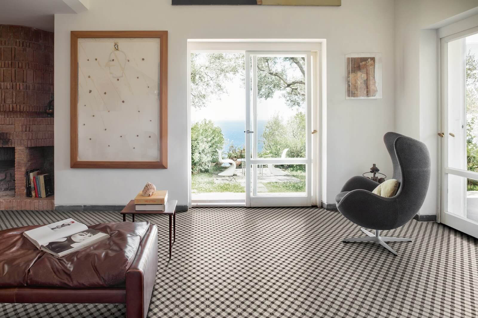
Patterned or Textured Tile
Tiles with patterns or 3D textures already have a lot going on visually. In these cases, it’s often best to keep the grout subtle.
A grout color that matches the background tone of the tile keeps things unified and prevents distraction. This allows the pattern or shape to take center stage.
For example, encaustic cement tiles often feature multiple colors. Choosing grout that blends with the base tone ensures the pattern stays readable and cohesive.
Grout Selection Based on Room Type
The function of a space affects how grout behaves over time. A kitchen backsplash gets splashed with oil. A shower is exposed to steam and water. A hallway floor gets constant foot traffic. These conditions should influence your grout choice.
Kitchen
In kitchens, practicality is essential. Backsplashes are exposed to grease, food splatter, and water. For this reason, mid-tone or darker grout works best. It masks stains and reduces cleaning stress.
If you’re installing floor tiles in a kitchen, neutral grout colors like gray or tan are solid options. They hide dirt and wear well over time.
Island fronts, pantry walls, or accent walls can be places where more creativity is allowed. You could experiment with a bold grout color here if you want to add a unique touch.
Bathroom
Bathrooms tend to be lighter, airier spaces. Here, white or off-white grout is often used with white or light-colored tiles to create a fresh and clean atmosphere.
But be cautious moisture and mold can affect grout over time. If you’re not ready to commit to constant cleaning or sealing, consider a slightly darker grout, such as light gray or beige, especially on floors.
In walk-in showers, where water exposure is high, epoxy grout may be a better choice. It’s more water-resistant and holds color better over time.
Entryways and Hallways
These areas see heavy use and regular foot traffic. Grout color should be chosen with durability in mind.
Medium to dark tones are ideal. They won’t show dirt easily and tend to age better. Pairing earthy tile with taupe or chocolate-colored grout can give your space a warm, natural look while being practical.
Modern Grout Color Trends
Grout colors have come a long way from the standard white, gray, and beige. As design becomes more personalized, so does grout selection.
In 2025, we’re seeing more use of:
- Softer neutrals: Sand, bone, taupe, and greige tones offer warmth and flexibility.
- Color-matched grout: Some tile manufacturers now offer grout in exact shades to match their products, creating a smooth, uninterrupted surface.
- Pastel grout: Mint, blush, and sky blue are appearing in creative home designs, especially in kids’ rooms or statement walls.
- Metallic grout: Used sparingly, silver or bronze grout lines can highlight mosaic or glass tile for a luxurious finish.
Homeowners are no longer limited to three or four grout shades. With better materials and sealing options, it’s easier to use color creatively without compromising durability.
Tips for Making the Right Choice
Choosing grout can feel like guesswork, but there are ways to make the process smoother.
- Request tile and grout samples: Place them together under your actual room lighting. What looks good under store lighting may look completely different at home.
- Think about cleaning and sealing: If your grout will be in a high-stain or wet area, sealing it is a must regardless of color.
- Balance bold tile with neutral grout: If your tile has a lot of color, pattern, or texture, keep the grout simple.
- Use mid-tone grout for flexibility: Shades like light gray, greige, or warm beige tend to go with almost everything and age well.