
Enums, layout factories, and a bit of discipline for building maintainable dynamic UIs.
By Ada Kirsch. Ada is an experienced iOS Developer with more than 10 years of expertise in designing, developing and maintaining small and large-scale iOS applications. She is skilled in delivering high-quality, user-centric solutions with a strong focus on performance and scalability. She is constantly striving to learn new technologies and look to ways to better herself in the applications development industry.
When Flexibility Becomes a Problem
If you’ve worked on a modern iOS app, you’ve probably hit this wall: the server continually determines what appears on the screen — a hero banner, a promo grid, a list of products, or perhaps a carousel — and before long, your collection view becomes a cluttered mess of layout logic. What starts as a “flexible” home screen ends up a mess of conditionals:
if type == “hero” {
…
} else if type == “grid” {
…
}
Each new widget means another if. Another custom layout. Another place for things to break. You open the view controller six months later and can’t remember why half the code exists. I’ve been there. When I first tried to make a fully server-driven UI, I thought the answer was “just be organized.” Turns out, that’s not enough. The real fix is structural: the way you represent the screen itself needs to change.
Step 1. Model Sections with Enums
The simplest and cleanest way I’ve found is to treat every section as an enum case. Each case holds the data it needs — no giant structs full of optionals, no guessing which fields are relevant.
enum ScreenSection {
case hero(HeroVM)
case grid(GridVM)
case list(ListVM)
case carousel(CarouselVM)
}
After decoding the server response, you map it to [ScreenSection]. That array becomes your single source of truth for the screen. You can read the code and immediately see what the screen is made of. It also provides compile-time safety: if you add a new section type, the compiler informs you everywhere you need to handle it.
Step 2. Build Layouts with a Factory
Compositional Layout is great because each section can define its own structure.
But to keep it sane, push all that setup into a layout factory.
struct LayoutFactory {
static func createLayout(for section: ScreenSection) -> NSCollectionLayoutSection {
switch section {
case .hero:
return fullWidthSection(height: .absolute(200))
case .grid:
return gridSection(columns: 2)
case .list:
return listSection()
case .carousel:
return carouselSection()
}
}
Then plug that into your UICollectionViewCompositionalLayout:
UICollectionViewCompositionalLayout { index, env in
let section = self.sections[index]
return LayoutFactory.createLayout(for: section)
}
Now all your layout rules live in one place. You can read the switch and instantly understand the screen’s structure. And when someone says “we’re adding a new promo type,” you just add one enum case and one layout branch. Done.
Step 3. Drive It with a Diffable Data Source
Diffable data sources make this setup feel complete. They pair perfectly with your enum model — one section per enum case, one item list per view model.
var snapshot = NSDiffableDataSourceSnapshot<SectionID, AnyHashable>()
for section in sections {
let id = SectionID(section)
snapshot.appendSections([id])
snapshot.appendItems(section.items, toSection: id)
}
dataSource.apply(snapshot, animatingDifferences: true)
Now the UI updates cleanly when the server changes what’s on the screen. No brittle index math or reload storms. Everything — data, layout, and presentation — flows from that same [ScreenSection] array.
Step 4. Keep Reusable Helpers Handy
At some point, you’ll notice patterns. You’ll write the same kind of grid layout or carousel setup repeatedly. That’s your cue to extract helpers — not frameworks, just plain functions that make layouts readable.
Here’s a simple example:
// Full-width section with a configurable height
func fullWidthSection(height: NSCollectionLayoutDimension) -> NSCollectionLayoutSection {
let item = NSCollectionLayoutItem(
layoutSize: NSCollectionLayoutSize(
widthDimension: .fractionalWidth(1.0),
heightDimension: height
)
)
let group = NSCollectionLayoutGroup.horizontal(
layoutSize: NSCollectionLayoutSize(
widthDimension: .fractionalWidth(1.0),
heightDimension: height
),
subitems: [item]
)
return NSCollectionLayoutSection(group: group)
}
// Standard section header
func sectionHeader() -> NSCollectionLayoutBoundarySupplementaryItem {
return NSCollectionLayoutBoundarySupplementaryItem(
layoutSize: NSCollectionLayoutSize(
widthDimension: .fractionalWidth(1.0),
heightDimension: .absolute(44)
),
elementKind: UICollectionView.elementKindSectionHeader,
alignment: .top
)
}
// Example grid section
func gridSection(columns: Int) -> NSCollectionLayoutSection {
let item = NSCollectionLayoutItem(
layoutSize: NSCollectionLayoutSize(
widthDimension: .fractionalWidth(1.0 / CGFloat(columns)),
heightDimension: .absolute(100)
)
)
item.contentInsets = NSDirectionalEdgeInsets(top: 4, leading: 4, bottom: 4, trailing: 4)
let group = NSCollectionLayoutGroup.horizontal(
layoutSize: NSCollectionLayoutSize(
widthDimension: .fractionalWidth(1.0),
heightDimension: .absolute(100)
),
subitems: [item]
)
return NSCollectionLayoutSection(group: group)
}
// Example carousel section
func carouselSection() -> NSCollectionLayoutSection {
let item = NSCollectionLayoutItem(
layoutSize: NSCollectionLayoutSize(
widthDimension: .fractionalWidth(0.8),
heightDimension: .fractionalHeight(1.0)
)
)
let group = NSCollectionLayoutGroup.horizontal(
layoutSize: NSCollectionLayoutSize(
widthDimension: .fractionalWidth(0.8),
heightDimension: .absolute(200)
),
subitems: [item]
)
let section = NSCollectionLayoutSection(group: group)
section.orthogonalScrollingBehavior = .groupPaging
return section
}
Nothing fancy — but after a few of these, you start to see how they form a shared language inside your team. “Full-width hero,” “two-column grid,” “paging carousel.” Everyone knows what that means.
Step 5. Why This Pattern Works
Let’s pause and look at what’s really happening here. You’ve moved from ad-hoc, imperative UI logic to a declarative model that describes the screen in plain Swift types. It’s not about “architecture” for its own sake — it’s about reducing entropy.
Type Safety
Every section is explicit. If the server sends a new widget, you can’t forget to handle it. Swift won’t let you.
Clean Separation
Your layout code lives apart from your view controllers. When a bug shows up, you know exactly where to look — either the data mapping or the layout factory, not both.
Extendability
Adding a new UI doesn’t require touching existing code. That’s what keeps this system from decaying over time.
Real Server-Driven UI
The server decides what to show. The client stays predictable. You get flexibility without the fragility that usually comes with it.
Step 6. The Flow in Practice
Once you wire everything together, the screen lifecycle looks like this:
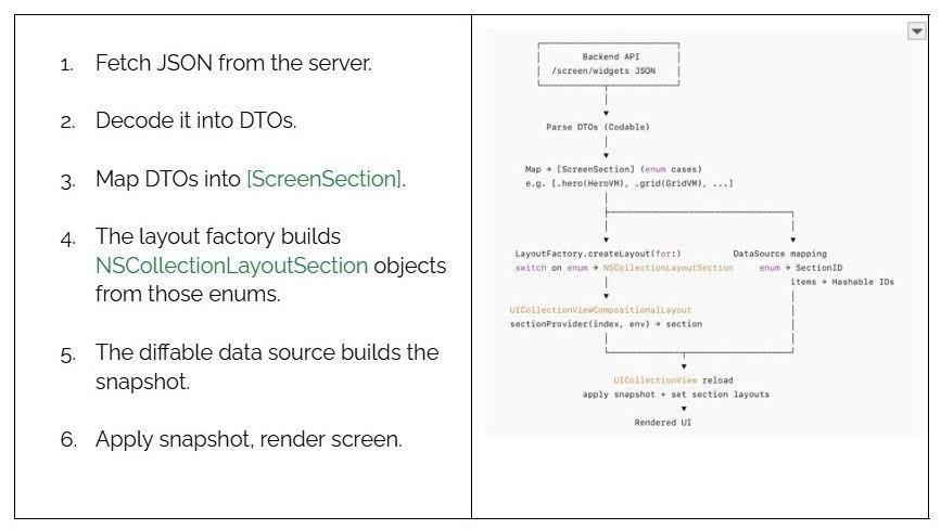
That’s the whole loop. It’s clear, repeatable, and surprisingly easy to debug.
What You Gain Beyond the Code
The biggest difference shows up months later. When a new teammate joins, they can open the [ScreenSection] enum and immediately see every component the screen can render. When design adds a new widget, you can implement it in isolation without touching anything else. When the backend team wants to reorder sections, you don’t need a new layout — the server just changes the payload. It’s the kind of system that quietly saves you hours. You stop worrying about regressions. You spend less time wiring things up and more time refining how they look and feel.
I’ve used this pattern in large-scale apps with many experiments running through the same home screen pipeline. It held up – not because it’s clever, but because it’s reliably straightforward.
A Closing Thought
Server-driven UIs aren’t new. Neither are enums nor compositional layouts. But together, they create a balance most teams never quite reach — a UI that adapts without becoming fragile. If you ever find yourself drowning in conditionals, remember this pattern. Structure doesn’t kill flexibility; it’s what makes flexibility possible.