There was a time when desktop computers were the only way people could connect to the internet and browse websites. However, the evolution of smartphones and tablets has allowed people to remotely access websites on their mobile devices by connecting to Wi-Fi internet.
Statistics show that over 50% of internet users use mobile devices. If you own or operate a website, it must have a design that will accommodate viewers using all different devices and screen sizes. Otherwise, you will lose potential subscribers or customers to your website.
What is a Responsive Web Design?
A responsive web design is a universally engaging web design that appears appropriately on all different devices and screen sizes. So, whether someone uses a desktop computer or smartphone to access your website, it will appear fully functional and aesthetically pleasing to them.
Almost all modern websites need responsive designs to capture the widest audience possible. You don’t want your website design to discriminate against computer or mobile users because millions of people use each. That is why you need to implement a web design into your existing or new website to retain your visitors and keep them engaged.
How Does a Responsive Design Work?
The secret to the success of a responsive web design revolves around three key elements: flexible grids, CSS media queries, and responsive images. A Hereford web design studio would incorporate these elements into your website’s design to ensure that no visitor is dissatisfied.
Here is an overview of the three responsive web design elements:
Flexible Grids
Traditional web designs used fixed-width layouts to align with the screen size of the average desktop computer user. That is no longer sufficient for today’s world because many users access websites on mobile devices with much smaller screens than computer monitors.
As a result, a website’s design layout must use flexible grids (sometimes called fluid grids) that can automatically adjust themselves to the visitor’s screen size. This dynamic approach to web design is critical for scaling and rearranging content to fit every screen size.
CSS Media Queries
CSS media queries refer to the CSS style sheets that determine how content is displayed and rendered under various conditions, such as different screen sizes. When you use media queries with your website’s CSS style sheet, you can apply different design styles to every possible device and screen size that might access and display your website to users.
CSS media queries let you define breakpoints to adjust critical content elements like font sizes and layouts. It requires slightly more work than developing a fixed-width website because you must make multiple queries to accommodate every screen size. On the other hand, the upside
Responsive Images
All the media content, such as the images, must be scalable to properly fit different screen sizes without looking distorted or blurry. If you have poor-quality media assets, they won’t look good if scaled for higher-resolution screens.
Therefore, you must include responsive images in your website that can scale to any screen size without losing their quality and appeal. The trick to doing this is by setting the width property of the images as a percentage rather than pixels. You must also set the height property to “auto” to ensure the image is fully scalable up and down.
The Advantages of a Responsive Web Design
Is it worth investing in a responsive web design? The answer is YES! Let’s take a look at the top four advantages of a responsive web design so that you will understand how and why it will benefit your brand or business:
1) Easy Maintenance
Maintaining a responsive website is much easier than you might think because you only need to update one website for the results to appear across all platforms.
Traditionally, a fixed-width website requires you to make multiple versions of the website to accommodate all the different screen sizes of your visitors. With a responsive website design, you only need to create one version for all screen sizes. That way, when you update that one version, those updates are reflected on all devices and screens.
2) Improves SEO Website Ranking
Did you know that search engines like Google will rank websites higher on search results pages if they have responsive designs?
The search engine algorithms are programmed to detect responsive designs because they are more user-friendly to people. User-friendly websites will consistently rank higher than ones with non-responsive designs.
For this reason, you should invest in a responsive design for your website to improve its search engine ranking and attract more organic traffic.
3) Better User Experience
The user experience means everything when someone visits your website. If you wish to retain visitors and keep them engaged with your website in the future, they must have a pleasant experience on it. Otherwise, they will never want to come back again.
A responsive design will make the user experience enjoyable and simplified. Visitors can easily navigate your website and access content without seeing distortions or limitations. That will make them want to return to your website and recommend it to their friends and family.
Increasing conversions and reducing bounce rates is what every web admin should strive to achieve when owning and operating a website. Doing this starts with a responsive design.
4) Faster Loading Speed
Part of the user experience revolves around the speed at which content loads for people. The content on a responsive website loads much faster than on a traditional website, especially the media content.
Remember that responsive images are optimized to scale and adjust to different screen sizes without losing their quality. It also means they don’t need to be large-sized image files, either. Because of this, the images will load fast for everyone, regardless of their device.
Hire a Professional
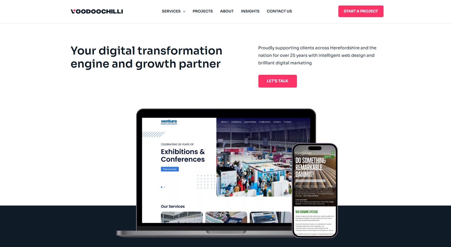
Only a genuinely skilled web design professional can create and implement a responsive web design into a website. A company like Voodoo Chilli offers Hereford web design services, including responsive design creation, branding, SEO, and website maintenance services.
Contact Voodoo Chilli at 01432 278766 or mailto:mail@voodoochilli.com for more information.