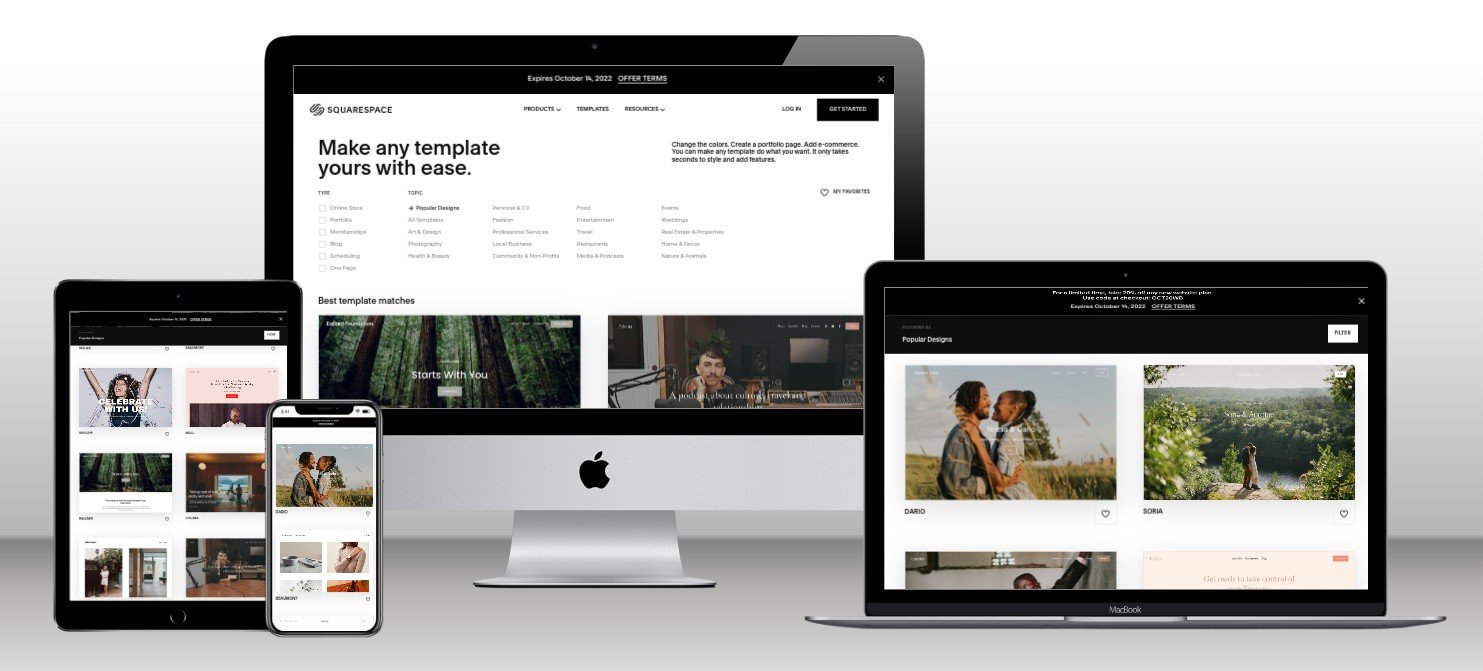
In today’s mobile-first world, having a website that looks great on any device isn’t a luxury—it’s a necessity. If you’re building your site with Squarespace, you’re already ahead of the game. Squarespace’s built-in responsive design tools make it easier than ever to ensure your content looks stunning across desktops, tablets, and smartphones.
Let’s explore what responsive design really means, why it’s crucial for your website’s success, and how to make the most of it using Squarespace—plus how to save with SquareSpace Coupon codes.
What Is Responsive Design?
Responsive design is a web design approach that automatically adjusts your website’s layout, images, text, and navigation to fit different screen sizes and orientations. Rather than creating separate designs for phones, tablets, and desktops, responsive design ensures a single site adapts seamlessly to all devices.
Why Responsive Design Matters in 2025
Here’s why responsive design isn’t just important—it’s critical:
1. Mobile Traffic Dominates
Over 60% of all web traffic comes from mobile devices. If your site doesn’t look or function properly on a phone, you’re losing more than half your potential audience.
2. Boosts SEO Rankings
Google prioritizes mobile-friendly websites in search results. A responsive Squarespace site improves your visibility and rankings, driving more organic traffic.
3. Enhances User Experience
Visitors are more likely to stay and engage with your content when your site loads quickly and looks great, no matter the device.
4. Increases Conversions
Whether you’re selling products, booking appointments, or collecting emails—responsive design ensures every visitor can take action easily.
How Squarespace Makes Responsive Design Easy
Squarespace takes care of responsive design automatically. Here’s how:
✅ Built-in Mobile Optimization
Every Squarespace template is designed to be mobile-friendly right out of the box. No need to create multiple versions of your site.
✅ Custom Layout Adjustments
With intuitive drag-and-drop tools, you can preview and tweak layouts specifically for different devices.
✅ Automatic Image Scaling
Your images automatically resize and reformat based on the screen size, maintaining fast loading times and visual quality.
✅ Style Editor Controls
You can customize fonts, colors, and spacing that adapt to any screen without writing a single line of code.
Tips for Getting the Most Out of Responsive Design on Squarespace
- Use content blocks smartly: Stack content vertically for mobile users.
- Preview on all devices: Use Squarespace’s preview tool to test your design on phones, tablets, and desktops.
- Compress images: Faster load times equal better user experience and SEO.
- Avoid Flash or large files: These elements don’t perform well on mobile and can drive visitors away.
Save on Your Squarespace Subscription
Ready to build a beautiful, responsive site? Don’t forget to use SquareSpace Coupon codes to save on your subscription.
Whether you’re launching a blog, portfolio, or online store, you can get discounts on monthly or annual plans. Search for current SquareSpace Coupon codes before checkout to make the most of your investment.
Final Thoughts
Responsive design is no longer optional—it’s essential. Squarespace makes it easier than ever to create a professional, mobile-optimized website without the technical headache.
Take advantage of Squarespace’s powerful tools and make sure every visitor gets a flawless experience. And before you go live, make sure to use the best available SquareSpace Coupon codes to save on your plan.