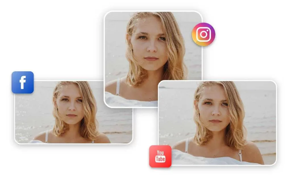
Photos need to be resized and optimised for many purposes like social media, digital or billboard marketing, and websites. When browsing through various websites on the internet, the most common hurdle we come across is slow loading. It is because the images are of an improper size and thus require the browser to resize them each time the page loads. This results in too much time wastage because a web page usually consists of many bytes. Thus, we must use tools like online photo resizer to employ methods to resize our images for easy loading.
Why Resize Images in Different Formats
Websites or your photo gallery with resized and optimized images undoubtedly have better results. Websites with good user experience gain more visitors because the search engine tends to favor them. Discussed below are a few further reasons why resizing images is important for a successful website experience.
Adjust The Width and Height of the Images
Irrespective of the size of your image, the browser loads the whole image and resizes it so it can be displayed effectively on the given screen size. So it’s best to keep the size of your image within the permissible size range. For Example, if your home page section has a specific limit of 620 pixels, it’s best to follow that limit and not upload an image that is larger or depends on the browser to adjust it.
Needlessly huge images take forever to load and use more of the user’s data than necessary, which is not recommended. Thus, tools like WordPress provide some options when you add an image. However, it’s important to remember that only the size of the display is affected, the file size however remains unchanged.
Making Responsive Images
After resizing a photo, it’s equally important to ensure that it displays perfectly on other devices and smaller screens. You are also able to properly set the width in style sheets, and ensure that you set the property to 100%. This gives the advantage of the image automatically adjusting itself to the required size rather than retaining a fixed size. No matter what size the window is, the image will resize on its own to meet the required size.
This also prevents the ever so repulsive horizontal scrolling which is so unpopular among users. Moreover, if you wish to limit your image size and make sure it doesn’t get any bigger on huge screens due to quality loss, you can use the max-width property. Setting the max width to 100% means that the image cannot exceed its original size. Thus, you can make the image as small as possible within your needs.
Performing Image Compression
Another major aspect of image resizing is known as compression. It’s quite technical to understand how exactly it works, but compression squeezes your image data into smaller bits and sends it to the browser. There it can easily attain its original shape. There are two kinds of images which are as follows: lossy and lossless. Lossy compression involves depletion of the original image quality, resulting in a bit blurry version.
On the other hand, lossless image compression involves no loss in image quality. This is the most preferred option because the images retain their sharpness and are crisp. PNG and GIF files are effectively compressed losslessly, but JPEG compression is quite lossy, although it may be suitable for smaller images. For this reason, you may convert your files from PNG to JPG.
Scale Up the Images
One of the reasons an image appears fuzzy and blurred is because it’s scaled up. The tiny pixels are stretched and expanded which does not look good at all. Moreover, even setting the image to 1920 pixels does not solve the matter because they require more download time. This is bad for website visitors and leads to poor search engine optimization. Percentages also do not work well for search engines.
Ideally, a photo should be the exact size as required by the page and that pixel size must be stated in the code. Search engines prefer a clear idea of dimensions. This is due to the reason that browsers can display the page with all the data in the correct position before the images are downloaded. This further proves how important image optimization is, even though it’s quite a complicated process and there isn’t a standard size.
Conclusion
When the photos are smaller in size, lossy compression is possible without making the quality difference too obvious to the naked eye. However, it’s not recommended to let the image quality be below 85%. In case your images are displayed on a larger screen, the result is quite blurry and a lot more noticeable. It’s a smart idea to toy around with your JPEG files and determine the extent to which they can be compressed while retaining image quality. No doubt resizing and optimizing images takes a lot of work, but a fast-loading image has numerous advantages. Use a reliable online photo resizer because less loading time guarantees better website performance in the long run.


