When it comes to interior design, the color palette one selects sets the foundation for the overall aesthetic and emotional tone of a space. Neutrals have long held a foundational place in this world; their ability to complement and elevate an environment without overwhelming it is unmatched. Understated but significant, these hues provide a blank slate for a variety of designs to manifest, establishing them as an essential element in the creation of stylish, sophisticated interiors. For both novice decorators and seasoned professionals alike, understanding neutrals is akin to mastering a key language of design.
This article will offer a unique perspective on the power of neutrals within the home. Specifically, it investigates the process of selecting the right balance of neutral shades to suit the natural lighting and existing decor of a space. We’ll also explore the strategic layering of textures and tones to add complexity, the thoughtful introduction of color to inject life, the intentional use of contrast for visual interest, and the careful accessorizing that can further define a room’s character.
Choosing the Right Neutrals
When considering the range of neutral colors, noticing the slight variations in undertones is key for creating a color scheme that blends well with the natural light and elements already present in a space. Warm beiges can give a space a warm feel, especially in rooms filled with the warm light of the afternoon sun, while cool grays can create a sharp, contemporary look in brightly lit or north-facing spaces.
The key is in the careful consideration of the room’s natural light, along with taking into account current finishes — such as flooring, cabinetry, and countertops — and the color and texture of furnishings, all of which play an important role in interior design company decision-making. Through this careful choice process, one ensures the selected neutrals not only match the room’s vibe but also improve its natural features, creating a cohesive and calm look.
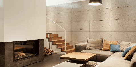
Layering Textures and Tones
Exploring deeper into the neutral shades, introducing a variety of textures and shades is similar to using a diverse range of colors—each addition brings depth to the décor of your home. Picture the contrast between soft linen drapes and a sleek leather couch, or the country appeal of a roughly cut wooden table against the sleek surface of a wall painted in satin finish.
By choosing different tints within the same neutral group, the visual interest is gently increased without being too conspicuous; a dove gray can enhance a charcoal item, for example. Metal finishes also add to the overall effect, with brushed nickel providing a modern touch and aged bronze exuding a classic coziness. Fabrics fulfill various roles, their textures range from the plushness of a woolen blanket to the sharpness of a cotton cushion. It’s in the careful choice of these components that a neutral color scheme lifts the design above the standard, forming a look that is both organic and refined.
Pops of Color
Integrating colors into a mostly neutral setting revitalizes and gives a personal touch to your living area. To catch the eye and add vibrancy, include strategic color highlights in your rooms, choosing either emphatic, strong tones, or soft pastel tones. These colors can range from an attention-grabbing piece, a painted feature wall, or decorative items like cushions and containers.
Gentle pastel colors are subtle, making for a calm and welcoming space, while strong colors, used purposefully, can challenge the calmness of neutrals, injecting vitality and establishing focal points in a room. Harmonizing these highlights—selected with care and displayed against a neutral backdrop—transforms a room into a visually pleasing and dynamic area.
Creating Contrast
Creating a captivating neutral palette lies in the contrast. This requires more than just choosing colors; it’s about creating relationships between colors and textures that appeal to the senses. Imagine the stark interplay between the delicate light of ivory pillows against the rich depth of a dark brown throw rug. The combination of cool and warm tones brings a room to life, with cool blues providing a soothing backdrop to the energizing warmth of terracotta accents.
It’s through this play of light and dark, as well as cool and warm hues that one uncovers the perfect balance for their home—a space that guides the eye from one area to another without ever feeling overwhelmed. So, use subtle shades of a neutral palette alongside strong contrasting elements to achieve a design that offers both simplicity and depth, providing a sophisticated visual experience.
Accessorizing With Neutrals
To effectively enhance a space using a neutral color scheme, carefully select items like throw pillows, vases, and rugs in neutral colors; which are both adaptable and timeless, which makes it simple to update the look as wanted. Skillfully accessorizing with neutrals involves subtle differences in shades and the textures and finishes of the items: a soft beige cashmere blanket adds a touch of luxury, while a matte charcoal ceramic lamp can create a serene, stabilizing ambiance.
Consider how different neutral items work together, ensuring they are compatible with each other and the overall design of the room. By selecting items that harmonize well and are also flexible in design, you can easily update your space with small changes, maintaining a look that is fresh yet enduring.
Interior design hinges greatly on the chosen color palette, setting the tone and ambiance of a space. Neutrals stand out as foundational elements, offering a versatile canvas that harmonizes with various design schemes. Their understated yet impactful presence allows for the creation of stylish and sophisticated interiors. This article has explored the art of selecting the perfect balance of shades to complement natural lighting and existing decor. Additionally, we’ve discussed the layering of textures and tones, the strategic introduction of pops of color for vitality, and the importance of creating contrast for visual interest. By skillfully accessorizing with neutrals, one can maintain a fresh yet enduring look in their home.