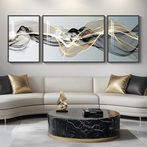
Luxury interior design has long relied on material richness, proportion, and controlled contrast to express refinement within residential and commercial spaces. Among the most enduring visual statements is the use of gold-toned artwork, particularly within curated collections such as the Gold Collection, which presents metallic-infused abstract pieces in varied sizes and textured contemporary styles. These works reflect layered finishes, brushed metallic pigments, and dimensional surfaces designed to elevate modern interiors without overwhelming them. Gold-toned abstract wall art offers warmth while maintaining a disciplined aesthetic that suits both minimalist apartments and expansive luxury homes. When integrated thoughtfully, it transforms neutral rooms into balanced environments that communicate confidence and permanence.
The Symbolism of Gold in Interior Spaces
Gold has symbolized prosperity, warmth, and cultural prestige across centuries of architectural history. In contemporary interiors, it functions less as ornamentation and more as an accent that introduces luminosity. Designers often use gold tones to counteract cool palettes dominated by stone, glass, or matte finishes. This interplay softens strict minimalism while preserving clarity of form. The result is a space that feels curated rather than decorated.
Gold reflects light differently from flat pigments, which makes it especially powerful in open-plan living areas. During daylight hours, metallic surfaces capture natural light and create subtle movement across textured canvases. In the evening, artificial lighting enhances its depth and produces a controlled glow. This adaptability makes gold abstract paintings suitable for urban flats in London as well as coastal homes along the British shoreline. The versatility reinforces why designers consistently return to metallic palettes.
In high-end residential projects, gold accents frequently appear alongside marble, velvet, and dark timber. These combinations create contrast without visual noise. A large gold-toned abstract canvas above a fireplace anchors the room while drawing the eye upward. Interior architects often treat artwork as a structural component rather than a final accessory. This perspective ensures that art contributes to spatial planning from the outset.
Commercial interiors also benefit from gold symbolism when used with restraint. Boutique hotels and executive offices integrate metallic abstract pieces to convey authority and stability. Clients and guests subconsciously associate warm metallic tones with longevity and success. Yet professional designers avoid excessive shine, opting instead for brushed or textured finishes. Such choices maintain sophistication while avoiding theatrical excess.
Metallic Accents in Modern Abstract Painting
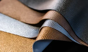
Modern abstract painters use metallic pigments to introduce dimension without relying on figurative imagery. Gold leaf, mica powders, and layered acrylic mediums produce surfaces that shift depending on viewpoint. These techniques allow artists to create depth through texture rather than narrative. The outcome is art that complements diverse architectural styles. It feels contemporary yet grounded in traditional craftsmanship.
Metallic accents often highlight compositional focal points within abstract designs. A sweep of gold across a muted background can guide the viewer’s attention toward balance lines and geometric intersections. Designers appreciate this quality because it harmonizes with structured interiors. The metallic element operates as both a color and a reflective surface. This dual function enhances its visual impact.
In luxury apartments, smaller metallic artworks can frame entryways or reading corners. The glimmer provides interest without overwhelming intimate spaces. Larger canvases with layered gold textures perform well in expansive living rooms with high ceilings. Their scale amplifies the architectural height of the room. Such deliberate placement ensures that metallic elements remain integrated rather than intrusive.
The craft behind metallic abstract art requires technical control and material knowledge. Artists must understand how different mediums react under varying humidity and light conditions. High-quality canvases prevent warping, while sealed finishes preserve color stability. These production standards align with the expectations of discerning collectors. Investing in durable craftsmanship supports long-term aesthetic value.
Textured Surfaces and Visual Depth
Texture introduces tactile richness that flat prints cannot replicate. Thick impasto layers, palette knife techniques, and embedded metallic fragments create subtle shadows. These shadows alter perception throughout the day. As natural light shifts, the artwork reveals new contours. This evolving quality adds vitality to static interiors.
Textured gold surfaces are particularly effective in spaces dominated by smooth finishes. Glass balustrades, polished stone floors, and lacquered cabinetry benefit from the contrast. The raised elements absorb and reflect light unevenly, creating a layered glow. Designers often pair textured art with soft furnishings such as wool rugs or linen curtains. This repetition of tactile contrast builds cohesion across the room.
In premium office settings, textured abstract paintings introduce warmth into otherwise functional layouts. Boardrooms and reception areas can feel sterile when dominated by steel and glass. A metallic textured canvas counterbalances this severity. It signals attention to detail and creative thinking. Subtle dimensionality encourages longer visual engagement from visitors.
Homeowners increasingly recognize how texture influences mood. Flat, mass-produced prints may fill wall space, yet they rarely anchor a room emotionally. Textured art commands presence without relying on bold color saturation. The quiet interplay of shadow and metallic sheen feels deliberate. Such qualities contribute to a composed and intentional interior.
Scale, Proportion, and Placement
Selecting the appropriate size for gold-toned abstract art shapes the perception of an entire room. Oversized pieces create focal authority, especially in open living areas. Smaller canvases can be grouped to build rhythm along corridors or staircases. Proportion must relate to wall height, furniture arrangement, and sight lines. Without this alignment, even premium artwork can feel misplaced.
Interior designers often calculate artwork width as a percentage of the furniture beneath it. A canvas spanning two-thirds of a sofa length generally achieves balance. In tall spaces, vertical compositions draw the eye upward and emphasize architectural height. Horizontal formats complement elongated dining rooms. These measured decisions reinforce visual harmony.
In commercial projects, scale influences brand perception. A substantial gold abstract painting in a reception area conveys confidence and permanence. Conversely, modest pieces placed thoughtfully within private offices encourage focus and calm. Placement must consider lighting sources to avoid glare on metallic surfaces. Strategic positioning ensures the reflective qualities enhance rather than distract.
Residential clients in the United Kingdom often favor adaptable sizing options. Homes vary widely from compact city flats to countryside estates. Offering multiple dimensions allows art to integrate seamlessly into diverse floor plans. This flexibility supports personalized design without compromising luxury standards. Thoughtful sizing transforms abstract art into an architectural partner.
The Influence of Abstract Pop Art on Premium Interiors
Contemporary interiors increasingly draw inspiration from abstract pop art aesthetics. Bold color blocking and graphic movement influence how designers curate statement pieces. Discussions around Modern abstract pop art for home and office review illustrate how modern abstract pop art reshapes both home and office environments. Gold tones often merge with vibrant accents to balance energy and refinement. This fusion creates interiors that feel current without sacrificing elegance.
Abstract pop art introduces playful geometry into traditionally restrained spaces. When integrated carefully, it injects vitality into luxury settings. Designers may combine gold metallic backdrops with expressive The contrast between polish and spontaneity keeps rooms dynamic. It ensures that opulence never becomes static.
In corporate offices, abstract pop art elements can soften rigid branding palettes. A gold-infused pop abstract canvas adds warmth while preserving professionalism. The visual movement encourages creativity among teams. Yet designers maintain proportion and cohesion to prevent visual overload. Balance remains central to successful execution.
The integration of pop influences also aligns with global design trends. Younger homeowners seek expressive interiors that reflect personality. Gold tones anchor these experiments in sophistication. The interplay of metallic depth and bold abstraction bridges generational tastes. Such adaptability explains the sustained relevance of gold-toned abstract art in premium interiors.