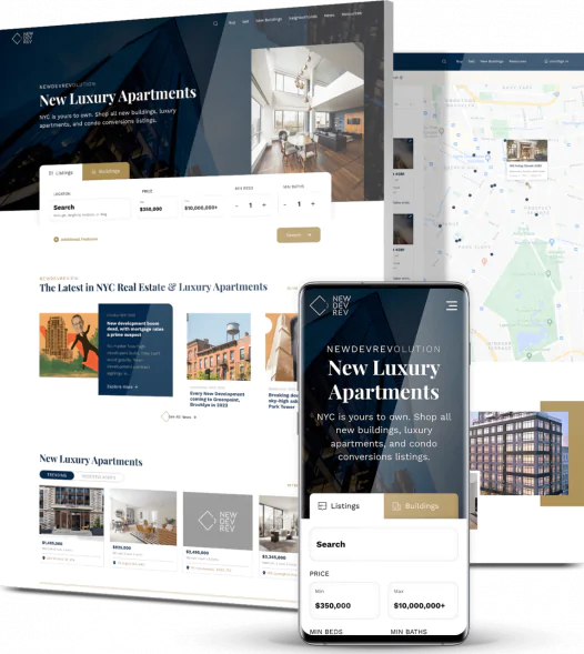
San Francisco, a city known for its technological innovation, has been utilising Responsive Web Design since its inception. The feature ensures optimal website functionality across various devices and has become a standard in the city’s tech industry.
This article provides an overview of why developers started using responsive design, what differentiates it from its counterpart, and an overview of this essential website.
- Responsive Design in San Francisco
The dawn of the mobile internet era in the early 2000s brought new challenges for web designers. As more people began accessing the internet via their mobile devices, it became clear that more than traditional web design approaches were needed.
Recognizing this shift, the tech industry in San Francisco began exploring new design methodologies. This led to the birth of responsive design, an approach that ensures websites adapt to the screen size of the device they’re viewed on, providing an optimal user experience regardless of the device used.
- Responsive vs. Adaptive Web Design
Responsive and adaptive web design are two approaches in Web And Mobile App Development Services in San Francisco that create websites that look good on all devices. Responsive design uses a single fluid layout that changes to fit any screen size, adjusting its content and width according to the device.
On the other hand, adaptive design creates different layouts for different devices, loading static layouts based on different breakpoints. While responsive design is generally easier and cheaper to implement, adaptive design offers more control over how a page looks when it resizes.
However, both approaches aim to optimise mobile browsing and enhance user experience.
- Core Elements of Responsive Design
Responsive design is a web design approach that ensures optimal viewing and interaction experience across various devices. It relies on three critical components:
- Media Queries: These are CSS techniques that apply different style rules based on the device’s characteristics, such as width, height, and resolution.
- Fluid Grids: This concept defines layout proportions in relative units like percentages rather than absolute units like pixels. This ensures that the layout adapts to the screen size.
- Flexible Visuals: Images and other media types are also sized in relative units to ensure they scale properly within the fluid grid.
These elements work together to create a seamless user experience across all devices.
- Practical Tips and Guides
A responsive website is a crucial part of Web And Mobile App Development Services In San Francisco used for businesses worldwide. Here are some practical tips for optimising websites for mobile responsiveness:
- Mobile-First Design: Prioritise designing for mobile devices. As mobile internet usage continues to rise, a mobile-first approach ensures your website provides an optimal user experience on these devices.
- Fast Loading Times: Ensure your website loads quickly on all devices. Slow loading times can lead to high bounce rates.
- Choose the Right Agency: Partner with a design agency that understands the importance of responsive design. They can provide the technical expertise to create a responsive, user-friendly website.
- Looking Ahead: The Future of Responsive Design
The future of responsive design is exciting and filled with possibilities.
With advancements in CSS, HTML, and JavaScript, along with the emergence of new devices like foldable phones and large-screen TVs, San Francisco’s developers are at the forefront of exploring innovative ways to keep websites responsive and user-friendly.
As technology evolves, responsiveness in Web And Mobile App Development Services In San Francisco will remain the core.
In Conclusion
Responsive web design has revolutionised Web And Mobile App Development Services In San Francisco. It has changed how we interact with the digital world. From the early days of mobile internet to the rise of CSS Grid and Flexbox, the city has consistently adopted and advanced responsive design practices.
Whether through innovative design approaches or new technologies, San Francisco is poised to continue leading the way in responsive web design innovation.


