Color has the unique ability to evoke emotions, set moods, and shape how people perceive your designs. Among all hues, soft blues stand out for their calm, refreshing energy. They can make a space feel open, a website look approachable, or a brand feel trustworthy. Whether you’re a designer, marketer, or someone simply looking to refresh a personal project, understanding how to work with soft blues can transform your visual storytelling.
Why Soft Blue Works So Well in Design
Blue, by nature, symbolizes trust, serenity, and clarity. It’s the color of open skies and calm seas, which is why brands and creators frequently lean on it when they want to inspire relaxation or convey reliability. Within the blue spectrum, lighter shades have a special charm — they’re versatile, modern, and feel effortlessly elegant without overpowering other elements on the page.
If you’re considering experimenting with these shades, exploring resources on a light blue background can be an inspiring starting point. From web pages to printed materials, this subtle hue can act as a visual foundation, balancing other colors while adding a sense of sophistication.
The Psychology Behind Light Blues
Lighter tones of blue are associated with clarity and openness. Psychologists often link them to feelings of calm and order, making them a favorite choice for wellness brands, minimalistic websites, and even personal spaces like work-from-home offices. Unlike darker blues that can feel formal or heavy, soft blue tones feel fresh and inviting — perfect for modern design needs.
- Trust and Reliability: Great for brands wanting to establish credibility.
- Calm and Serenity: Common in wellness, spa, and meditation visuals.
- Clarity and Space: Ideal for layouts that need breathing room.
Where to Use Light Blues in Design
1. Web and App Design
A soft blue palette can help create interfaces that feel friendly and easy to navigate. Backgrounds in this tone enhance readability and prevent user fatigue, especially when paired with clean typography like sans-serif fonts.
2. Marketing Materials
Flyers, posters, or even email headers benefit from light blue elements because they grab attention without screaming for it. They subtly guide the eye toward important content — perfect for brands aiming for an understated but professional look.
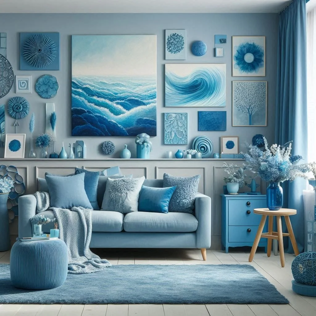
3. Interior and Physical Products
Light blue works beautifully in packaging or product design, particularly for lifestyle goods. It pairs well with neutrals like white or gray and adds a modern yet timeless vibe to physical branding.
Combining Light Blue with Other Colors
One of the best things about light blue is its flexibility. It’s a perfect companion to neutrals and works harmoniously with both warm and cool tones:
- White or Cream: Creates a clean, airy feel.
- Navy or Charcoal: Adds depth and sophistication.
- Pastels (pink, lavender, mint): Infuses a playful, fresh aesthetic.
- Gold or Copper: Elevates the design with a luxurious touch.
When pairing colors, think about the story you want to tell. For example, light blue and white often evoke coastal vibes, while pairing light blue with muted pink feels modern and friendly — perfect for lifestyle blogs or creative portfolios.
Practical Tips for Designers
- Use Contrast Wisely: If your text sits on a blue background, ensure it contrasts enough to remain readable. White or darker blues often work well.
- Experiment with Gradients: Light blue gradients, transitioning into white or deeper blues, can add dimension to flat designs.
- Mind the Mood: Before finalizing your palette, consider what emotion you want the audience to feel — peaceful, professional, playful? Choose complementary colors accordingly.
- Test Across Devices: Light shades can appear differently on screens versus print. Always preview your work to ensure consistency.
Real-Life Examples
Think of popular brands using soft blue in their identity — tech companies often leverage it to appear trustworthy and approachable (Twitter’s iconic blue is a prime example). Similarly, many wellness apps incorporate light blue backgrounds to foster calmness during guided meditations or breathing exercises. Even in fashion and interior design, this color’s versatility makes it a perennial favorite for spring and summer collections.
Why It’s Still Relevant Today
Trends in design evolve, but light blue remains evergreen because it straddles modernity and tradition. It’s simple yet elegant, calming yet vibrant. As minimalism continues to influence branding and digital interfaces, this shade provides a timeless solution that works equally well for startups, personal brands, and established corporations.
Final Thoughts
Working with soft blue hues isn’t just about choosing a pretty color — it’s about understanding the emotion behind it and using it intentionally. When used thoughtfully, light blue can anchor your design, highlight content, and create a sense of harmony that resonates with your audience. Whether you’re refreshing a website, designing marketing materials, or simply adding subtle charm to a personal project, this shade offers a balance of freshness and sophistication that’s hard to beat.


