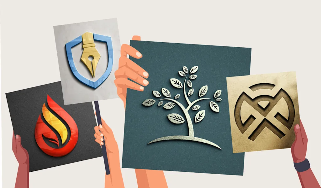
A logo is much more than a single design — it’s the cornerstone of a brand’s visual identity. But today’s businesses need flexibility. Logos appear everywhere: from billboards and websites to social media icons and app splash screens. A single static image can’t do it all. That’s why professional designers now create logo systems — sets of adaptable variations that keep the brand consistent across every context.
Expanding your logo set is about preparing for versatility without losing identity. Done right, it ensures that your brand looks strong, readable, and recognizable whether it’s printed in full color or embossed in monochrome on a product label.
Building a Cohesive Logo Family
The foundation of a good logo system begins with a hierarchy. At the top sits the primary logo — the full design, often including both the symbol and wordmark. This version carries the most weight and typically appears on official materials such as websites, packaging, and ads.
However, your primary logo isn’t always practical. That’s where secondary variations come in. A simplified horizontal logo might work better on website headers, while a stacked version suits square formats like posters or business cards. A standalone icon or emblem can represent the brand in smaller spaces, such as mobile app icons, social media avatars, or product engravings.
These versions shouldn’t feel like separate designs; they’re all part of a single visual language. Each variation reinforces the same core identity, simply adapting to the environment it’s used in.
Managing Color Versions
Color flexibility is another critical part of expanding your logo system. No logo can rely on one palette alone — it needs options for different media, surfaces, and lighting conditions.
Most brands develop three key color versions: the full-color logo, which uses the official palette and is ideal for most situations; a black or dark monochrome version for use on light backgrounds; and a white or light version for dark or photographic backgrounds. Some companies also include single-color alternatives for limited printing, embossing, or engraving.
Testing these variations early helps ensure the logo remains legible and recognizable wherever it appears. A color that looks perfect on screen may appear dull or unbalanced in print. By planning multiple versions, you prevent visual inconsistencies and protect the integrity of your brand.
The Role of Mockups
Once you have your logo variants and color options, the next step is testing them in real-world scenarios — and that’s where mockups become invaluable.
Mockups let you see how your logo performs outside the design software. You can apply it to business cards, signage, merchandise, or digital screens to evaluate how it scales, contrasts, and interacts with its surroundings. These visual tests often reveal issues you’d never notice on a blank canvas, such as spacing problems or readability challenges.
Designers often study examples of how existing brands manage these transitions. Platforms like free logo png are useful for analyzing real logos and testing how designs behave in different file formats and settings. Exploring downloadable assets and transparent logo examples can help you understand how professional logos maintain clarity and consistency across multiple applications — from web to print to 3D mockups.
Seeing these logos in context is one of the best ways to refine your own. It teaches you how to balance proportions, color weight, and spacing in practical settings.
Keeping Consistency Across Platforms
Consistency is what turns a logo from a graphic into a true brand asset. As you expand your logo set, maintaining harmony between versions is crucial. Each variant should use the same typography, spacing ratios, and color values. Even small inconsistencies — like slightly different font weights or spacing — can dilute your visual identity over time.
A helpful approach is to establish a few design “non-negotiables.” For instance, maybe your logo symbol must always appear above the brand name, or your tagline should never be used in a circular lockup. By setting these parameters early, you protect your brand from visual drift as it grows across new materials and platforms.
Documenting with Brand Guidelines
After you’ve created your logo variations, color options, and usage rules, it’s time to formalize everything in a brand style guide. This guide serves as the blueprint for how your logo should appear in every situation — including size restrictions, clear space requirements, and approved color codes.
Think of it as insurance for your brand. Whether you’re collaborating with external partners, designers, or printers, clear documentation ensures your visual identity stays consistent everywhere. It also makes onboarding easier when new teams or agencies come on board.
Adapting for the Future
One of the biggest advantages of an expanded logo set is longevity. As your business evolves, new contexts will emerge — new platforms, marketing channels, or design trends. A flexible logo system gives you the freedom to adapt without starting over.
For instance, many companies now use motion logos for digital platforms or animated social media campaigns. If your identity already includes simple, layered variants, transitioning to animation or interactivity becomes much easier. The same applies to new color schemes or seasonal rebrands; a modular design system gives you space to evolve naturally.
Final Thoughts
Expanding your logo set isn’t about creating more complexity — it’s about building resilience. Each new version, color option, or mockup serves a purpose: to ensure your brand remains clear, professional, and memorable no matter where it appears.
A thoughtful logo system strikes the balance between flexibility and consistency. It’s adaptable but unified, creative yet structured. When you invest the time to develop these variations — and test them across real-world scenarios — your logo becomes more than a design; it becomes a long-lasting symbol of identity.
Whether you’re refining an existing logo or starting fresh, take the time to explore, experiment, and learn from brands that do it well. A single design might start your story, but a well-built logo set will keep it strong for years to come. When this visual consistency is paired with smart digital practices—such as using the right on-page SEO tool to optimize brand pages and assets—your logo system doesn’t just look good, it actively supports long-term visibility, recognition, and growth.