
How to Design AI Website Hero Images That Work on Mobile

A bakery launches a new homepage with a striking photograph: warm bread on a wooden counter, sunlight crossing the frame, and plenty of room for a headline. It looks convincing on a wide desktop monitor. Then someone opens the page on a phone. The loaf disappears beyond the crop, the headline covers the counter, and the button sits over a bright patch that makes it hard to read. Nothing is technically broken, but the first impression is.
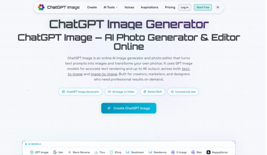
This happens because a hero image has to work inside a layout, not merely look attractive by itself. Teams need to plan where the subject sits, how the image will be cropped, and which elements belong in the webpage rather than the artwork. A ChatGPT image generator can help create visual options from a written brief, but the surrounding design decisions still matter. A few simple tests can prevent an appealing draft from becoming an awkward mobile experience.
Plan the Container Before the Visual
Start with the actual hero section in your website builder or design file. Note its width, height, headline position, navigation, button, and any gradient used behind the text. Next, inspect the same section at a typical phone width. If the desktop hero is wide and shallow while the mobile section is narrow and tall, one image may not serve both layouts without significant cropping.
Make a rough placement sketch before writing a prompt. For example, a home-services company might want a technician on the right, with the headline and booking button on the left. On a phone, that right-hand subject may leave the visible area entirely. The team could prepare a separate mobile composition or move the subject closer to the center. Either choice is easier to make before producing final assets.
Keep essential interface text as real HTML whenever possible. A headline baked into the image cannot reflow naturally, may be cut off by cropping, and is harder to update or translate. The background image should establish the setting and direct attention; The webpage should carry the offer, navigation, and action button.
Write Prompts Around the Focal Point
A useful prompt identifies more than a subject and an art style. It tells the image model where the visual weight belongs and where empty space must remain. Ask for a particular camera distance, lighting direction, background simplicity, and subject position. Avoid filling the entire frame with decorative details if the design needs room for a prominent headline.
Consider this brief for a fictional neighborhood bakery: “Wide editorial photograph of three rustic loaves on a wooden counter, main loaf slightly right of center, soft morning light from the left, uncluttered wall behind, natural colors, no text or logos, generous quiet space on the left.” This describes an image that can support a website layout, not just a beautiful bakery scene. It also makes unwanted lettering less likely.
Generate and Revise a Small Candidate Set
Begin with a few distinctly different compositions, not dozens of nearly identical images. Try one with a centered subject, one with controlled space for text, and one with a tighter camera angle. Compare them inside the page mockup before judging their photographic detail. The best-looking standalone image may be the least useful once the headline, menu, and button appear.
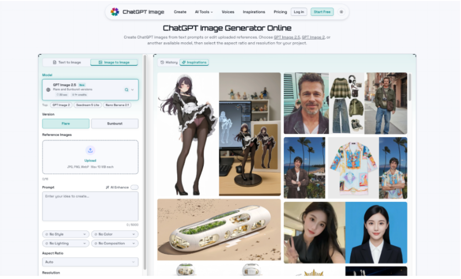
For an existing approved photograph, the ChatGPT image editing workflow allows a user to upload a reference and describe changes, such as simplifying the background or shifting the visual atmosphere. Its text-to-image option can also produce a fresh composition from a prompt. Choose an available aspect ratio, generate a candidate, and check the result for unwanted objects or altered product details. A reference guides an edit; it does not guarantee exact preservation.
Test on Screens, Not Just Canvases
Place candidates in the actual webpage and examine at least three widths: a large desktop, a tablet-sized view, and a narrow phone. Watch what happens when the browser uses a cover-style image fit, which fills a container by trimming portions of the image. If the focal point keeps moving out of view, adjust the crop position or provide a dedicated mobile image instead of forcing one asset everywhere.
Then check the text overlay. Does the heading remain readable where the background becomes bright or detailed? A subtle overlay may help, but it should not flatten the whole photograph. Test the button’s contrast and make sure it remains visually distinct from the hero. Check again with longer headline copy, because a two-line heading can become four lines on a small screen.
Finally, examine the loaded page rather than only the design preview. Oversized image files can delay the first meaningful view, especially on slower connections. Export an appropriately sized web asset, choose a supported modern format where practical, and compare visual quality after compression. If the subject looks muddy at mobile size, reconsider the crop or source rather than automatically increasing every file’s dimensions.
Review of Accuracy Before Publishing
A convincing generated ChatGPT image may contain a misleading detail. Product labels can change, equipment can acquire impossible controls, and an apparent storefront may not represent a real location. Compare the draft against approved source material, particularly when the picture implies a factual claim about what a business sells or where it operates. Treat any invented product feature as a reason to revise or reject the asset.
Keep a short approval checklist: the focal point survives the crop, interface text is readable, the image matches the offer, and no unintended marks or people appear. Obtain the necessary permission for reference photos and recognizable likenesses. If the image is primarily decorative, configure its alternative text accordingly; if it conveys information, write a useful description instead of repeating the adjacent headline.
Make the Next Hero Easier to Build
Once one hero passes these checks, keeps its prompt, final dimensions, crop settings, and approved color treatment. That small record becomes a starting point for future pages without forcing every campaign into the same visual. It also gives colleagues a way to distinguish a creative preference from a technical constraint.
The practical test is straightforward: can a visitor identify the subject, read the message, and find the next action on both a wide screen and a phone? If the answer is yes, the image is doing its job. If not, revise the composition or the layout while the changes are still inexpensive.




Comment