
Nataliya Verkhoturtseva, founder of Brooklyn-based Verk Studio, is one of New York City’s top UX/UI designers. She has worked with dozens of established brands, including Hugo Boss, Marchessa, and Nouvel Heritage. Nataliya shares her insights and advice for an effective mobile-first design strategy.
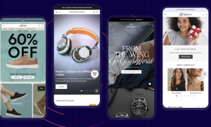
COVID-19 had a massive impact on e-commerce. The pandemic accelerated changes in consumer spending habits, and this led to mobile commerce driving over 50% of e-commerce sales. Research has shown that after just three negative experiences customers will abandon your business and never return. How to make sure the brand’s website runs as smoothly as possible on mobile devices of all shapes and sizes? Here’s what Verkhoturtseva recommends.
Could you tell me about a few projects that you recently completed?
I helped an upscale jewelry brand to increase its conversion rate. Their users were coming via social media because the company had very engaging content on Instagram. But once users hit the website, most of them didn’t make a purchase because the website’s aesthetics did not match the upscale look of the products.
I made sure that the new website has a clean sophisticated appearance and provides a user-centered shopping experience. As a result, this helped the target audience feel confident buying high-end jewelry online. By the end of the project the brand was able to increase the average order value and conversion rate.
For one of my fashion apparel clients, I conducted a comprehensive UI/UX audit that pinpointed friction points of existing user experience that can be improved. Based on the insights, I identified that the brand’s mobile experience was in need of enhancements. After these updates were done, the company was able to significantly increase the website’s conversion rate and overall sales. Also, with the new and improved navigation it was easier for users to find different categories they were looking for.
Finally, a data stack company that came to me with an outdated website was able to establish itself as a thought leader. Their goal was to drive lead generation and also to be a source of data analytics for their potential clients.
Eventually, I created a cohesive and immersive brand identity that helped to craft a unique and user-friendly website experience for this client. Additionally, I provided motion and graphic design support and visual quality assurance services. My work included handing off the approved designs to the development team
Are smaller screens more difficult to work with?
Clear navigation and engaging content previews serve to guide customers to the next step of their retail journey. That’s what I focus on to make sure shoppers are able to find exactly what they’re looking for.
While designing for small screens, I take special care about how I am using space and media content like images and videos. It’s important to make sure not to overuse white space to display content in a meaningful way. This helps to give customers access to content more efficiently.
For the Product Detail Page (PDP), price-point, colorways, reviews, product images, Call-to-Action buttons (CTA), and other factors impact a user’s purchasing confidence. Images and videos shouldn’t be blocking vital content.
It’s important to ensure that the CTA is placed strategically and easily accessible. One compelling feature is the use of a ‘sticky’ CTA that’s anchored to the same position on the screen as the user scrolls. That way, the main CTA is never lost and always available when the customer is ready to take their next step in the purchase journey.
It’s important to strip away unnecessary elements and focus on the mobile site’s core functions, goals, and objectives. Details about shipping, payment providers, etc. can be added later.
How do you remove any potential friction from the user’s path-to-purchase?
I make sure product images and color variants are close to each other and easily accessible. Users shouldn’t have to scroll back and forth between selecting different colors, sizes, and product imagery because this inhibits product discovery, which in turn impacts the conversion rate. Another key element in removing friction from the path-to-purchase is by placing special emphasis on intuition. If something on the website looks like it can scroll, it should scroll.
How do you put users in control of the shopping experience?
Additional information tabs should be clickable. It’s important not to overload mobile websites with text-heavy blocks. This gives your customer control over their experience by encouraging them to learn more about the product in a digestible way. Product carousels, testimonials, social proof, and other similar modules should all be scrollable as well.
How do you prioritize accessibility?
Things get smaller on mobile. I normally test the sizing of fonts on multiple mobile viewports to ensure that it’s readable. Another point you need to pay attention to is the color contrast. For example, it might be difficult to read light gray text on a white background. Compliant color contrast should consider saturation and harshness to maintain a minimum contrast ratio of 4.5 : 1.
One helpful tool is Web AIM’s contrast checker. It enables users to compare different colors to see if they pass accessibility standards. There are also Figma Plugins that show these ratios while you’re knee-deep in the design process.
Mobile phones are mostly used for personal needs and fun, so websites should be easy. It’s important to focus on accessibility as early as possible in the design process. And let’s not forget that one in four U.S. citizens are living with a disability. It’s crucial for brands to hold themselves to the highest standards.


