When designing a logo, there are many things to consider, from trends to color psychology. One more component of a logo you should pay attention to is the background. It does not necessarily have to be monochromatic: there are many options for decorating the logo’s background. Let’s consider some interesting ideas for the background of the logo, and get acquainted with how to create it, together with the company Turbologo.
The variants of backgrounds design
- Classic wood
Such background sets a warm mood. Logos for businesses related to handmade goods, flowers or eco-trends, such as clothes or cosmetics made from natural materials will look spectacular on it.
- Brick wall
The nature of the background will set the tone for logos of companies with a bold, strong character that want to make a statement.
- Polygons
A solid background of multiple polygons reflects rigor, modernity and sustainability. This logo backing is suitable for companies related to IT, technology and design.
Figures can be complemented by gradient, neon stripes and other elements. The main thing is that the background does not take all the attention and does not overload the logo design.
- Half-tones
Although the background creates a slight retro effect, it does not overpower. This image will work for most logos.
- Bokeh effect
A distinctive feature of the bokeh effect is a fuzzy background with highlights in the foreground. It is often used in photos to give the picture a touch of magic.
The logo on the background with the bokeh effect looks festive and fabulous. Therefore, such a sign base is optimal to use for companies working in the field of entertainment and event organization.
- Paper
White checkered paper can be a universal background for different logos. Emblems that have geometric elements will look best on it.
- Drops and dabs of paint
Dashes and drops of paint are often found as a logo background for creative brands. With this design, you can reflect the direction of the company and attract the attention of the target audience.
- Cage
A checkered background design is quite rare in logos. So when choosing this design, you can definitely stand out among your competitors.
- Lines
Lines are another option for logo backgrounds. The type of stripes will determine the message of the brand. For example, straight broken lines are associated with high technology, and smooth lines with beauty and health.
- Neon
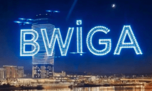
Neon logos can be found at nightclubs and other entertainment venues. However, the use of this design is not limited to the listed options. A neon sign is suitable for companies that are not afraid to attract attention and declare themselves to the audience.
- Patterns
Details in the form of patterns can be not only part of the logo, but also its background. Logos of this design look harmoniously at clothing brands and beauty salons.
- Gradient
A common but attractive variant of background design is the gradient fill. Elements of logo are distinguishable and text is easily readable on such background. A gradient background will emphasize the other components of the sign and give the design a twist.
- Texture
Texture background conveys the characteristics of the surface of a material. It can be paper, metal, canvas, fabric, etc. The logo on such an unusual background is able to tell about the services, benefits, features of the brand through texture.
- Flash of Light
Is your brand like a flash of light against other companies? Express it in your sign design by choosing the appropriate background.
How to choose?
Choose the right background thanks to recommendations from top designers. Of course, it is better to entrust the design of the site or blog to professionals. However, you can also try to pick up the background yourself. To do this, follow the simple and effective expert recommendations, which are outlined below.
- Communication with the target audience
The first important step is to designate the purpose and tasks that should perform the background image. So, if your brand is about promoting a product, then it’s appropriate to use an image with your product. This will help create a positive first impression with the visitor and connect them with your products or services.
In case we are talking about a travel-related logo for a blog, a winning option would be to use a background image with some scenic landscape from your travels. Help the visitor to imagine and feel like a direct participant in the events. If you use a photo in motion or with a nice perspective as a background, it will help make the emblem more graceful and dynamic.
- Find high-quality, high-resolution images
There are a number of services with ready professional images and photos for every taste (Shutterstock, Depositphotos and others). However, the picture should have a convenient orientation for the site (landscape) and a suitable resolution. The minimum recommended resolution is 1024 by 768 pixels, but it’s better to use the middle variant and look for an image with a width of at least 2000 pixels for the background. If you download a picture with a small resolution, the background will look like the early 90’s.
Also remember that it’s better to download a picture with a higher resolution and then cut off the excess, than try to stretch a low-quality image. Use special services and image editors (Illustrator, Photoshop, Paint, IrfanView).
Crop a monotone background and emphasize the main details of the image. If you process the photo well, the image of the product or person will have a favorable effect on the visitor, forming the desired impression.
- Get the focus right
Set the focus to draw visitors’ attention to the right target (your brand or product). Working with focus allows you to align the background more favorably so that meaningful details don’t get lost behind other elements of the logo.
- Monotonous background of the site
Photos may not be appropriate for backgrounds in all cases, and then monochrome color blocks come to the rescue, which allow you to create stylish logo backgrounds for a variety of purposes. Just make sure that the color scheme fits your theme and evokes the right emotional response from the visitor.
When selecting a uniform background, consider matching the color scheme so that the text doesn’t disappear and is clearly visible. If your goal is to focus guests on the information component of the brand, a simple white background will be the best solution. The white color will give the site cleanliness and elegance, creating the impression of a more classic and solid company.
Conclusion
The background is the basis of the logo, which is designed to complement the design and emphasize the main elements of the sign. Choose the right background and make a logo today yourself or with the help of professionals. Good luck!

