Window coverings are more than just functional. They frame the view, affect lighting, and influence how every color and texture within a room is perceived. In recent years, the role of window treatments has shifted from purely utilitarian to undeniably design-driven. As the visual landscape of homes evolves, so do the color trends that dominate these design decisions. In modern interiors, color is used in more intentional, mood-driven ways—creating harmony, adding contrast, or incorporating natural elements. From minimalist to maximalist styles, today’s popular hues help ground the room’s aesthetic, making window coverings one of the most subtle but impactful features in a space. Whether you’re renovating, decorating, or simply replacing outdated blinds, choosing the right tone can completely alter how a room feels. We will explore how emerging palettes in modern window coverings reflect broader shifts in design priorities, including comfort, sustainability, and a return to nature.
Color as a Silent Designer
- Earth Tones and Nature-Inspired Shades Dominate
One of the most prominent color trends in window coverings right now is a return to warm, earth-inspired palettes. Soft browns, olive greens, muted terracottas, and sandy beiges are appearing more often in roller shades, curtains, and fabric blinds. These tones create a sense of groundedness, echoing the natural world and inviting tranquility into the home. Paired with wood finishes or organic textures, these colors help transform sterile spaces into cozy retreats. The rise in popularity of these hues can also be tied to the broader movement toward wellness in design, where color is used not only for aesthetic purposes but also to create emotional impact. Homes now serve multiple functions—office, school, gym, and sanctuary—and earthy window coverings help maintain calm across all roles. Companies like Nu Look Roofing, Siding, and Windows have seen increased demand for shades and treatments that balance subtle, nature-inspired colors with performance fabrics that regulate light and temperature.
- Bold Contrasts and Moody Interiors Make a Comeback
While neutrals remain dominant, bold contrasts are carving out their place in modern window treatment design. Deep charcoal, navy, forest green, and even black have been used to bring depth and sophistication to minimalist spaces. These dramatic tones act as an anchor within bright interiors, drawing the eye and enhancing contrast. In living rooms and home offices, darker window coverings paired with light-colored walls create a dynamic look that doesn’t overpower the space. More homeowners are embracing these deeper shades to express individuality and set the tone for specific rooms. The resurgence of maximalism also plays a role, with statement fabrics and layered drapery offering a platform for experimentation. These bolder tones allow light control and privacy while functioning as a strong design element. When layered with sheer panels or metallic hardware, they offer a visual break from the softness of modern minimalism, adding complexity and style to both new builds and renovations.
- Warm Neutrals Over Cool Greys
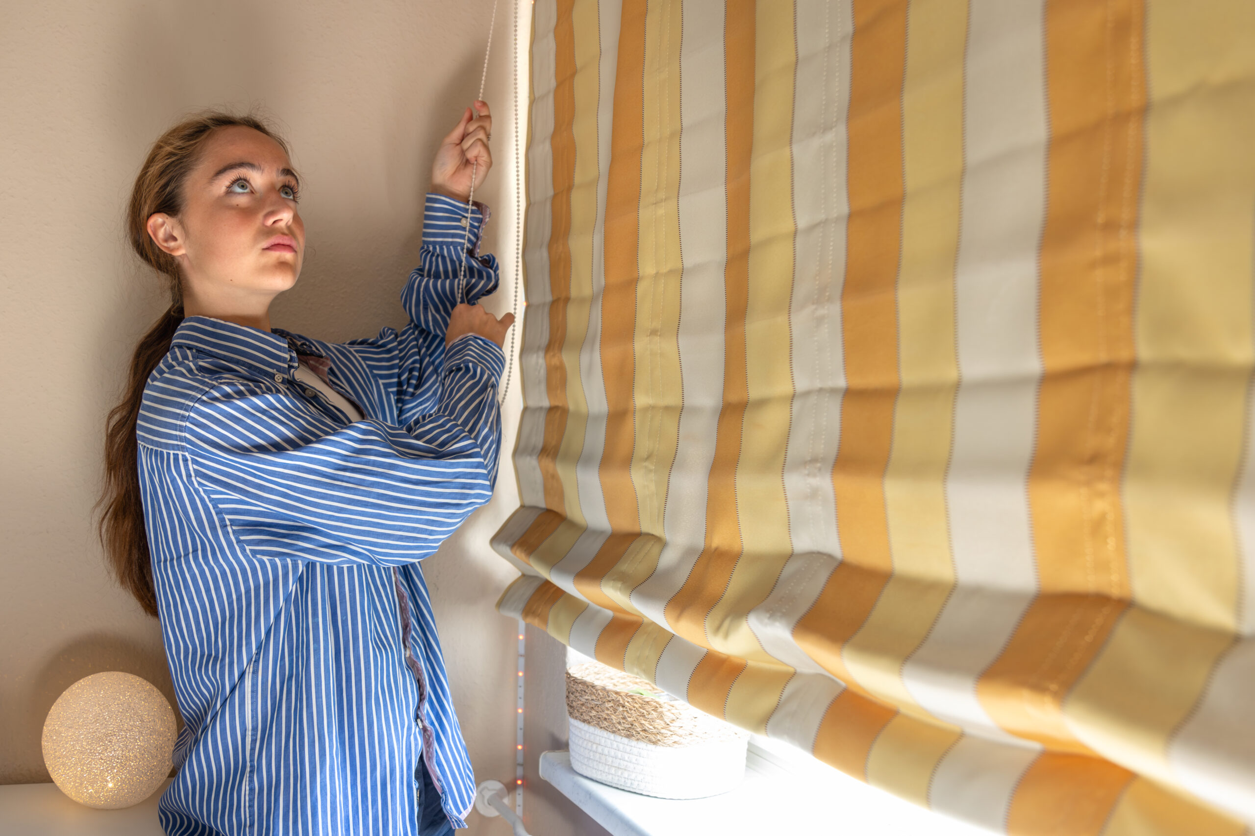
Cool grays have been a staple in interior design for over a decade, but warmer neutrals are gradually replacing them. Shades like beige, taupe, cream, and soft clay are gaining popularity in both fabric and textured window treatments. These colors provide a sense of comfort while maintaining the flexibility that greys once offered. They blend beautifully with wood flooring, white trim, and both traditional and modern furniture. As design leans toward embracing imperfections and more tactile finishes, warmer neutrals reflect the shift toward authenticity and softness in home environments. These tones don’t just complement décor—they influence how light filters into a room, casting a warmer glow and creating a welcoming feel. Window treatments in these colors function like a neutral canvas, making them adaptable for seasonal décor changes or evolving tastes. They are especially favored in bedrooms and dining areas where ambiance is key.
- Muted Pastels and Dusty Hues Gain Popularity
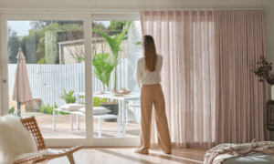
Another growing trend is the use of muted pastels and dusty hues in window coverings. Think blush, sage, lavender-gray, and powder blue—but toned down with a weathered, vintage feel. These colors are perfect for those who want to move beyond beige but don’t want to commit to saturated shades. These softer tones add personality while maintaining a subtle elegance. They work well in children’s rooms, guest spaces, or reading nooks where a touch of whimsy or nostalgia is welcome. With a growing appreciation for layered design, muted pastels are often paired with natural fabrics like linen or cotton, creating a relaxed and understated effect. The resurgence of vintage-inspired decor also supports this trend, as homeowners seek expressive color stories without being overwhelmed. These gentle shades align with broader shifts toward comfort, emotional connection, and design that feels lived-in rather than staged or overly curated.
In today’s homes, color trends in window coverings are about more than what’s fashionable—they reflect how people want their spaces to function and feel. Whether it’s the grounding effect of earth tones, the drama of deep hues, the warmth of evolving neutrals, or the softness of dusty pastels, these choices shape the emotional tone of a room. Window treatments have become a central feature in the overall design narrative, striking a balance between beauty and practical performance. With so many evolving styles to choose from, homeowners can now curate color stories that suit both their spaces and their lifestyles. From energy efficiency to ambiance, the role of window coverings has expanded—and with it, the power of color as a defining design tool. As personal expression continues to shape interiors, window treatments will remain a canvas where quiet creativity meets everyday function.