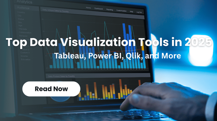
Top Data Visualization Tools in 2025: Tableau, Power BI, Qlik, and More
Ever wondered how the big companies transform messy data into sound decisions? The data visualization software market stood at $8.85 billion as of 2019, and it is expected to reach $19.20 billion by 2027, according to Fortune Business Insights.
That’s explosive growth propelled by cloud computing, AI breakthroughs, and a thirst for instant insights among businesses. Data visualization Services as the intermediary between data and intelligence.
Whether you’re a startup founder or an enterprise analyst, picking the right tool is important. This guide will cover the 7 best data visualization tools of 2025 so that you can choose the one that is right for you based on your individual needs and budget.
What Makes a Data Visualization Tool Stand Out?
The best data visualization tools are powerful yet accessible, enabling you to turn your complex data sets into digestible visuals that can be understood at a glance – without having to pore over the manual first.
Integration capabilities are paramount — you want to make sure you use software that can integrate easily with your existing databases, cloud platforms and business solutions. Powerful customizations make it possible to personalize dashboards and reports based on your specific workflow needs.
Security is, of course, a big factor, especially for American companies that have sensitive customer user data to protect or compliance regulations to follow. Analyze the data on the fly so that your team is up to date when speed is of the essence.
Mobile˙ access is a must in 2025, as executives can monitor key metrics while on the move. Select tools that have substantial community backing, great documentation and decrease the time to learn how to use them effectively.
Top 10 Data Visualization Tools in 2025
Now you have learnt about the best data visualization tools and why you need them. The next step is choosing the one that meets your needs. That’s why here we are enlisting the top 7 tools for data visualization in 2025, to help you make the best decision.
Tableau: Setting the Gold Standard for Data Visualization
Tableau has made a name for itself as a powerhouse tool for data visualization, redefining how businesses and growing companies — large and small — interact with big data. And because Salesforce owns it, it has a friction-free connection to countless data sources that you can use to create gorgeous charts and interactive maps with simple drag-and-drop.
This tool handles massive datasets for AI and machine learning projects. Mobile-friendly views keep teams connected on the go. Community forums offer quick tips and support.
Key Features
- Effortless integration with Teradata, AWS, and more.
- Real-time dashboards for instant business decisions.
- Scalable options from desktop to cloud deployment.
Pros and Cons
- Pros: Exceptional speed, beautiful visuals, strong community backing.
- Cons: Higher pricing, limited auto-refresh in basic versions.
Power BI: Microsoft’s Leading Solution for Dynamic Dashboards
Power BI leaps ahead as Microsoft’s easy-to-use tool for visualizing and transforming data in real time to help businesses make decisions faster. It connects to Excel, Azure and databases, including Oracle or Salesforce, as well as whether you use it with a cloud or on-premise environment.
No memory limitations stand in your way; security features are outstanding. Custom dashboards turn reams of complex data into something intuitive and shareable.
Key Features
- Ease of data exploration with natural language queries.
- Solid support for sources, and without the speed issues.
- Scalable solutions ideal for your growing business.
Pros and Cons
- Pros: Cost-efficient, great Microsoft compatibility, and easy report sharing.
- Cons: Might struggle with extremely heterogeneous data.
Qlik Sense: Advanced Analytics for Modern Businesses
Qlik Sense reinvents data exploration, making it simple for you to explore all your data to any level of detail and take advantage of broad open web standards with a flexible point-and-click interface. It provides real-time analysis, a colourful display that energizes team members and is already used by over 40,000 customers worldwide – many of whom deal with MSG BI reporting.
Fast onboarding makes it accessible for contemporary workflows. Maintenance stays straightforward and cost-effective.
Key Features
- Associative AI to enable unlimited data discovery.
- Enterprise reporting with customizable options.
- Instant insights for snap team decisions.
Pros and Cons
- Pros: Easy interfaces, low maintenance, and inexpensive.
- Cons: Limited RAM, support can be spotty in areas
Google Charts: Accessible, Customizable, and Versatile Visualizations
Google Charts gives you a fast, interactive way to create graphical charts online with HTML5 (plus VML for optional old IE support) and a convenient way to use cross-platform without requiring installation on your client’s machine. What developers like is that it integrates effortlessly with Google Workspace, and so data integration works well for web apps and fast visual projects.
Attractive charts come together fast. It’s versatile for various graph types.
Key Features
- Simple data embedding in web apps.
- Zoom functionality for detailed views.
- Strong compatibility with Google tools.
Pros and Cons
- Pros: Entirely free, easy-to-use interface, impressive results.
- Cons: Needs internet, basic customization options only.
Sisense: High-Powered Analytics for Big Data Workloads
Sisense crunches large data sets in real time and has deployment options that work for companies dealing with sophisticated analytics. Its user-friendly dashboards let you access important trends easily, combined with excellent customer support and quick updates for easy customization.
Key Features
- Real-time data processing for immediate insights.
- Flexible cloud or on-premise setups.
- Simple pattern recognition in a high-volume data setting.
Pros and Cons
- Pros: High support, fast custom tweaks, good for heavy workloads.
- Cons: Building a cube might be tough; visualization options are limited.
D3.js: Open-Source Flexibility for Developers
D3.js delivers open-source magic to developers, allowing you to create beautiful graphics with both JavaScript and SVG for modern browsers and interactive data applications. Tech teams are fans because it can handle big datasets with smooth animations, even in 3D configurations that require high performance.
This tool thrives on flexibility. It allows drawing different kinds of charts, like bar charts and scatter plots.
Key Features
- Binding between the DOM and data, with dynamic updates.
- Support for large-scale, animated environments.
- High interactivity without heavy frameworks.
Pros and Cons
- Pros: Fully customizable, perfect for coders, and it’s free.
- Cons: Not beginner-friendly; learning curve is difficult.
IBM Watson Analytics: AI-Driven Visual Analysis
Through the power of AI and natural language processing, IBM Watson can understand insights about different data types, from unstructured to structured – it’s well-suited for businesses such as healthcare and finance. It is cross-platform and supports predictive analytics with self-service dashboards, making it easy for users to create graphic data analysis.
This tool uncovers insights efficiently. It is packed with intelligent features for better decision-making.
Key Features
- NLP for easy pattern detection.
- Multi-device access for flexibility.
- Predictive tools for forward-looking insights.
Pros and Cons
- Pros: Powerful AI computing, easy-to-use dashboards and widespread application.
- Cons: Expensive to maintain, inconsistent customer support.
Conclusion: Empowering Decisions with Top Data Visualization Tools
As we’ve learned, the top tools for data visualization in 2025 — whether the procedure is hand-off or hands-on with Tableau’s drag-and-drop magic, or Power BI’s integrated workflow — all aim to turn dry and lifeless numbers into captivating visuals.
They’re powering American businesses to make smarter decisions in the face of explosive market growth. Which works best for your workflow? Qlik Sense for that associative knowledge, or perhaps Google Charts, because they would be free to experiment?
Products such as Sisense process big data loads and D3. JS offers developer freedom. IBM Watson adds AI smarts. Try a few with free trials. You’ll discover new patterns, benefits and efficiencies.
Ready to take your data game to the next level? Jump in today and let your decisions take off. How soon will you gain insights?