In the intersection of art, mathematics, and technology, one of the most compelling challenges is to simulate complex 3D phenomena using limited tools. Among such tasks is the creation of an animated 3D intersection between two spheres — a visual illusion that can be executed entirely using CSS (Cascading Style Sheets), HTML, and a deep understanding of trigonometry. This article is a theoretical exploration of how such an effect can be conceptualized and executed, using no actual code, but instead emphasizing geometry, physics, visual design, and web rendering principles.
Part 1: Understanding the Building Blocks
To understand how to simulate 3D sphere intersections using CSS and trigonometry, we must first deeply explore the underlying ideas. This includes how we represent 3D shapes in a 2D space, how CSS handles transformations, and how trigonometric functions can mimic physical properties such as rotation, curvature, and spatial alignment.
1.1 Spheres in Geometry
A sphere, in mathematical terms, is a perfectly symmetrical 3D object where every point on the surface is equidistant from the center. Its geometric representation is straightforward: it is defined by a single radius and a central point in 3D space. The surface of a sphere is curved uniformly in all directions, making it smooth and continuous.
To represent a sphere on a 2D screen, one must simulate how it looks under perspective — that is, from a given viewpoint. This perspective includes visual clues like light, shadow, gradient, and relative position.
1.2 Rendering Spheres in Web Design
Web design is inherently two-dimensional. Every element on a webpage is positioned on a flat plane — the viewport. Therefore, simulating a 3D object like a sphere requires illusionistic techniques. Gradients are often used to imply curvature, shadows to imply depth, and animations to suggest rotation or interaction with light.
1.3 CSS Transforms as 3D Tools
CSS offers the ability to transform elements in three dimensions. Using properties like transform: rotate3d and transform: translateZ, one can manipulate HTML elements in a pseudo-3D space. These tools work in conjunction with perspective, a CSS property that mimics how objects appear smaller as they move further away, adding a crucial layer of realism.
Part 2: Trigonometry as a Simulation Engine
While CSS provides the mechanisms to display movement, trigonometry is what gives this movement precision, fluidity, and realism.
2.1 Spherical Coordinates
Trigonometry is essential for mapping motion across a spherical surface. To simulate realistic movement — such as a sphere rotating around an axis — we use spherical coordinate systems. These are defined by three components:
- Radius (r): The distance from the center of the sphere to a point on its surface.
- Theta (θ): The azimuthal angle, typically measured in the horizontal plane.
- Phi (φ): The polar angle, typically measured from the vertical axis.
With these components, we can locate any point on the surface of the sphere. This is essential for calculating where a sphere should be positioned or how it should rotate at any given moment.
2.2 Rotational Movement
Rotation in 3D space is governed by angular displacement. The rotation of a sphere about its center can be expressed as a continuous change in θ and φ over time. Trigonometric functions like sine and cosine are ideal for expressing these changes because they naturally cycle between -1 and 1, creating smooth, periodic motion. By applying these functions to the coordinates of a sphere, we simulate spinning, bobbing, or orbital effects.
2.3 Intersection through Projection
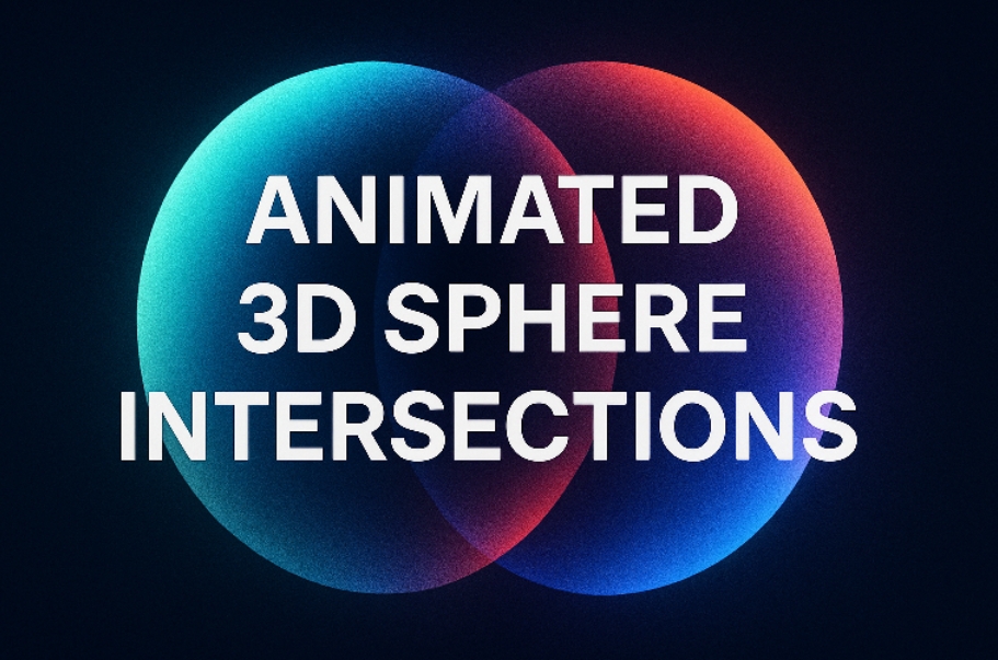
The concept of two spheres intersecting is a 3D geometric event — it happens when their volumes overlap in space. However, on a 2D screen, we only have visual representation, not true volume. Therefore, we must simulate this intersection visually, often using layered elements and transparency.
The illusion of intersection can be crafted by positioning two spherical shapes so they overlap visually, animating their relative movement to simulate rotation or merging. Transparency, blending modes, and gradients help reinforce this illusion by allowing the viewer to “see through” one object into another.
Looking for professional web development services? Let’s connect and we can help your website look aesthetic and cool.
Part 3: Visual Theory of Overlapping Spheres
Creating a convincing intersection of two 3D spheres is as much about perception as it is about mathematical correctness.
3.1 Depth through Overlap
One of the primary ways humans interpret depth is through occlusion — when one object partially covers another, we perceive it as being closer. By animating one sphere to pass in front of or behind another, we suggest to the viewer that they exist in three-dimensional space.
3.2 Shadows and Highlights
To emphasize the roundness of each sphere, shadows and highlights are essential. A light source is imagined (even if not literally rendered), and spheres are shaded accordingly. When two spheres overlap, their lighting should adjust to reinforce the sense of depth — for example, the front sphere may cast a shadow on the rear one.
3.3 Opacity and Interpenetration
True 3D intersection involves the overlapping of volume. In web simulation, this is mimicked using partial transparency. As spheres begin to overlap, their intersecting area can be shown with a blending of colors or with an inner glow. This visual effect hints at depth and transparency, tricks the eye, and supports the illusion of spatial interpenetration.
Part 4: Animating the Intersection
An animated intersection of spheres must go beyond static positioning. It needs motion, interaction, and life. Here’s how trigonometry and CSS come together to simulate dynamic, continuous intersection.
4.1 Defining the Animation Path
To animate the spheres meaningfully, we define how each moves through 3D space. A common approach is to have one or both spheres orbit a central axis — for example, by rotating around the Y-axis (vertical axis). This is done using parametric equations that apply sine and cosine to map positions over time.
Imagine Sphere A remains stationary while Sphere B orbits it. At every moment t, we calculate the position of Sphere B using:
- X-position: cos(t) * radius
- Z-position: sin(t) * radius
These positions are then translated into CSS transformations, allowing the sphere to move smoothly in a circular path, seemingly intersecting with Sphere A.
4.2 Creating Perceived Volume
To further reinforce the illusion of 3D, spheres are often scaled slightly based on their Z-position. As a sphere moves closer to the viewer, it becomes slightly larger; as it moves back, smaller. This simulates perspective — a key visual cue in human depth perception.
Using cosine and sine once again, we modify the scale proportionally to the sphere’s depth. This can be expressed in a value that oscillates subtly between 0.9 and 1.1, creating the illusion of moving in and out of the scene.
4.3 Temporal Consistency
A successful animation feels continuous and organic. This requires a consistent timing function. Trigonometric functions like sine and cosine inherently provide this consistency, as they change values in a smooth, wave-like manner. Unlike linear animations, which may feel mechanical or robotic, trigonometric motion feels natural — almost like the motion of planets or the gentle rolling of waves.
Part 5: Interaction Between the Spheres
The illusion becomes especially convincing when the two spheres interact — not just pass by each other, but seem to interlock or merge dynamically.
5.1 Synchronized Rotation
When both spheres are animated — each rotating around its own center while simultaneously orbiting a shared point — the interplay becomes rich and dynamic. Careful synchronization ensures that their paths cross in a visually pleasing way.
For instance, Sphere A might rotate around its own Y-axis while Sphere B rotates around a shared center. The trigonometric relationship between their respective rotations ensures that moments of intersection are both predictable and artistically controllable.
5.2 Transparency as a Visual Tool
Transparency plays a critical role in selling the intersection. By reducing opacity or using gradient masks, we can suggest that one sphere is passing inside the other. This is an abstracted metaphor for 3D interpenetration — our brains fill in the blanks, interpreting partial transparency as volumetric blending.
5.3 Use of Color Blending
Advanced visual effects may include blending modes, such as multiply or overlay, that allow overlapping colors to merge. This enhances the sensation of interaction between the two spheres, especially at their points of intersection.
For example, a cyan-colored sphere overlapping a magenta-colored sphere might produce a deep blue in the intersecting region, providing a dynamic visual accent that implies physical blending.
Part 6: Perspective and Viewport Considerations
Animating 3D effects in CSS requires thoughtful use of perspective. The browser viewport is inherently 2D, so all 3D transformations must be perceived through tricks of rendering.
6.1 Simulated Camera
The perspective property in CSS acts like a virtual camera lens. By placing this on a parent container, it informs how child elements are rendered in terms of depth and rotation. A lower perspective value results in a more dramatic perspective effect (closer camera), while a higher value flattens the depth (distant camera).
Adjusting this property allows us to tune how “3D” the intersection appears. For interactive experiences, changing the perspective dynamically (e.g., in response to mouse movement) can create the illusion of shifting viewpoints.
6.2 Managing the Z-axis
The Z-axis is crucial in depth simulation. Positioning elements along the Z-axis (closer or further from the viewer) determines which appears in front. This is often paired with z-index, but in 3D contexts, physical placement is more effective.
By modulating the Z-position of spheres over time using trigonometric functions, we simulate them moving toward and away from the viewer. This creates not only the illusion of motion but also the illusion of breathing space — a subtle expansion and contraction that mimics life.
Read also: Professional Digital Marketing Services
Part 7: Human Perception and the Art of Illusion
Ultimately, all these techniques are in service of one thing: creating a believable illusion. Human perception is sensitive to motion, light, depth, and pattern. By understanding these perceptual cues, we can design more effective visual experiences.
7.1 Predictable Patterns and Novelty
The brain is wired to detect patterns. Circular motion is soothing because it is predictable. However, we also seek novelty — slight variations in speed, scale, and angle make animations feel alive.
By combining stable motion paths (like orbits) with small unpredictable variations (like slight changes in opacity or position), we engage the viewer’s curiosity without overwhelming them.
7.2 Depth from Layering
Layering is perhaps the simplest yet most powerful depth cue. When one sphere visibly passes over another, the brain interprets this as a 3D event. By orchestrating these transitions carefully — using timed rotations and scale changes — we simulate a dynamic 3D environment on a flat screen.
The Harmony of Math and Design
The animated 3D intersection of spheres using CSS and trigonometry is a masterclass in minimalist visual engineering. It requires no canvas, no external libraries, no WebGL — just a deep understanding of how humans perceive space, and how math can be used to simulate that perception.
By leveraging spherical coordinates, rotational trigonometry, CSS perspective, and visual design principles, designers can craft interactive experiences that feel three-dimensional, responsive, and alive. This process bridges the gap between artistic expression and technical execution, reminding us that the web remains one of the most flexible and creative platforms for visual storytelling.
The takeaway here is not merely how to animate spheres, but how to think — to translate mathematical concepts into visual elements, to simulate physical laws using design tools, and to continually push the boundaries of what’s possible with nothing but code, creativity, and a deep understanding of how we see.