Menu icons are one of those “small changes” that can make a WordPress site feel instantly more polished.
But they’re also easy to mess up.
If you add icons to every link, mix random styles, or load a heavy icon font just to show 5 symbols, your header quickly starts looking like a cluttered app toolbar, and your site can slow down for no real reason.
This guide keeps it simple:
- When menu icons help (and when they don’t)
- The easiest way to add them in WordPress
- How to keep it clean on mobile
- What to avoid so your menu still feels premium
When menu icons are actually useful
Icons work best when they help people scan faster.
They’re most useful for links like:
- Home
- Shop
- Cart
- Account
- Support
- Pricing
- Search
Icons are usually not useful for links like:
- About
- Blog
- Company
- Our Story
- Insights
Why? Because those are already readable and obvious. Adding icons there often makes the menu noisy without improving clarity.
Simple rule: add icons only where they add instant meaning.
How many menu icons should you use?
If you want the menu to look clean, keep it tight:
✅ 3 to 5 icons is the sweet spot
❌ 8+ icons usually turn into visual clutter
A good “icon set” for most sites:
- Home
- Pricing
- Support / Contact
- Account
- Cart (if WooCommerce)
Pick one icon style (this matters more than people think)
Most “icon menus” look off because the icon styles don’t match.
Pick ONE style and stick to it:
- All outline icons, or
- All filled icons
Also, keep sizing consistent. The icon should be slightly smaller than your menu text—not bigger.
If you’re unsure, go with outline icons. They tend to feel lighter and more modern in headers.
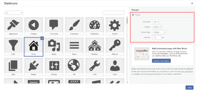
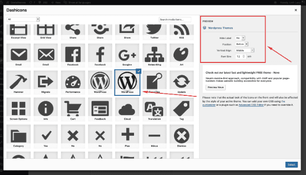
Option 1: The easiest method (plugin-based)
If you want to add icons quickly without touching code, a menu icon plugin is the fastest route.
How it generally works:
- Install a menu icon plugin
- Go to Appearance → Menus
- You’ll see an icon picker for each menu item
- Select an icon, save the menu, done
How to keep this method clean:
- Use the plugin only for a few items (3–5)
- Avoid icon packs that load huge font files
- Test your header speed after enabling it
If your menu is already complex (sticky header, dropdowns, mobile drawer quirks), plugin-based icon handling can get unpredictable depending on the theme. In those cases, having a custom WordPress development company implement icons cleanly in the theme can save you a lot of “why did my header break?” moments.
Option 2: The cleanest method (SVG icons, lightweight)
If you care about performance (and you should), SVG icons are usually the best approach:
- Crisp at any size
- No icon font loading
- Easy to style with CSS
- Less bloat
There are two common ways this is done:
A) Add SVG icons inside menu item labels
This is the cleanest visually, but it depends on how your theme outputs menus. Some themes strip HTML in menu labels or behave inconsistently.
B) Add icons via CSS using classes
This is often the most stable approach:
- Add a CSS class to each menu item (WordPress supports this)
- Use CSS to show an icon before the label
This gives a consistent layout and spacing without messing with menu markup.
If you want icons to behave perfectly across desktop + mobile, and you’re particular about alignment (most people are), this is another area where a custom WordPress development service can implement it in a way that stays stable even after theme updates.
Option 3: Block theme method (Navigation block)
If you use Appearance → Editor, you’re probably on a block theme using the Navigation block.
Block themes vary a lot:
- Some allow inserting icon blocks or patterns nicely
- Some don’t, and you end up fighting the header layout
If your theme doesn’t support icons gracefully in the Navigation block, don’t force it.
A clean compromise for block themes:
- Keep text links normal
- Add icons only for “Cart” and “Account” (these are the ones that actually benefit from icons)
- Keep the rest text-only for clarity
The mobile test that saves you from a bad menu
A menu can look great on desktop and still be awful on mobile.
Do this quick test:
- Open your site on your phone
- Open the menu
- Try tapping your top 3 links quickly
If you notice:
- icons pushing text onto a new line
- misaligned icons
- tiny tap targets
- cluttered look
…then reduce the number of icons or simplify spacing.
Mobile rule: icons should never make your menu harder to read.
5 common mistakes that make menu icons look “cheap”
1) Using icons instead of labels
Don’t do this. Users shouldn’t guess.
2) Icons are bigger than the text
Your menu is not a toolbar. Keep icons smaller and subtle.
3) Mixing different icon styles
Outline + filled + sketchy icons together = messy instantly.
4) Too many icons
Icons on every item make the header look busy and childish.
5) Loading heavy icon fonts for a few icons
This is the silent performance killer. SVGs or lightweight methods are better.
A simple “good menu icon” checklist
Before you ship it:
- Only 3–5 menu items have icons
- Icons are the same style (all outline or all filled)
- Icons are slightly smaller than text
- Spacing is consistent (icon → label gap)
- Mobile menu still looks clean and readable
- Site speed doesn’t drop after adding icons
If you can tick these off, your menu will feel intentional—not decorative.
Conclusion: Keep icons helpful, not decorative
Menu icons can absolutely make your WordPress navigation feel sharper and easier to scan—but only if they’re used with restraint.
If you remember just three things:
- Use icons only where they add meaning (Cart, Account, Support, Pricing)
- Keep the style consistent and the count low (3–5 max)
- Test mobile so icons don’t clutter the drawer menu
…you’ll end up with a menu that feels modern and premium without adding noise.
And if your header is already “sensitive” (sticky menus, dropdown behavior, complex layouts), it’s often smarter to have a custom WordPress development company implement the icon setup cleanly so it stays stable, fast, and aligned across devices.
If you share your current menu items (just paste the list), I’ll tell you exactly which 3–5 should get icons and which ones should stay text-only.