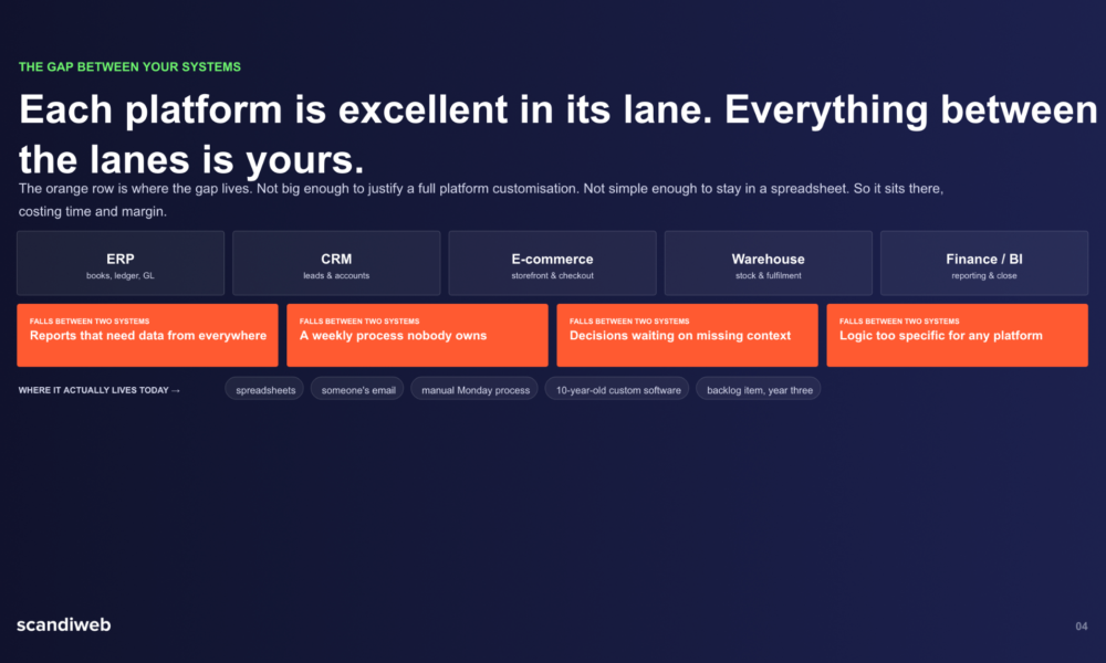
Trends in design always come back around. What once felt outdated suddenly feels fresh again. In recent years, we’ve seen the return of Y2K fashion, glossy lip aesthetics, chunky sneakers, and bold pink branding.
Now, typography is following the same path. Designers are once again talking about the playful, dramatic lettering style inspired by the early 2000s the iconic “Bratz” typeface.
But why now?
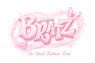
The early 2000s were full of personality. Brands were not afraid to be loud, stylish, and expressive. The Bratz dolls, launched in 2001, quickly became cultural icons. Their branding stood out because it was bold, glamorous, and confident.
The lettering used in their logo was just as strong as the dolls themselves. That distinctive look is what many designers today refer to when they mention the bratz font as nothing can beat the uniqueness of this font.
The Power of Nostalgia in Design
One of the biggest reasons this typeface is trending again is nostalgia. Millennials and Gen Z both connect emotionally to early 2000s culture. For Millennials, it reminds them of childhood. For Gen Z, it represents a fun, rebellious era they admire.
Brands understand the power of nostalgia. When a design reminds people of a happy or stylish time, it builds an instant emotional connection. That’s why we see so many Y2K-inspired campaigns on Instagram, TikTok, and fashion websites. The bold curves, shiny finishes, and playful shapes of the Bratz-inspired lettering perfectly match this trend.
Typography is not just about letters it’s about feeling. And this particular style feels confident, fashionable, and unapologetic.
Bold Typography Is Winning Again
For a long time, minimalism dominated design. Clean sans-serif fonts, simple layouts, and neutral colors were everywhere. While minimalism still works, many designers are now moving toward more expressive styles.
Bold typography grabs attention faster. On social media, where users scroll quickly, brands only have seconds to stand out. A strong, playful font makes people stop and look.
The Bratz-inspired typeface is thick, dramatic, and full of personality. It doesn’t try to be subtle. It demands attention. In today’s crowded digital space, that’s a big advantage.
Perfect for Fashion and Beauty Brands
Fashion and beauty brands are leading this revival. The original Bratz branding was heavily focused on style, glamour, and attitude. Those same qualities are important in modern beauty and streetwear marketing.
Designers working on lip gloss packaging, clothing drops, or influencer branding often look for fonts that feel fun and bold. This typeface style delivers that energy. It works especially well for:
- Y2K-inspired clothing brands
- Makeup lines targeting Gen Z
- Social media graphics
- Event posters and pop-up shops
- Merchandise and stickers
It communicates confidence. And confidence sells.
Social Media Loves Personality
Another reason designers are revisiting this typeface is TikTok and Instagram culture. Social media today rewards personality. Brands that look too corporate or plain often struggle to connect with younger audiences.
The Bratz-style lettering feels personal and expressive. It doesn’t look like a traditional corporate font. Instead, it feels playful and rebellious. That matches the tone of many viral trends and influencer aesthetics.
When paired with bright colors, glossy effects, and bold photography, this typography instantly creates a strong visual identity.
The Rise of Y2K Aesthetic as a Movement
The return of this font style is not happening alone. It is part of a bigger Y2K aesthetic movement. This includes:
- Chrome text effects
- Butterfly graphics
- Glitter overlays
- Pink and purple gradients
- Low-rise fashion styling
Typography plays a key role in completing that look. Designers want fonts that feel authentic to the era, not just modern fonts that are slightly edited.
By using a typeface inspired by the Bratz branding, designers create a more believable and cohesive aesthetic.
More Than Just a “Doll” Font
Some people may think this typeface is only connected to toys. But designers see it differently. They see strong brand identity.
The original Bratz logo was smart branding. It was different from Barbie’s softer style. It showed attitude and independence. That strong identity is something many new brands want today.
In fact, many startups are trying to stand out by rejecting overly clean, tech-style fonts. Instead, they are choosing expressive, bold typography that tells a story.
This is why designers are not just copying the past they are reinterpreting it. They adjust spacing, colors, and effects to fit modern platforms while keeping the bold energy.
Customization Makes It Even Stronger
Another reason this typeface is trending again is customization. Designers today rarely use fonts exactly as they are. They modify them. They stretch letters, add shadows, apply glossy textures, or mix them with handwritten elements.
The Bratz-inspired lettering style works well for these creative edits. Its thick shapes allow room for gradients, outlines, and 3D effects. This makes it flexible for digital campaigns and merchandise.
Customization also helps brands avoid looking outdated. Instead of copying the early 2000s exactly, they create a modern version of it.
What This Trend Says About Modern Design
The return of this typeface shows something important about today’s design world: personality matters.
People are tired of overly polished, identical branding. They want character. They want something that feels human and expressive.
Design trends often move in cycles. After years of minimalism, bold and playful styles are naturally coming back. The Bratz-inspired typeface fits perfectly into this shift.
It represents confidence, nostalgia, fashion, and individuality values that resonate strongly with today’s audiences.
Final Thoughts
Designers are talking about the “Bratz” typeface again because it represents more than just a font. It represents an era, an attitude, and a strong visual identity.
In a digital world full of competition, bold typography helps brands stand out. The playful curves and confident style of this lettering make it ideal for fashion, beauty, and social media branding.