Gray Marble: A Buyer’s No-Regrets Playbook for Calm, High-Impact Interiors
Why gray marble is suddenly everywhere (and why it’s not just a design fad)
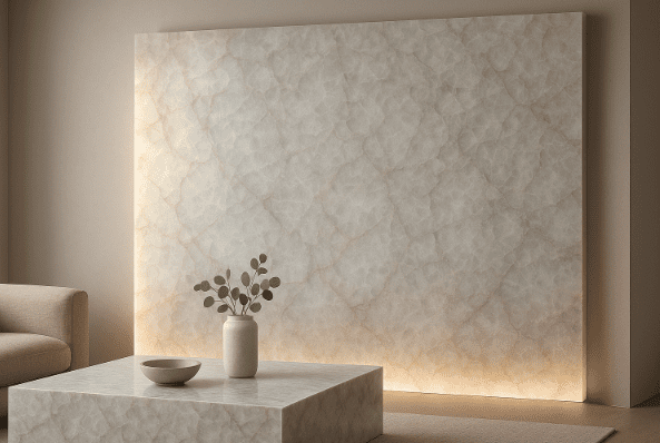
Gray marble has become the new neutral in high-end interiors because it solves a modern design problem: many minimalist spaces look clean, but also feel cold, flat, or overly sterile. Gray marble adds depth without demanding attention. Under warm lighting it reads soft and layered; under daylight it looks crisp and architectural. That’s why it’s increasingly specified for kitchen islands, bathroom vanities, fireplace surrounds, feature walls, and boutique-hotel lobbies.
But the deeper driver isn’t fashion—it’s buyer psychology. Today’s buyers want materials that feel permanent rather than decorative, architectural rather than trendy. Gray marble delivers that built-in value, especially when paired with wood, brushed metal, textured plaster, and matte fixtures. It also performs well visually for listings, hospitality branding, and long-term use without locking a space into a short-lived aesthetic.
If you want to understand how suppliers present gray marble for real projects—rather than mood-board inspiration—start with a gray marble manufacturer as a baseline reference for categories, applications, and sourcing logic.
The data-driven reality: what buyers actually want from stone
Design trends may start conversations, but purchase decisions are driven by risk. Across residential, hospitality, and commercial projects, buyers consistently prioritize durability in daily use, visual stability under mixed lighting, and materials that don’t require constant attention.
Gray marble meets these expectations because it’s visually forgiving. Many gray tones hide minor water marks, dust, and everyday wear better than pure white surfaces while keeping spaces bright. From a material standpoint, the critical variables are not the stone name, but background tone, vein movement, finish, and how the surface behaves in real environments.
Professional buyers don’t approve marble like paint. They define an acceptable range—tone and movement—then select slabs within that range. This framework becomes even more important for commercial projects and repeat orders, where consistency across zones and phases matters more than a single perfect slab.
If you want a structured, buyer-first decision method before committing emotionally to one photo, this approach mirrors how experienced teams evaluate engineered options—especially in commercial settings where edge details and fabrication rules are standardised—such as commercial integrated quartz with professional edge finishing for countertops and vanity tops. The takeaway isn’t “choose quartz instead,” but “choose with specification logic.”
The “deadly details” that cause gray marble regret
Most gray marble regrets don’t come from poor stone quality. They come from expecting natural stone to behave like a printed surface. The same failure points appear repeatedly:
Lighting mismatch can make calm slabs feel busy at night.
The single-sample trap leads buyers to expect identical repetition.
Seam shock happens when slab pairing and viewing angles aren’t planned early.
Finish confusion creates unexpected glare or contact marks.
Visual overload occurs when dramatic marble is placed in already complex rooms.
The fix is methodical, not complicated. Define the marble’s role in the space, lock the movement level, and treat seam planning as part of design—not a last-minute fabrication issue. If your goal is calm luxury with real impact, this framework is built for that outcome.
The buyer’s shortcut: define the role first, then choose the stone
The fastest way to reduce regret—and rework—is to decide what job gray marble is doing.
Role 1: The Calm Foundation
Low-contrast movement and gentle veining that supports the room rather than dominating it. Common in full-floor applications, large bathroom walls, perimeter countertops, and open-plan living spaces.
Role 2: The Hero Surface
A single focal element—an island waterfall edge, fireplace surround, feature wall, or signature vanity—where stronger movement is acceptable, but seam planning becomes critical.
Role 3: The Connector Material
Used to bridge wood, metal, glass, and plaster without visual conflict. Often specified in transitional spaces, hallway consoles, shelving, and modern-classic interiors. In boutique hospitality, designers sometimes add a controlled “colour note” elsewhere (not replacing gray marble, but complementing it), which is why reference guides like 10 uses of green quartz often show up in early concept discussions.
This role-based thinking is essential for commercial interiors and multi-zone projects, where marble must perform consistently across public and private areas.
A practical use-test before approving any gray marble
Before committing, run a simple use-test. Identify real light sources and temperatures. Mark stress zones such as sink cutouts, cooktops, and main sightlines. Ask one decisive question: when repeated across a large surface, will this pattern feel calmer—or noisier?
If marble meant to feel calm looks exciting on a small sample, that’s a warning sign. Exciting often becomes chaotic at scale. For hero slabs, excitement is acceptable—but seam logic and slab pairing must be controlled.
Why calm gray marble often outperforms pure white in real projects
In real installations, pure white surfaces often amplify contrast once daily life begins—cooking, water, changing daylight, and artificial lighting. Small marks become visually loud, and spaces can feel sharper than intended. This is easy to see in kitchen-focused references such as pure white quartz countertops in the kitchen: the look can be striking, but the environment and lighting make or break the outcome.
Calm gray marble lowers contrast while preserving brightness. It also pairs naturally with materials that dominate modern interiors: oak or walnut cabinetry, brushed nickel or champagne brass hardware, matte black fixtures, and warm neutral textiles. The result feels finished with minimal décor because the stone carries the atmosphere.
For buyers who want the “quiet movement” look with stronger visual repeatability (especially across phases or multiple units), alternatives like white quartz stone with grey veins are often evaluated alongside gray marble—not as a replacement, but as a risk-control benchmark.
Specification language that reduces rework and decision drift
Professional outcomes come from executable language. Instead of adjectives, buyers define tone windows, movement levels, vein character, finish standards, and zone assignments. Before production, they confirm slab grouping, seam direction, edge detailing, finish consistency checks, and export packing protection.
This approach is critical for phased commercial projects and repeat orders, where rework, visual mismatch, or inconsistent batches can disrupt timelines and budgets. Controlled consistency—not unrealistic sameness—is the goal.
The industry shift: why commercial buyers favor factory-direct frameworks
Stone sourcing today is less about finding a material and more about managing variables: repeatability, lead time, fabrication clarity, and installation outcomes. Commercial buyers and developers increasingly favor factory-direct partners who communicate in process and control points.
When suppliers document selection logic clearly and support slab consistency across orders, buyers gain decision stability. That stability directly reduces rework, change orders, and costly on-site improvisation. This is also why buyers evaluating quartzite slab programs often apply the same framework to marble—because the risk profile is similar.
FAQ
- Does gray marble work in small spaces, or will it make rooms darker?
Gray marble can work beautifully in small spaces if the background tone is light and the movement stays calm. Warm lighting and light cabinetry help maintain brightness. - What’s the biggest mistake buyers make when choosing gray marble?
Approving a small sample and expecting the entire order to match exactly. A better approach is approving a tone window and movement level, then selecting slabs within that range. - Should I choose polished or honed gray marble for a modern interior?
Many modern interiors prefer honed finishes for a softer look under layered lighting. Polished finishes feel brighter and more formal. The right choice depends on lighting and daily use. - How do I keep marble seams from looking obvious?
Plan seams early and place them near natural visual breaks such as sink cutouts or appliance gaps. Pair slabs so vein movement feels continuous rather than interrupted. - Can gray marble still feel warm, not cold?
Yes. Gray marble becomes warm when paired with wood tones, soft textures, warm neutrals, and warm lighting instead of cool white LEDs.
Conclusion: gray marble reduces risk when decisions are stable
Gray marble isn’t popular because it’s safe—it’s popular because it’s smart when specified correctly. By defining the role, locking movement levels, aligning finish with lighting, and planning seams early, buyers reduce rework, stabilize decisions, and protect project timelines.
For residential, hospitality, and commercial projects alike, this framework turns gray marble from a visual gamble into a reliable architectural material—one that delivers calm impact, repeatable outcomes, and no-regrets performance over time.