A clear sales dashboard helps teams read performance at a glance. This guide explains layout choices, color logic, and calculated fields that turn raw figures into context. It shows why five to seven metrics beat crowded screens.
You will see how role-based views keep reps, managers, and executives focused on what they need. The article also covers mobile access and accessibility, so insights travel well.
Next, it reviews common toolsets, from CRM-native options to BI platforms and incentive trackers.
Finally, it shows how dashboards drive strategy, highlighting trends, exposing bottlenecks, and aligning daily actions with revenue targets.
Designing a Smart Sales Dashboard
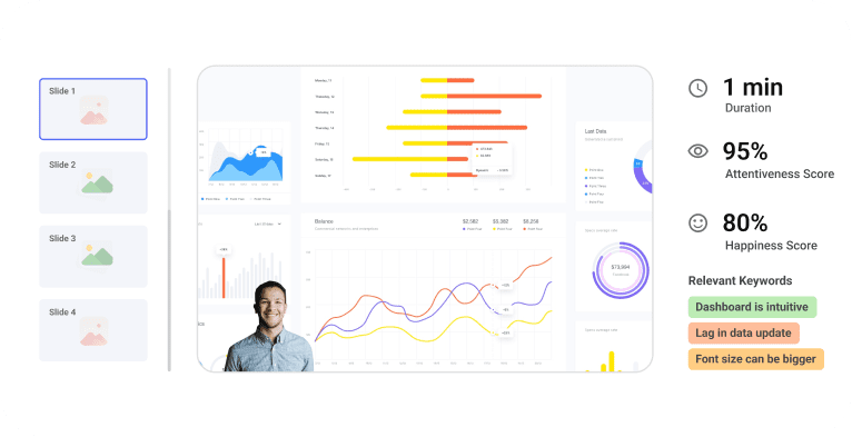
A good sales dashboard works like a car’s instrument panel. Just as a car needs well-placed gauges, your dashboard needs the right information in the right spots. Anyone should understand your sales data stories with just a quick look at a well-designed dashboard.
Visual Clarity And Layout Best Practices
Smart dashboards place vital information where users look first, in the upper left corner. This setup makes use of natural web content scanning patterns, which helps users understand data faster without searching all over.
Your first dashboard should stay simple. Pick five to seven metrics at most. Users get overwhelmed by too many views, which makes important data less noticeable. The best dashboards usually show just two or three views.
Grid layouts solve the confusion of where to look first. Your viewers can process information faster with systematic organization. A clean layout without clutter lets users focus on what matters most.
Colors play a vital part in making dashboards work. Your dashboard should use consistent color logic: green shows on-track metrics, yellow indicates items needing attention, and red marks critical issues. Users spot urgent matters faster with this system.
Adding calculated fields helps users whenever possible. Show percentage changes or target variances instead of raw numbers that need mental math.
Role-Specific Views For Reps, Managers, And Executives
Many people make the mistake of creating generic dashboards without thinking about the end users.
Team members need different data based on their roles:
- Sales representatives need individual performance metrics and pipeline health
- Managers require team performance data and coaching insights
- Executives want revenue forecasts and high-level trends
Sales reps should see their quotas, activity metrics, and current opportunities. Manager views focus on team trends, coaching chances, and pipeline coverage. Executive dashboards show forecasts and Customer Acquisition Cost (CAC).
Role-based access shows each person only relevant information. This focused approach prevents information overload while keeping everyone in sync. Teams using role-specific dashboards are much more likely to hit their targets, 65% compared to just 22% for those without such customization.
Mobile Responsiveness And Accessibility
Sales teams work on the move now. Mobile-ready dashboards have become essential. A responsive design adjusts to any screen size while staying clear and usable.
These practices make your dashboard available to everyone:
- Use one or two column layouts to avoid content wrapping on small screens
- Add text descriptions for images and charts to help visually impaired users
- Choose text block widgets and proper heading structures over image-based text
- Include labels with colors to distinguish data points
Screen readers process dashboard elements in their creation order. Place any explanatory text first so screen reader users get context before other information.
The ideal Zebra BI sales dashboard delivers powerful insights while staying available to all users. Clear designs with good contrast and thoughtful layouts help everyone use the dashboard better, not just those with special needs.
A simple and predictable layout forms the foundation of available dashboards. Your design should stay clean with consistent patterns that everyone can understand easily.
Tools and Platforms to Build Your Dashboard
Building a dashboard becomes simple when you have the right tools. Let me show you some platforms that transform your metrics into visual magic without needing a data science background.
CRM-Integrated Tools Like HubSpot and Salesforce
CRM-integrated dashboards connect directly to your customer data. HubSpot’s reporting suite lets you create custom reports and interactive dashboards that aid business decisions and optimize sales. Small businesses and startups love its unified platform because it helps them find and win customers right from the start.
Salesforce has earned its #1 CRM ranking from more than 23,000 businesses in a variety of segments. Manufacturing companies can use both platforms to create role-specific dashboards. Executives track margin and growth numbers while sales reps keep an eye on their pipelines.
BI Tools Like Tableau And Google Data Studio
Business intelligence tools take dashboard creation up a notch. Tableau stands out with its data visualization features – data connectivity, drag-and-drop visualization, and advanced analytics. You’ll find it handles complex calculations and statistical analysis well. The platform also shows trend lines and predictive analysis to help you spot data patterns.
Google Data Studio (now Looker Studio) works naturally with the Google ecosystem. The platform links to Google Analytics, Ads, Search Console, and YouTube Analytics. Though it’s free, you get hundreds of partner connectors for MySQL and Amazon data sources. The only catch is that, unlike Tableau, you need to convert Excel files to CSV or Google Sheets format first.
You might also want to check out Looker (great for semantic layer development) and Domo (perfect for simple data analysis on mobile).
Sales Performance Platforms Like Everstage
Teams that focus on sales compensation and performance tracking need specialized platforms. Everstage automates sales compensation end-to-end with flexible plan-building features. The platform pulls data from multiple sources, including CRM, HRMS, and accounting systems.
Its innovative calculator helps teams and managers make smart payout predictions. Everstage also blends with Salesforce, so reps can check their commission details without switching platforms or changing CRM data.
The best Zebra BI sales dashboard solutions mix elements from these platforms – CRM integration for data access, BI tools for visualization, and performance features for sales insights. Pick tools that suit your technical skills, budget, and business needs.
Using Dashboards to Drive Sales Strategy
Pretty pictures don’t drive results – action does. Sales dashboards excel at turning raw data into decisions that drive performance and boost revenue.
Tracking Trends And Forecasting Outcomes
Sales leaders gain a forward-looking view of business performance through dashboards. Teams can spot patterns that spreadsheets might miss with live visuals. Revenue predictions over specific periods appear in sales forecasting dashboards, which help teams make smart decisions about resources.
Your dashboard functions as a GPS for sales goals and shows your exact position relative to targets. Teams can estimate expected sales by analyzing deal timelines on their dashboards. This helps them track progress and understand which tactics deliver results.
Identifying Bottlenecks And Coaching Opportunities
Problem areas become visible through dashboards that show where deals stall. Managers can spot common struggles among multiple reps by comparing their performance numbers.
Sales coaching becomes challenging without knowing what reps need help with. Success and weakness areas appear clearly on performance dashboards. This allows managers to design training programs that deliver results. To name just one example, see how sales managers can find the best prospect contact times by analyzing call data.
Lining Up Team Goals With Live Data
Success in today’s market demands access to live data. Reps often lose their drive because they feel directionless without performance feedback. A rep who sees their exact progress against goals on a Zebra BI sales dashboard gains immediate clarity about their daily priorities.
Dashboards build transparency across teams. Everyone can celebrate wins together and work better as a unit with shared access to performance data.
Conclusion:
A clear sales dashboard helps teams read performance at a glance. This guide explains layout choices, color logic, and calculated fields that turn raw figures into context. It shows why five to seven metrics beat crowded screens.
You will see how role-based views keep reps, managers, and executives focused on what they need. The article also covers mobile access and accessibility, so insights travel well. Next, it reviews common toolsets, from CRM-native options to BI platforms and incentive trackers.
Finally, it shows how dashboards drive strategy, highlighting trends, exposing bottlenecks, and aligning daily actions with revenue targets.