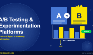
A/B Testing for Velocity: Surprising Results and Expert Advice
A/B testing can dramatically accelerate business velocity, but most teams test the wrong things. This article compiles proven strategies from industry experts who have used testing to speed up conversions, reduce friction, and make faster decisions across multiple sectors. The insights reveal that velocity improvements often come from testing assumptions about user behavior rather than minor design tweaks.
- Remove Optional Fields to Reduce Purchase Time
- Fewer Choices Help Nonprofits Launch Faster
- Strong Visual Hierarchy Accelerates Patient Decisions
- Test Assumptions Rather Than Aesthetic Features
- Simpler Forms Attract More Qualified Leads
- Clarity Drives Velocity More Than Eliminating Steps
- Smaller Pull Requests Accelerate Review Times
- Multiple Data Sources Reveal User Behavior
- Eliminate Unnecessary Handoffs to Boost Speed
- Early Adopter Feedback Enables Graceful Feature Rollout
- Split Decisions Accelerate User Choice Velocity
- Simple Direct Offers Outperform Complex Campaigns
- Segment Users by Network and Device
- Authentic Customer Photos Build Trust and Conversions
- Real Stakes Reveal True Performance Improvements
- Proper Education Maintains Trust During Cancellations
- Quick Contact Forms Enhance Conversion Rates
- Multi Step Forms Complete Better Than Singles
Remove Optional Fields to Reduce Purchase Time
The most valuable velocity improvement came from testing our checkout process. We assumed customers abandoned their carts due to pricing friction, so we ran tests on discount messaging, payment options, and price transparency. None of those moved the needle meaningfully. When we finally tested a seemingly minor change — removing one optional form field that asked for shipping preferences upfront — conversion rates jumped 19 percent, and average time-to-purchase dropped from 8.2 minutes to 3.4 minutes. The surprising result was that customers didn’t want to make decisions about future preferences before committing to their purchase. They felt pressured by too many choices at checkout. This insight would never have emerged from surveys or user interviews where people rationalize their behavior. A/B testing revealed the actual behavior. We also tested simplifying our frame selection interface by reducing the filtering options from 12 to 4 categories. Counterintuitively, this improved both conversion rates by 23 percent and customer satisfaction scores, because customers felt less overwhelmed. Conventional wisdom holds that more choices drive engagement. The data said paralysis kills velocity.
My advice for setting up practical tests: First, measure the actual problem with precision before testing solutions. Most teams test fixes without baseline data. Know your current conversion rate, average time-to-completion, and where customers actually drop off. Second, test one variable at a time, or you’ll never understand what actually moved the metric. Third, run tests long enough to achieve statistical significance; don’t stop early just because the results look good. Fourth, measure secondary metrics next to your primary metric. Our form field removal improved checkout speed, but we had to verify it didn’t increase customer support inquiries afterward. The best velocity improvements come from testing ruthlessly and believing what the data shows, not what you expected to see.

Fewer Choices Help Nonprofits Launch Faster
I think about velocity as time from idea to first live donor. That’s the number that matters in nonprofit fundraising.
At RallyUp, we ran an experiment with new organizations. One group saw our full campaign setup with all the options and flexibility. The other group saw a stripped-down fast launch path with fewer choices, quicker to complete. We tracked how long it took each group to go from signup to a live fundraiser.
What surprised us wasn’t just that the simpler version was faster. The nonprofits using that flow also had higher donor completion at checkout. Giving them fewer decisions upfront didn’t just save time; it helped them raise more money, sooner.
That stuck with me. It’s easy to think of experimentation as serving a dashboard somewhere. But the best tests make life easier for real people doing real work. With nonprofit teams especially, every extra field or toggle is another reason to put off launching.
When I set up tests now, I pick one primary metric: time to launch, completion rate, something concrete. Keep the control stable, only change one or two variables, and make sure enough people go through each version that you can actually trust what you’re seeing.
The velocity improvements that last are the ones that still hold up when your users are juggling twelve other things and just need it to work.

Strong Visual Hierarchy Accelerates Patient Decisions
One of the strongest examples of velocity gains came from an experiment on our clinic locator, the starting point for most patients on hellodent. We tested a variation of the results page that immediately displayed insurance acceptance and next available appointment times after a user entered their location. These signals matter a lot for patients navigating options across hundreds of clinics, especially with the Canadian Dental Care Plan in play.
The interesting outcome was that the minimal, polished layout underperformed. The version that emphasized these decision signals with a stronger visual hierarchy drove more actions per session and reduced repeat searches. Patients moved faster because the information that mattered most was placed directly in their line of sight instead of being hidden behind extra clicks.
My advice is to define velocity using specific behavioral metrics tied to your flow. For hellodent, that included fewer search refinements, shorter intervals between interactions, and a higher completion rate from the first search. Instrument these interactions before running the test so every step is measurable.
Also, focus on testing full decision moments rather than isolated UI tweaks. Dental decisions rely on combinations of signals such as insurance fit, proximity, services, and appointment availability. Testing them together reveals improvements that genuinely accelerate how people choose a provider and move through the booking process.

Test Assumptions Rather Than Aesthetic Features
One notable example is when we conducted an A/B test within the onboarding flow for a small part that we thought was already optimized. The only change we made was to switch the order of two steps, asking the user to set their goal before they selected their first template. We thought it would be a minor adjustment. Instead, we increased completion velocity by almost 18%, simply because the user cared more about why they were there before deciding what they wanted to build. I was surprised at how much improvement there was with improved clarity, compared to any UI or automation we had previously tested.
My number one piece of advice would be to test assumptions, not features. Many teams run experiments around buttons, colors, or copy. But the biggest velocity shifts have come from challenging the flow choices, rather than the aesthetics. Look for friction points or decision points where users are hesitating, re-think the order or number of decisions, and keep the test isolated so you can track results cleanly. And above all else, don’t try to predict the winner. The tests that move the needle the most are typically the ones you were convinced “wouldn’t matter at all.”

Simpler Forms Attract More Qualified Leads
We once ran an A/B test to see if changing our demo request process could speed up how fast people connected with our team. The old version had several steps and fields, while the new one cut it down to a few quick questions. It sounds small, but it made a big difference. The simpler version increased demo requests by almost a third.
What surprised me most was that faster didn’t mean less qualified. The leads were actually better. People who finished the shorter form tended to be decision-makers ready to move. It taught me that speed and simplicity often go hand in hand with quality when you’re building for business users who value efficiency.
My advice for anyone running tests is to stay focused. Test one thing at a time, measure what matters, and don’t overthink it. You don’t need complicated setups to learn something meaningful. The goal isn’t to prove you’re right; it’s to find what truly helps your customers take the next step faster.

Clarity Drives Velocity More Than Eliminating Steps
One of the projects I led this year involved testing an A/B for a key landing page, which focused on improving discovery of products as well as limiting drop-off rates during our busiest season of the year. For this test, I wanted to compare an original top-down product grid to a design that focused more on lifestyle photography, which placed links to products throughout a story-based content page. My hypothesis here was that, although this design would obviously slow down discovery, it would drive more users further down the funnel in the long run. What really blew me away, however, was seeing that this lifestyle page actually increased CTR by 17% and decreased average session time. The moral of this story is that velocity is sometimes more about clarity than about eliminating steps, at least in terms of trust-building early in the funnel. My biggest advice here is to test actual behavior rather than hypotheses, and always include context in addition to metric analysis. Slower doesn’t always mean longer!

Smaller Pull Requests Accelerate Review Times
We used A/B testing to identify a significant velocity improvement in our code review process, which often bottlenecked our custom software development sprints. Our hypothesis was that reducing the size of Pull Requests (PRs) would accelerate review times without compromising code quality.
We ran an experiment where one development team (the variant) was mandated to submit smaller, more atomic PRs (max 250 lines of code), while another team (the control) continued with their usual PR sizes. We tracked average PR review time, the number of review cycles, and, crucially, the defect rate post-merge for both teams.
The surprising result was not just a 30% reduction in average PR review time for the smaller PR team, but also a 10% decrease in the number of bugs introduced post-merge. We had anticipated faster reviews, but the improvement in quality was unexpected; it showed that focused, smaller changes were easier to review thoroughly.
My advice for setting up effective tests is to always validate your assumptions, even the seemingly obvious ones. Define clear, measurable metrics before starting, and isolate the variable you’re testing. Also, ensure your teams understand the purpose of the experiment, not as a judgment, but as a collective effort to improve processes.

Multiple Data Sources Reveal User Behavior
We ran A/B tests on different checkout flows as part of a mobile app redesign aimed at improving completion rates. By using analytics tools to track user flows and drop-off points, we tested variations and achieved a 22% increase in checkout completion, exceeding our 20% target. Additionally, we reduced checkout time to 1.8 minutes, which demonstrated how A/B testing can identify both conversion and velocity improvements simultaneously. My recommendation is to use multiple data sources like analytics, heatmaps, and session recordings together to understand not just what users do, but why they behave that way during the testing process.

Eliminate Unnecessary Handoffs to Boost Speed
I remember one of the experiments during a massive billing modernization program we did for a large insurance carrier.
We had a concern that the slow claim-to-payment time wasn’t just about the systems; we thought the workflow itself was the bottleneck. So, we set up a classic A/B test. One team stuck to the old, multi-step review process. The other used a simplified, AI-assisted flow where the system pre-validated documents and flagged anything weird automatically.
Here’s the shocker: The huge boost in speed didn’t actually come from the automation. It came from realizing and then cutting out one totally unnecessary handoff, a step everyone just assumed had to be there. Just eliminating that step improved cycle time by nearly 30%. The AI insights were helpful, but the workflow clarity is what really moved the needle.
If you’re running tests, here’s what I suggest:
-
Don’t test everything at once. Focus on one variable at a time.
-
Begin with a hypothesis that questions something people have always believed.
-
Measure both speed and quality. If you only focus on speed, you’ll end up redoing work.

Early Adopter Feedback Enables Graceful Feature Rollout
Depending on the widespread use of a feature in our application, we employ different tactics for incremental roll-out so we can ensure that changes to UI and workflow are well-received and adopted. Timesheet entry is the most frequently used tool by the most daily users of our system, so we took every approach possible when we launched an overhaul to that page in early 2025. We provided beta access to an initial set of customer company accounts, with emphasis on variety of user sizes in those companies. We also provided an on/off switch in each company’s settings to let them enable or disable the new layout, and even individual key features in that layout. Frankly, without feedback from those early adopters and the ability to monitor activity between companies that made the switch and those that didn’t, we would have been overwhelmed with feedback related to edge cases we were able to solve before wider release. It made for a very graceful roll-out of a feature that affects every account and the majority of our users. Taking the slow, option-rich approach and monitoring activity so you can adjust along the way pays dividends in trust from your user base’s willingness to be involved and inform future changes as well.

Split Decisions Accelerate User Choice Velocity
One of my recent experiences with using A/B tests to improve user velocity came from redesigning our onboarding marketing opt-in flow. Our opt-in rate was only 6.3%. The goal was to help users move through onboarding with less friction. Our onboarding screen consisted of two toggles, one for push notification consent and the other for marketing email consent.
After competitor research and internal brainstorms, we identified two UX patterns to test:
1. a redesigned single screen with both opt-in toggles (UX improvements: moved them to the bottom right for convenience)
2. a split-screen flow separating email and push decisions.
To evaluate how each affected conversion, we ran a simple A/B test:
1. 33% control group
2. 33% single screen
3. 33% split screen
Our metrics:
1. push + email opt-in (main metric)
2. push opt-in rate
3. email opt-in rate
4. onboarding completion rate
The surprising outcome was that the split-screen flow, despite adding an extra step, actually accelerated user decisions. It delivered a +298% uplift on iOS and +64% on Android, raising opt-ins from 6.3% to 25%, while onboarding completion remained stable.
We discovered that velocity isn’t always about fewer steps, but rather about simpler decisions. Breaking one heavy choice into two easy ones can help users move through an additional screen. It’s better than stuffing everything into a single screen.
My advice for effective tests is to set up an A/B infrastructure. And that alone will drive the team’s desire toward experimentation. Initiate weekly sessions with analysts to identify potential bottlenecks in users’ behavior. And of course, experiment more, because it’s hard to nail it with the initial UX flow.

Simple Direct Offers Outperform Complex Campaigns
When scaling e-commerce brands like TrueSportsFan.com, I used rapid experimentation to test different marketing approaches and discovered something unexpected. Simple, direct offers through targeted social media ads consistently outperformed elaborate marketing setups, which helped reduce customer acquisition cost by 27% and increase conversion rates by 14% within 90 days. My advice is to embrace agile marketing and test quickly rather than overbuilding campaigns, because complexity doesn’t always lead to better results.

Segment Users by Network and Device
One of the most impactful A/B experiments we conducted aimed at reducing connection latency within our screen mirroring app. Here, we wanted to validate if the introduction of an AI-based adaptive bitrate algorithm, which dynamically adjusts stream quality based on real-time Wi-Fi conditions, would improve start times for mirroring and reduce buffering.
Users were divided into two groups:
-
Group A (control): Employed our regular static bitrate system.
-
Group B (test): Utilized the new adaptive bitrate algorithm.
The surprising result? Whereas we anticipated a clear drop in latency across the board, it actually only improved dramatically on mid-tier network environments (for example, 20-50 Mbps connections). In the case of users on ultra-fast or very weak connections, AI adaptation provided little to no benefit — and even, in some edge cases, increased the connection setup time due to added computation.
This has taught us one important thing: gains in velocity aren’t always linear nor universal; they depend on the real-world context.
Our recommendations regarding the setup of efficient testing:
-
Segment users in meaningful ways, such as by device type, region, or network condition. Uniform testing conceals nuanced insights.
-
Measure beyond averages: Track distribution shifts, such as P90 latency, not just mean improvements.
-
Run tests for a duration sufficient to capture behavioral adaptation. For example, when new optimizations are introduced, users might initially mirror differently.
The key is to approach A/B testing not as a “yes/no” validation, but as a learning system that uncovers where — and why — improvements actually matter.

Authentic Customer Photos Build Trust and Conversions
Our product pages weren’t converting well, so we tested two completely different approaches for our performance shorts. Version A had professional studio shots with detailed fabric specs and technical descriptions. Version B showed real customers mid-workout with sweat visible, plus candid reviews about fit and comfort. My assumption was that polished, technical presentation would win since we’re selling performance gear. The result shocked me: Version B outperformed by 49% in conversions, and average order value increased by 27%. People didn’t just buy the shorts; they added matching tops because the authenticity built trust. What really surprised us was the time spent on page jumped from 40 seconds to nearly two minutes with the realistic photos. We ran this test across 5,000 website visitors over three weeks, splitting traffic evenly. The insight wasn’t about abandoning quality imagery; it was understanding that customers wanted proof our gear actually performs under pressure, not just looks good on a hanger. Real sweat sells better than perfect lighting.

Real Stakes Reveal True Performance Improvements
For years I’ve been building out clean tech at scale: from rolling out solar technology to 5 continents, to creating circular supply chains for materials everyone thought we didn’t want. I’ve always believed that progress doesn’t come from ideas alone… it comes from ideas pressure-tested in the real world.
In fact, the best test I’ve ever run was never meant to be a test at all. We were just trying to reduce turnaround time for a bulk logistics challenge. One team cut two steps I thought were prerequisites. It succeeded. The other team used “standard” procedure and finished last. “Standard” was losing us close to 30 hours per week.
I’d probably go so far as to say this is the universal truth: the best test is the one that looks like life. No simulations. Just real variables and real risk. You’ll learn more from one curveball thrown your way than from 50 sanitized mockups. So if you’re setting up a test, make sure the stakes are real — that is, if it goes wrong, it costs time or money. This is when people take notice. And frankly, this is when you’ll find out who’s just ticking boxes… and who’s trying to do better.

Proper Education Maintains Trust During Cancellations
The team conducted an A/B test on subscription cancellation procedures to determine how showing individualized microbiome education during the decision process would affect customer churn speed. The research indicated that customers abandoned their subscriptions because they experienced short-term health issues and lacked a proper understanding of probiotic functions. The test included two versions of the screen where the first displayed a fixed image, but the second provided brief visual content and customer service access. The test version achieved two positive results by lowering cancellation rates and boosting satisfaction levels among customers who canceled their subscriptions. Customers who receive proper information about their products will maintain respect for the company even when they decide to leave. The key to successful experimentation involves developing specific hypotheses and maintaining strict control over tested elements while monitoring both success rates and customer opinions. The establishment of trust stands as a more valuable achievement than customer retention.

Quick Contact Forms Enhance Conversion Rates
We’ve implemented a number of A/B tests that have helped us greatly increase the volume of high-quality leads being generated from both our main website and our online store. We are always looking for new ways to generate a higher conversion rate, and one of the most encouraging was implementing a quick contact form on our online store. We found that giving users the option to fill out a form doesn’t detract from online sales; if anything, it enhances the commerce environment and has led to better business for us overall.

Multi Step Forms Complete Better Than Singles
I’ve noticed that making small changes during testing can cause user velocity to increase significantly. This is true in application funnels where friction is equal to customers who are lost.
We did an A/B test with our loan application form. In the test, we compared a single page version with a step-by-step version. It is commonly thought that shorter forms are better at converting. It was surprising that the multi-step version outperformed the single page version by 18%. Users said that the segmented layout felt easier and that they were more likely to complete it.
Here is my advice on how to set up tests that work well:
Test one variable at a time. You might want to redesign everything, but you will never know what actually worked.
Keep track of micro conversions, not just the final result. We kept track of how quickly fields were completed to catch points where people would drop off.
Use data to lead, not assumptions. This result changed what we expected and also changed how we design flows forever.

Related Articles
- 18 Ways to Use Customer Feedback for Continuous Improvement
- How AI Revolutionizes Real-Time Marketing: 18 Success Stories
- 18 Surprising Areas Where Speed Boosts Business: Lessons Learned