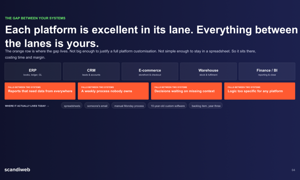
Introduction: The Best Software Feels Like It’s Not There
In an age where digital products often compete on flash—animations, gamification, AI assistants—there’s a quiet revolution happening in business software: tools that are designed to disappear.
No, not literally. But when a product works so smoothly that it fades into the background of your day—that’s what great UX really is.
That’s exactly how Sabeer Nelli built Zil Money. Not as a fintech platform that wows users with visual flair, but as one that removes friction, respects attention, and supports real business operators in getting things done fast.
Zil Money doesn’t demand your time. It returns it.
UX That Started in a Gas Station Office
Before Zil Money became a go-to platform for managing payments, payroll, and business checking accounts, it started in an unlikely place: the back office of a fuel station.
Nelli, running Tyler Petroleum, spent too much time dealing with fragmented payment systems:
- One tool for printing checks
- Another for wire transfers
- A separate login for payroll
- A disconnected process for managing vendors
What all of these had in common? Poor UX. Not because they were ugly—but because they slowed down the actual work.
He didn’t set out to build beautiful software. He set out to build useful software. And in the process, he discovered that the most powerful UX often isn’t what you see—it’s what you don’t have to deal with.
What “Invisible UX” Looks Like at Zil Money
Let’s break it down. What makes Zil Money’s user experience so effective—yet so understated?
✅ 1. Minimal clicks to action
Want to send an ACH payment? It’s right on the homepage. Want to print a check? One click. Run payroll? Another click.
No buried menus. No tutorials needed.
✅ 2. Interface built around real workflows
Everything is structured the way business owners actually think:
- Vendors are central
- Payment types are clearly labeled
- Transactions are searchable
- Recurring actions are automated
✅ 3. One login for all tasks
Users don’t need different apps or tabs. They manage their payments, accounts, payroll, and vendors from a single dashboard—with the same logic and layout across features.
✅ 4. Error recovery built-in
Cancel a check? Reverse a transaction? Flag an issue? It’s not hidden under “Settings”—it’s surfaced where you need it, when you need it.
This isn’t design for design’s sake. It’s design for doing.
Built for People Who Don’t Have Time to Learn New Software
Most Zil Money users aren’t software junkies. They’re:
- Trucking companies trying to get drivers paid
- Law offices managing trust accounts
- Contractors paying vendors and printing checks
- Nonprofits running tight budgets on lean teams
They don’t have time for onboarding videos or hidden “power user” features. They need tools that just make sense.
And that’s why Zil Money succeeds where others stumble: it’s built to be intuitive, not impressive.
Case Study: Saving Time for a Property Management Firm
A mid-sized property management company in Arizona recently switched to Zil Money from a collection of tools:
- A separate platform for rent disbursements
- An outdated payroll system
- Bank wires handled via slow, error-prone processes
After one week on Zil Money:
- Their accountant reduced payment processing time by 40%
- The team printed over 150 checks in-house
- Vendor records and payment history were fully searchable from one screen
- They opened new USaccounts to manage owner funds per property
When asked what they liked most, they didn’t mention “features.” They said:
“It’s like the software finally understood what we were trying to do.”
That’s the power of good UX: it makes the user feel smart—not the software.
Why Flashy Design Fails in Business Tools
In consumer apps, attention is currency. You want users to stay longer, click more, share posts, invite friends. That leads to design built for engagement.
But business software is different. Time saved is the only true metric.
- Users don’t want a dopamine hit—they want the job done.
- They don’t want to be impressed—they want to be empowered.
- They don’t want features—they want flow.
Zil Money’s design philosophy reflects that difference. It doesn’t trap users—it frees them.
The Quiet Decisions That Shape Great UX
What makes Zil Money’s design so user-centric? It’s not one big idea. It’s hundreds of small ones:
- Using plain language instead of industry jargon
- Putting common actions front and center
- Letting users preview checks before printing
- Offering ACH and wire options side by side
- Making it easy to open and manage new accounts with zero paperwork delays
- Prioritizing real customer support over automated bots
Each of these may seem minor. Together, they add up to a product experience that respects the user’s time, stress level, and decision fatigue.
The Sabeer Nelli Approach: Utility First, Aesthetics Second
As CEO, Nelli isn’t obsessed with what looks good in a demo. He’s focused on what makes operations easier for the person who logs in on a Friday afternoon with six payments to make and payroll to finalize.
He doesn’t ask: “How can we make this look better?”
He asks: “How can we make this easier?”
That mindset has led to:
- Faster interfaces
- Fewer clicks
- More trust
- Less confusion
And in the fintech space, that’s a breath of fresh air.
What Other Builders Can Learn
If you’re creating software for professionals, take a page from Zil Money’s UX playbook:
- Design from the inside out
Start with workflows. Then design interfaces to match—not the other way around.
- Measure success in seconds saved
Every click removed is value added. Respect your users’ time.
- Give power without complexity
Don’t “dumb down” your product. Just organize it so power users and first-timers both feel confident.
- Listen, don’t assume
Much of Zil Money’s interface evolved from real customer conversations—not internal assumptions.
Final Word: The UX You Don’t Notice Is the One That Wins
Zil Money isn’t built to steal the spotlight. It’s built to support the people who rarely get one—business owners, managers, finance teams, and operators who just want things to work.
And under Sabeer Nelli’s leadership, that quiet, intuitive, efficient design has become a competitive edge.
If you’ve ever used software that “looked good” but slowed you down, you’ll appreciate what Zil Money does differently. It doesn’t show off. It just shows up.
Every. Single. Day.