In today’s competitive market, branding is more than just a logo or a slogan. it’s about creating an emotional connection with your audience. One of the most powerful tools in achieving this connection is color psychology. The colors you choose for your brand have the power to influence perceptions, evoke emotions, and ultimately shape buying decisions. In this blog, we’ll explore the impact of color psychology in branding and provide tips on how to select the perfect color palette for your brand.
Why Color Psychology Matters in Branding
Studies have shown that up to 90% of snap judgments about products can be based on color alone. Color is more than an aesthetic decision. It communicates meaning and triggers subconscious reactions. For example, red often signifies passion, urgency, or excitement, while blue exudes trust, calmness, and professionalism. Understanding how colors influence emotions can help your brand stand out, build trust, and drive engagement.
Key reasons why color psychology matters in branding:
- Creates Emotional Responses: Different colors evoke different emotions, shaping how people feel about your brand.
- Enhances Brand Recognition: Consistent use of colors can increase brand recognition by up to 80%.
- Influences Consumer Behavior: The right colors can trigger specific actions, such as making a purchase or engaging with content.
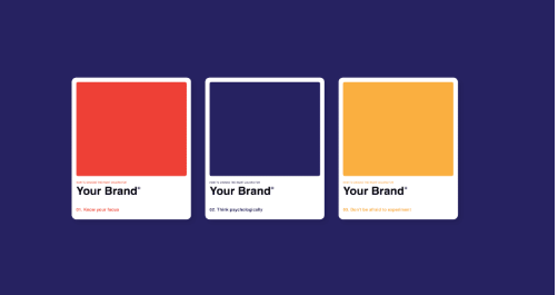
What Colors Say About Your Brand
Let’s break down some common colors and their psychological associations:
- Red: Energy, passion, urgency, and excitement. Often used by brands to evoke strong emotions and drive impulse actions.
- Blue: Trust, dependability, calmness, and security. Frequently chosen by financial institutions and tech companies.
- Yellow: Optimism, warmth, and happiness. This color is often used to grab attention and evoke positivity.
- Green: Health, growth, nature, and tranquility. Ideal for brands focused on sustainability or well-being.
- Orange: Creativity, enthusiasm, and energy. It’s a fun and playful color that can create a sense of excitement.
- Black: Power, sophistication, and luxury. Commonly used by high-end brands to convey exclusivity.
How to Choose the Right Color Palette for Your Brand
Selecting the right colors involves more than just personal preference. It requires a strategic approach that aligns with your brand’s identity, values, and target audience.
1. Define Your Brand Personality
Before choosing colors, understand your brand’s personality. Is your brand playful or serious? Modern or traditional? Luxurious or affordable? For example, if you want to convey trust and professionalism, blue might be the ideal choice. On the other hand, if you’re targeting a younger audience with a playful tone, vibrant colors like orange or pink could be more effective.
2. Consider Your Target Audience
Different colors resonate with different demographics. Research shows that men tend to prefer blue and green, while women are often drawn to purples and softer hues. Additionally, cultural differences can impact color preferences—for instance, red is associated with good luck in China but can signify danger in Western contexts.
3. Analyze Competitor Brands
While you don’t want to mimic your competitors, it’s important to understand the color trends within your industry. If everyone in your niche is using blue, you might consider a contrasting palette to stand out. However, be cautious not to stray too far from industry norms if they help establish trust.
4. Choose Primary, Secondary, and Accent Colors
A well-defined color palette includes primary, secondary, and accent colors. The primary color should reflect the core identity of your brand, while secondary colors provide flexibility. Accent colors can be used sparingly to highlight specific elements like call-to-action buttons or promotional banners.
5. Test and Validate Your Color Choices
Before finalizing your palette, test how the colors perform in different contexts—on your website, social media, packaging, and marketing materials. Conduct focus groups or A/B tests to gather feedback and ensure the colors resonate with your target audience.
Case Studies: Successful Brands Using Color Psychology
Coca-Cola: The Power of Red
Coca-Cola’s iconic red branding is a prime example of color psychology in action. Red evokes feelings of excitement, passion, and energy—perfect for a brand that aims to create moments of joy and refreshment. The color has become so synonymous with Coca-Cola that it instantly triggers brand recognition worldwide.
Spotify: Energetic and Fun with Green and Black
Spotify’s use of green as a primary color is unconventional in the tech world, but it works to convey freshness and creativity. Combined with a sleek black interface, the brand feels both modern and approachable.
Tiffany & Co.: Timeless Elegance with Tiffany Blue
Tiffany & Co.’s signature blue is synonymous with luxury, sophistication, and exclusivity. The unique shade has been trademarked, demonstrating the power of owning a distinctive color in branding.
Conclusion
Color psychology is a crucial component of branding that can influence how customers perceive and interact with your brand. By carefully selecting a color palette that aligns with your brand identity and resonates with your target audience, you can create a lasting impression and foster deeper emotional connections. Whether you’re building a new brand or refreshing an existing one, understanding the power of color can give you a competitive edge.
Remember, colors speak louder than words—make sure your brand is saying the right thing. With unlimited graphic design by Rivet Digital options available, brands today have the flexibility to experiment and craft the perfect color story.