When bloggers and website owners think of how to improve KPIs like conversions and subscribers, they generally think of optimizing on-page SEO and using different plug-ins. Although these efforts can make some changes, optimizing web design is one of the most impactful ways to make substantial changes to many important metrics in a site. This includes aspects like page load time, readability, conversions and more.
Web design encompasses all of the front end aspects of a website and it will greatly impact user experience. Making improvements to web design can help bloggers and website owners reach their desired KPIs. The modern blogger and website owner needs to have a robust mobile and responsive design to meet the needs of their audience. Some of the best design tips that bloggers and website owners can start utilizing today include.
1. Optimizing for site speed:
A common mistake that bloggers and website owners make in the design of their site is not optimizing for site speed. This often results in a good looking website that is extremely slow and bulky in addition to having low functionality for the reader. Many studies have shown that the vast majority of readers will bounce from your site if it doesn’t load in 3 seconds. Anything that adds more time to the loading page of your site should be avoided because you will end up losing traffic.
You can start optimizing your design for site speed by reducing the number of plugins on your site, using web caching, optimizing the images and files on your site and more. These changes will make significant improvements in your site speed. If you want to look at the site speed of your website or a specific page on your website, you can do it with Google PageSpeed Insights.
2. Simplicity in design:
One of the biggest design mistakes that sites often make is having a cluttered and distracted design. It’s very easy to get carried away with different themes, plugins, colors and layouts on website builders such as Wix or Shopify. Although many features and plugins seem productive, they may cause more harm than good. A cluttered design can increase bounce rate, reduce site speed and cause many other technical issues on your site.
Using simplicity in your design doesn’t mean your site has to look ugly. Simplicity just means removing all of the unnecessary elements that do not serve you or the visitors on your site. You can have a clean layout and sleek design without adding many plugins that will make the user experience worse. It may be best to work with a web developer to help you simplify your website’s design. Making too many changes on your own can cause performance issues to your site. You can just have a simple blog page, home page, FAQ page and that’s it.
3. Avoid stock photos:
Designing your website will also mean that you will have to add imagery to your site. The types of images you select for your site will dictate your branding and how readers perceive the credibility of your site. Many bloggers and website owners download themes that have stock photos that come along. In some cases, it’s better to have no photos than stock photos because of the quality of stock photos.
If you are including any photos of people in your design, make sure it’s you, an employee or a team photo. A collage maker can help you create a professional-looking design with ease. This helps establish trust and gives your site credibility in the eyes of your readers. Using stock photos that are popular is a huge red flag for readers that your site is untrustworthy and clients will not take you seriously. Use authentic and engaging photos of you or someone at your company instead of stock photos.
4. Add social proof:
One of the best elements that you can incorporate into your design is social proof. When a visitor lands on your site, they are usually coming from a search engine. They have no idea what your site does and whether or not they can trust you. Social proof allows you to build rapport and trust with your readers. Examples of social proof that you can add to your site include reviews, publications you were mentioned in, testimonials, awards and more.
This is even more important if you want to sell your online course on your website. The majority of website owners and bloggers sell services like sponsored posts, info products and consulting. It’s important to add social proof like testimonials and reviews to increase conversions and sales. The modern consumer is more informed than ever and nearly 87% will read a review prior to purchasing anything online.
The social proof shouldn’t be just any type of award or recognition, it should be tailored to the type of customer you’re trying to reach. For example, if you’re a B2B SEO agency, your social proof should be case studies on improving organic traffic for B2B clients. That is far more impactful than using a random marketing certification.
5. Mobile friendliness:
A vital design mistake that website owners and bloggers make is they don’t optimize for mobile devices. This is one of the most costly design errors to make because 54.8% of all web traffic comes from mobile devices. If your website is not optimized for mobile, it’s not optimized for the majority of your visitors. Your website needs to be secure and easy to use for mobile readers or they will bounce more and you can lose significant revenue.
You can take several steps today to make your website more mobile-friendly. First, your website needs to be more responsive. This means your website should be just as functional and easy to use on both desktop and mobile devices. Additionally, you can make buttons bigger, easier to read and compress your images and files for your mobile readers. Taking simple steps like this can improve the mobile experience of your readers dramatically.
6. Readability:
A subtle yet vital aspect of web design is readability. Readability refers to how easy it is for readers to read and understand the text on a website. A website with good readability will have text that is large enough to easily read. This makes the reading experience enjoyable for visitors and they stay longer on your website. It’s important to use a readable font and text size across all of the text on your site.
Readability also includes the word choices you use for your text. If you use a large amount of sophisticated words across your blogs, your readers will not enjoy it and will likely bounce. You can test the readability of your posts by using SEO plugins like Yoast. These plugins will scan your blog posts and see any on page SEO issues in addition to making sure your text is digestible for readers.
Consider that when it comes to readability, sometimes less is more.
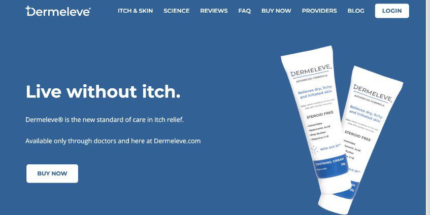
In this example from Dermeleve, the words found above the fold are simple, yet highly effective. The first sentence dictates what the product is about, and the second states where the product can be found. No need for complicated sentence structures or words.
7. Ease of navigation:
One of the best ways to keep readers on your site longer is to have easy navigation across your site. Navigation is a key part of the user experience and it’s a catalyst in retaining users longer on your site. Navigation includes how users find your blog, contact information, etc. A good rule of thumb for navigation is that a user should be 3 clicks or less away from any page they want to go to on your site.
You can optimize your navigation by adding links in your header and a search bar. The links in your header can be for your homepage, services, contact page, etc. The search bar is crucial if you have many blog posts. This will allow your readers to search for any keywords and find the blog that they are looking for. A good example is the Icons8 navigation menu:
It includes all of the major products and services offered, a clear search bar and a sign in link for users. It’s centered around what Icons8 users would be looking for and it’s a great example for easy navigation.
8. Optimize email sign up forms:
A tangible and high ROI benefit of optimizing your design is getting email subscribers and sign ups. Most bloggers and website owners have some sort of form or plugin they use to capture the email visitors on their site and turn them into subscribers on their email list. Incorporating your email sign up form into your design is a great strategy to capture visitors and potentially turn them into customers with email marketing.
Your email sign up form should be large and visible for your visitors. The placement of the sign up form can be at the top or bottom of the homepage and you can also add it to the bottom of your posts. Some websites do advanced techniques like A/B testing to see what placement of the sign up form works best. This can look like placing the sign up form in one area and seeing the amount of signups vs another area on the website. You can attract more sign ups for your email by offering promotions and exclusive content.
9. Add a call to action:
Spending endless amounts of hours on designing your website or blog without having a call to action means you can be losing out on thousands of dollars every month in revenue. The work that you do in designing your website can be captured with a compelling call to action. Taking a simple action like adding a call to action at the bottom of your homepage or blog posts can generate a significant amount of leads and email subscribers
The call to action you choose should be based on what’s the highest ROI conversion for your business. If you’re a website or blog owner, this can be adding a visitor to your email list or linking back to your services page so you can sell consulting or an info product. You can use different strategies to make your call to action more appealing like using:
- A sense of urgency
- Using popups
- Using strong verbiage
- “Using QR codes (QR codes can be created easily using a QR code maker)
Using a variety of these tactics can help improve the effectiveness of your call to action significantly. To learn more about which call to action buttons convert more, check out this related blog post.