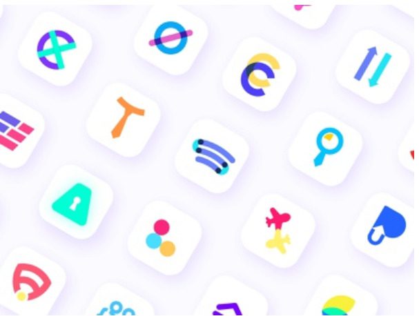
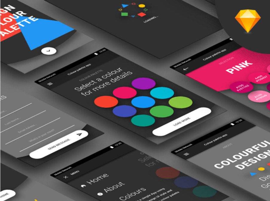
21% of millennials remove a mobile app if they don’t like the way the icon looks on the screen. Therefore, it is important to consider not only functionality, but also the aesthetic component.
1) Simplicity
Laconicism is the key to successful design in any sphere, including game development. Here are the nuances to consider:
Remove the excess. The more details there are in an image, the more difficult it is to recognize and recall it, as well as scale it. Keep in mind that the icon must be legible in all sizes, including the app store, the phone menu, and the settings panel.
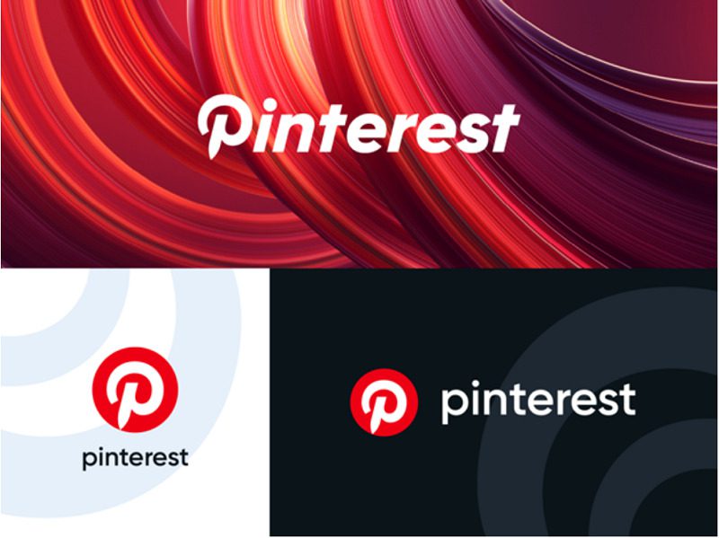
Make use of symbols. Concentrate on a single recognized element, such as a pin on Pinterest, a ghost on Snapchat, or an image on Instagram (camera). The logo, which is the brand’s primary visual sign, can serve as an icon provided it adheres to minimalist principles. Keep in mind that little is more.
Study the icons of your favorite apps and see what symbols are utilized in their design as a life hack.

2) Color
This branding element can be decisive when choosing an app. We will tell you how to choose the right color scheme:
Use no more than two or three colors like most popular companies like Airbnb, Pandora, or Dropbox. A large number of shades will merge into one fuzzy spot.
Take a cue from top brands. Research has shown that they most often choose blue for graphics (Google Calendar, Safari, Twitter, LinkedIn). The second and third places are shared by red and white, with red being most commonly used by brands related to food and drinks.
Make sure the colors you choose match your business, appeal to your target audience, and align with the rest of your corporate identity.
Check how the icon looks on different backgrounds – color, black and white.

3) Consistency
The visual symbol of the application must match its content. A harmonious image helps to perceive the product as a whole and induces stronger emotional attachment.
Use one design language: color palette, style, and techniques. Does your application have a gradient, unusual geometry, or a retro look? Apply them in the icon too.
If you have multiple applications, design them in the same style as Adobe did for its products: Photoshop Sketch, Illustrator Draw, Lightroom, Skan, and others.
Tie symbology to the functionality of the application so that the user at a glance understands what your product is about. For example, the Vivino wine rating uses a bunch of grapes, while the Spotify music service uses a speaker volume symbol.

4) Superfluous elements
Long labels and photographs are unnecessary elements on a small icon. They scatter the user’s attention and make it difficult to understand.
People perceive images 60,000 times faster than words, and when choosing an app, speed can be critical.
Remember, if you have to use words, then you have not exhausted the full potential of visuals. Match metaphors for your business until you find the right symbol.
Exceptions are short brand names (BBC News, Uber) or the use of the first letter (“F” for Facebook and Foursquare).
The same principle works with photographs, in which details will be indistinguishable at low resolution. If you have a favorite snapshot that characterizes your business, branding it with a vector.

5) Uniqueness
Your icon will constantly compete with thousands of others for user attention. Therefore, it is important to differentiate yourself from the competition so that the design is unique and evokes emotional attachment.
- Research the most popular apps in your niche, analyze what tricks they use. Think about how you can differentiate: colors, symbols or graphics.
- Analyze which elements attract your target audience and which ones, on the contrary, repel. Consider the results when designing your icon.
Conclusion:
Let’s summarize the most important points to keep in mind when designing a mobile app icon.
Take care of simplicity, recognition and uniqueness.
Follow trends to stay relevant.
Learn from top brands. For example, from this list of the most popular mobile apps:
Facebook Messenger
TikTok
Likee
Snapchat
Netflix
Spotify


